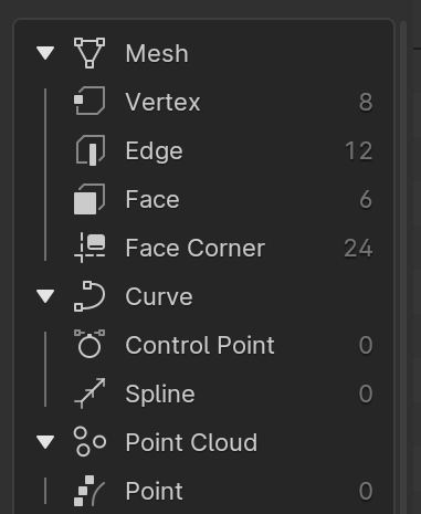
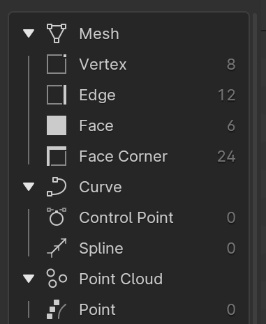
If you go to the Spreadsheet editor you will see a list of element types:
The icon for “Face Corner” is just a placeholder - that one actually represents snapping a node to a corner.
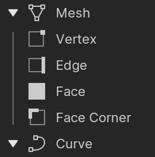
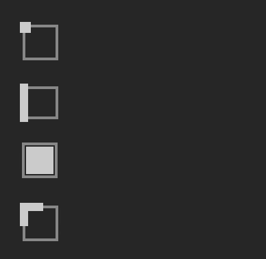
What should the icon for “Face Corner” look like? It needs to live in this list nicely and have a matching style. And of course be made using the same 14x14 grid as all the rest, so no tiny or fussy features.
Finally, the node-snapping placeholder icon is awful and has been an eyesore for years already.
But coming up with a good alternative is tough
How about something like this?
“Point” also need a dedicated icon. Could just be taking one of those point cloud circles and putting it in the center.
Curve, Control Point and Spline also were copied from existing icons I think and are not great at explaining the difference. I think actually “Curve” should be renamed to “Curves”? And then the icon can show multiple curves, spline can show a single curve, and control point a single control point on a curve.
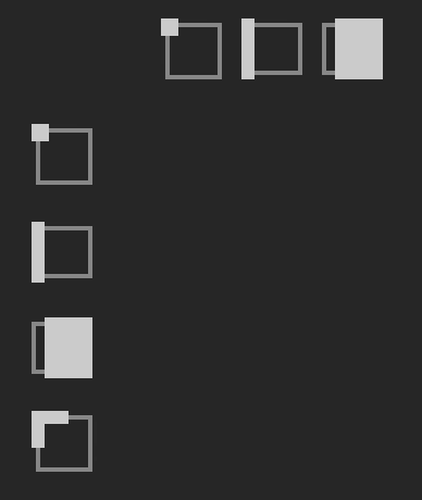
I think in addition to the face corner, the other 3 don’t need that hexagonal hinting behind them. Making them all 2D as the rest are, will make the icon stand out without so much clutter.
I agree on the ‘hexagonality’. However I don’t really like this corner icon. This looks more like ‘double edge’ or something like that. There could be something to drawing a ‘corner’ like that but maybe the sides should not extend all the way if you know what I mean.
I know ;-). But I do think this is much better. Even though I like the versions with a dot/square in the corner even better as to me that feels more like a part of the face and this feels more like part of the edges.
After looking at your ‘vertex’ icon I think the little vertex square should be centered on the corner. So sticking out slightly outside the square, like it did in the ‘3d’ versions. With it only sitting on the inside corner your ‘vertex’ icon feels like a ‘face corner’ icon to me.
Here’s a version of that; i adjust the other inner outlines so that they match the offet. (The FACE was left as-is, such that all the icons have the same X*Y dimension).
To be honest, I don’t care for this as much, compared to the v3.
But, we aren’t selecting a triangle. We’re selecting a corner of 2 adjoining edges.
Funny how this apparently ‘feels’ different for everybody. To me it’s not a ‘corner of 2 adjoing edges’, but ‘a corner of a face’ . I guess because I associate the face corner domain mainly with UV coordinates, which feel more face-related to me…
Anyway, I like these a lot. More than the ‘inner’ versions.
For the above design there would have to small tweaks to align with the design grid. For example if you expand a single-pixel width to two pixels by expanding half a pixel on either side you end up with blurriness when viewed at 1X scale. I also think that vertex dot is a bit small? Here a bit larger.
Although I am thinking that although this looks “cleaner”, I don’t think the one for “face” is clear enough to be understood without context. The look good as a group but the current version also works on its own.