That could work if it still looks okay with the gap between the edge and face being the same width as the edge lines. My earlier one now just looks like a coffee mug to me. LOL
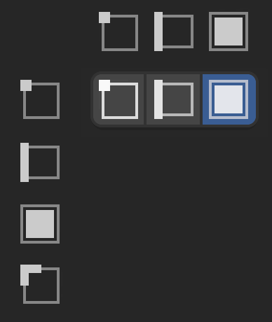
That could work if it still looks okay with the gap between the edge and face being the same width as the edge lines. My earlier one now just looks like a coffee mug to me. LOL
I actually did the highlights on opposing sides so that it was an extra layer of visual difference. I thought the non-symmetry would make the 3 even more distinct between each other. (But, might not be something you like).
For the grid/specs - i didn’t actually use the officials, I just drew it on top of the original pic at the top - sry if that created some extra work though. ![]()
I don’t like the “square almost covers border” - just looks off center, and the border isn’t needed to communicate that it’s a face. (LOL @ coffee mug, now i can’t not see it)… save that pic, we might need a coffee icon at some point?
The square in border-dead-center looks ok, though.
Sorry, don’t let me take this over. Feel free to put the highlights anywhere you think looks best.
The only reason I swapped any - and added the horizontal row of them - was to see how they looked close together like that. In some configurations they line up nice vertically but not horizontally, or the gap looks uneven.
Was just looking at that; it appears to be the inner padding, added by the curved button edgings? I’m guessing any full square would have the same visual effect, but i didn’t really notice it until you mentioned.
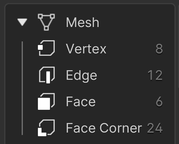
So if we keep the existing vertex, edge, and face icons, would this then be “face corner” based on all of the above?
Can we replace all the icons? This is possible, but would require @pablovazquez to weigh in.
Simpler icons lose identification with Mesh, that is present when icon look like outline of the default cube, iconic.
Just square white icon is never a good icon imho. It doesnt tell anything unless you already know what its trying to say to you.
In context of listing all domain icons you’ll guess what it is, but if there was a situation where only face icon was present, would you know what is going on? Its just square
It says Vertex, Edge, etc right next to the icon…?
I just don’t think that we need a icon that sort of vaguely looks like a cube, to know it’s actually part of a mesh variety. At actual size it looks like weird outline … thing.
Not in the way those icons are used here:

Fair point. I’ll still stand on it, though; I don’t think the ‘base’ icon needs to look like an implied 3D cube, for the artist to get the point. If we look at the icons used for snapping - vert, edge, face - they are presented in 2D format, and work fine in that way.
Since the current icon on the left means “point cloud”, could the following icon on the right work for point in a cloud?

My first impression is Yes.
This is how I would design the corner icon. ![]()
Okay, I’ll probably get these changes in today so I can combine a few icon changes together.
Note that although this will give us a “face corner” icon that matches the existing style, there is no reason why someone could not later propose changing all the editing component icons together to a different style, for example as @thorn-neverwake suggested.
Thanks for the help everyone!