I like it, xray facedots wasn’t activated by default, maybe it could change its naming to “ignore facedots” for clarity and be off by default? Good job, love that I can add auto xray to quick shortcuts. ::
1 Like
I also agree with @LudvikKoutny that I should be able to tell that Select through is on by a highlight in the X-ray button. Even if it’s just half a triangle or something like that.
Thanks! I’ll test the build for the final release of 3.2. And with testing I mean, use it as my Blender 3.2, just like I did for 3.1.2 
Looks good.
It was also proposed to use the toggle button with this icon from the outliner to indicate and control Select Through.
But at the moment Select through and AutoXray options will be available, any additional buttons with any interconnecting logics can be achieved with addons and without custom builds.
In that case, @JulienKaspar what do you think of an additional button in the header to indicate Select Through is on?
Why? When lcas finally made a good version with less UI clutter, why is the first instinct of everyone else to start cluttering the UI again?
Having two interdependent ON/OFF toggle buttons on the top bar is a hell. You can’t just glance at one to see if you are selecting only visible faces or not. You now need to evaluate two buttons next to each other with 4 total possible combinations of states, and extrapolate the “mode” you are currently on.
Select Through is what you should toggle frequently on or off. That’s what determines if you are able to select only visible faces or not. Whether you want to use xray and/or facedots to do your select through is more of a workflow preference. There will be almost no people who will want to keep togging the xray on or off as they work. They will just mostly settle on one of the two states. It makes no sense to put workflow preference toggle on the top level of the UI to create visual pollution.
Really… everyone in this thread, all the time… is always like “how can we add more buttons?”. It’s so incredibly frustrating. I should rename the title of this thread from Decoupling x-ray from and limit selection to visible to “Ideas on how to add as many buttons to Blender as possible”.
1 Like
Relax, I was asking for replacing the X-ray button with the Select through button on/off or a feasible alternative to show that Select through is on.
So to clarify, maybe Select through could show like this:
![]()
Select through is sortof in between both modes, which is the reason why I thought this might solve the issue for the icon, since this way, it can be part of the button. Left is default, middle is select through enabled and right is X-ray enabled. If you enable X-ray, it’ll go to the right icon, if you disable X-ray and have select through enabled it’ll be the one in the middle and if both select through and X-ray are off, it’s the left icon. The button itself thus only toggles X-ray on/off like it does now. Select through thus only toggles between the left and middle icon for the header UI wise.
But, at least, it will now be possible to do so with an addon too. So maybe that could be a simple addon that is shipped with Blender to enable the Select Through button if it can’t be in the official build.
I also want this in master ASAP, so I try to reach a consensus here.
1 Like
You are still avoiding the issue. You are mixing something you will be occasionally toggling during you work with something most people will decide once and keep toggled for a long time. You are mixing two features which have extremely different usage frequency. By adding half highlight to a button, you are introducing tons of new issues:
1: Blender’s UI framework does not have any concept of half-highlight like you drawn. No, the developers won’t add whole new UI concept for just this feature. No, they will not allow it to be hacked in there just for this feature. It will also add whole new visual language users need to learn. Which would not make sense to learn just for a single new feature.
2: You still quadruple the complexity. ON/OFF highlight has two possible states: 0 (OFF) and 1 (ON). Two buttons or one toggle button with two sub states has 4 possible states:
0 0
0 1
1 1
1 0
People won’t just glance at the button and think “Oh yeah, the top right triangle portion of the square is blue but the bottom left is gray, this means I am selecting through but not using Xray”. That’s just poor design. People will more likely be like “Oh crap, does top right blue triangle and bottom left gray triangle mean select through off and xray on? or is it the other way around?” So they will just end up having to open the popover menu anyway.
Non the less you keep missing the main point. You don’t want to overload the UI by shoving too much information in user’s face. User just needs to know whether their current selection will result in selecting only visible faces, or all faces within the lasso selection. They will mostly not need to know if the selection is done using Xray or not, becuase they have explicitly enabled or disabled xray themeselves, so they remember the state, and want to rely on that state always behaving the same. As I said, most people won’t be toggling Xray facedots on and off frequently. There are two camps of people, those who like them, and those who hate them. Almost no people seem to be in the camp in between.
It’s like saying we need top bar UI button for toggling between bright and dark UI theme. UI theme is something you set once according to your preference and something you expect to remain consistent. Not something you keep toggling several times a minute.
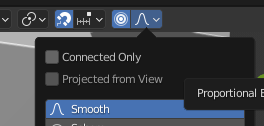
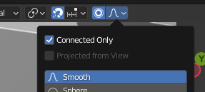
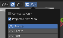
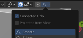
There is no half on button state in blender, but there is example of 4 state (on, on connected, on projected, off) button in edit mode made by using different icons:
1 Like
There are only 3 states, right?
- X-ray off, Select through off
- X-ray off, Select through on
- X-ray on > select through is on by definition
For mode 2, there could also be an icon change instead then. The button should not be highlighted in blue, since the button is still for X-ray on/off.
I can see when X-ray is on in the viewport. I can’t see when Select Through is on, neither from the header nor the viewport. I can only try to select something in the viewport to see if it’s on. I do occasionally toggle both X-ray and Select through, even in lcas build. And when I was in Sculpt mode for the last hour, I don’t know/ remember what mode it was on.
This visual confirmation for me is the only question that I would like to see solved. For the rest I am fine with the way it is really. So if everyone disagrees with me, then that’s a consensus too. Then no button change.
Yes, there are more than two states, but there are only two states which you care about. Whether you are selecting through, or whether you are selecting only visible faces. You will hardly be turning the xray on and off frequently. You will settle on one of the two workflows, since switching the selection method (face dots vs intersection) is usually inefficient and confusing.
I’d compare it to Autokey and keying set. When want to start animating, you set the keying set to whatever set of parameters you want to be keying, and then you turn on autokey. You want to see a visual indicator of whether autokey is on or off, to see whether moving your object will immediately result into keys being added, but you don’t need to see the button displaying which keying set is active, since you have explicitly set it yourself before you started for the exact reason that you expect the keying se to remain consistently the same, so you don’t have to constantly paranoidly keep checking it if it’s set to the right value.
I can see myself switching Xray facedots to perform some local operations.
Selecting faces in Xray by facedots is useful for editing layered structures because of precise access to inner mesh chunks.
Selecting faces in Xray by area is useful for massive through selections with defined contours.
Not sure how frequently though.
I posted a solution to exactly this right here, in my post above. Select through is what should have the visual icon indicator, xray should not. That would solve the exact problem you are describing, that you could not see the outcome of your selection before you try it. That was my point. You don’t really care whether you are using xray to select through, you care whether you are selecting through. So I proposed swapping the effect of the button, which in current vanilla blender toggles xray to become a button, which would toggle select through, and xray would be its sub-option.
That’s also what I meant with the button thingy. So we all agree.
We would hotkey these anyways.
Just for completion: how do people toggle X-ray from a button? Just use a hotkey instead, right?
Indeed, using only a hotkey is not very discoverable solution.
It assumes that you should know that Xray exists and is assigned to a hotkey when you just started to learn a program.
Also, in my opinion, switching Xray will be used more often than switching Select Through.
You may need to see transparent model more often than change your selection method, especially taking into account object mode where Select Through is not much functional, so highlighting should represent Xray.
Yeah that doesn’t help. You should have contributed to the discussion, blaming others for attempting is just disrespectful.
3 Likes
I disagree, I toggle Select Through more often. This is just a personal workflow thing, no need to discuss this
If Xray button will represent Select Through, what functionality this button should represent in object or sculpt mode then?
In modes where there’s no select through, there will only be X-ray. It really depends on the solution, whether it’ll be one or two buttons. A problem for later I’d say. Removing a button is easy, because that’s just leaving it as it is in Blender by default.
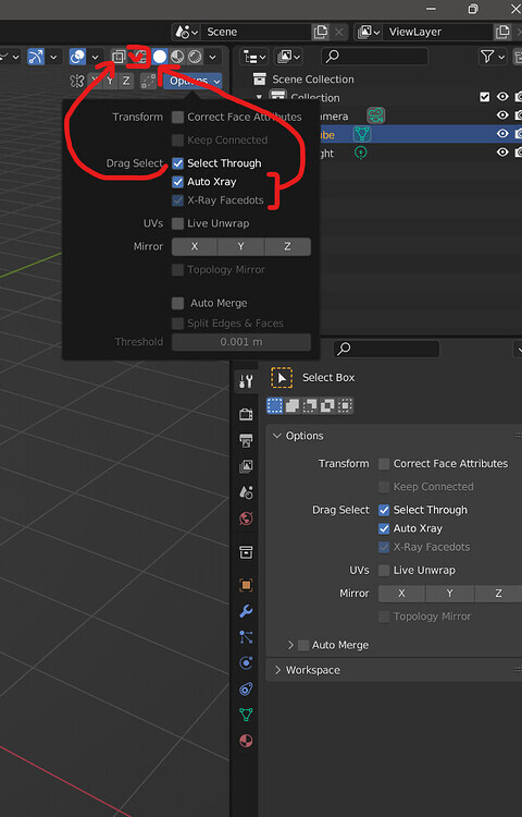
The default settings are a little weird. I have Xray Facedots enabled by default, and if you right click it in the toolsettings panel you can reset it to default. But if you already have a startup scene I have seen how it won’t have that setting on if it wasn’t there before. At least that’s what I am seeing right now as I double checked it. You can get the default startup scene if you rename your setting folder for 3.2 temporarily, should have Xray Facedots on.
As far as buttons in the header changing, that’s probably for the custom build only. I had an idea that I’ll do in a few days after release and updating to VS 2022 is sorted out.
I would like to clarify this - so the same button will represent different functionality in different modes?
In Edit mode it will represent Select Through and in Object / Sculpt modes it will represent Xray?
(I am talking about Ludvik proposal that assumes switching Xray button functionality from controlling Xray to controlling Select Through.)
I am not sure that UI team will agree to it since it is quite controversial solution in general.