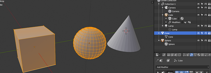
But only ObData will be highlighted like that. Besides, when You select couple of Mesh Objects and hit the Tab, all will enter Edit Mode. To exclude Mesh ObData from Edit mode, You have to unselect Object. Haven’t You?
Moreover, some of edit modes affect only Actove Object, which is clearly different from other data blocks (yellow colour).
It’s an important distinction, because it has to do with what mode you are in. If a certain object is in Edit Mode, you want to know which object it is. If 3 objects are in Edit Mode, those 3 have to stand out.
While in Edit Mode, you can still select, say, a lamp in the Outliner. That lamp will look selected. But it’s still not in Edit Mode. So it’s a different thing, and should not look the same.
Once more - all selected Objects enter Edit mode. At least now. You can’t select two Objects and enter Edit mode with ObData of only one of them! That even wouldn’t have sense.
No. Editing and selection are not the same. In Edit Mode you can still select things in the Outliner. You can select other objects there. But that does not put them in Edit Mode. It’s not the same thing.
It has to do with clearly communicating:
- Which mode am I in
- Which items are currently being edited in that mode
I tried - You’re not right. I made several Mesh Objects. I select just one of them end enter Edit Mode. The Mesh ObData gets a highlight. I can’t select any other Objects in a no way. I can only highlith rows of Outliner (lighter bar in my mockup). But can add other Object’s ObData to the Edit Mode session - all corresponding Objects become then selected-unactive and their ObData gets highlight. Can’t see a difference between selected and edited, since I can tweak Objects properties in Properties window. Ergo - all selected is editable.
How does Outliner indicate which mode is on, right now? I can’t see anything related with editon mode, with exception for higlighting the ObData.
Exactly. it’s not clear currently. It’s not clear which items you are editing, and it’s not clear which items you can add or remove from the edit session.
Could You make some mockups with different states? I’ll share my *.svg.
Hi there guys! I’ve just wanted to share some of my ideas in this long discussion that have passed from BA to here. Since jendrzych icons are in a good state only the color coding seems more a discussion subject.
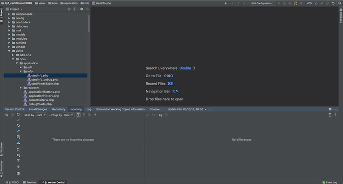
I’m just going to show you an exemple of what I think (focus on that :P) could be a good environment for blender color coding merging the all monochrome fans and the colors diehards.
In phpStorm (image below) the more used/important icons have colors or a mix and others are planely white since there is no reason in making that function or command pop. In the blender perspective this could be of help on having some functions more highlighted with colors when in some cases there is no need for that.
Even in the current “Outliner discussion” this could be of help in differentiating the objects of a selected collection and the other ones.
Just a perspective I haven’t seen approached and could help in some way.
I don’t get why it would be needed to also highlight the ObData when the object is selected honestly, what is the gain of that?
The object name highlighted in orange seems sufficent to me, but I might be missing something.
ObData is higlighted only when it’s under edition - in Edit mode (the only mode accesible for it, BTW). It has no other states. You cant select two ObDatas and enter Edit mode with only one of them.
I still don’t understant the need for differentiing states here. Outliner shows what can be edited and that’s it. I still can edit Object properties while Edit mode is active - it’s possible via Properties window, with no neet to enter back to Object Mode. All is needed is a selected data. Selected=editable. No difference for me. Outliner is quite overloaded with visual informations right now. Adding more states will bring more visual noise and will be extra confusing. Just as “hide” and hide in viewport" restriction icons are…
Have to see mockups of several different situations, depicting the problem that @billrey claims it exists. Or screenies at least.
I simply may miss something.
There is a difference. It has to do with modes. Because we have something called Edit Mode, Sculpt Mode etc, and a subsection of the items in your scene can be ‘in a mode’. Whatever is ‘in the mode’ - i.e. what you are editing, is something else than just something that is selected.
In all modes - with exception for Edit mode, since multiobject editing is here - affect only active Object. The golden-yellow, on my mockup.
Multi-edit mode will also be added to Sculpt Mode and probably other modes too. That’s why it’s relevant. You need to see which items are being edited in the mode, which may be different from which things are selected in the Outliner.
But, will I be able to select i.e. four objects and enter Sculpt mode with only two of them, while the rest fo those four objects will still be selected?
Yes, because while you are in Sculpt Mode, you can still select other things in the Outliner. You can also pull objects into the current mode session, which were not selected when you entered the mode.
No, I can’t - selecting other object while I’m in Sculpt mode turns me back to Object mode. This only makes sense, when selected objects are added to current Sculpt session, or switch Objects I’m sculpting. Nothing like that happens.
Man, what’s the purpose of selecting things, that I don’t work on at a moment?!
By the way - selecting thing in Outliner is a hell of mess. Nothing works, as expected. Some data is clicable, end enters edit mode, other does not…
You’re describing a situation like this one basically?
From what I understand from your previous posts, you would like to also have the ObData of the Cone highlighted, in a different way, but I can’t get why.
I’m getting a bit confused about this, to me it only makes sense to highlight the object data when the related object is in edit mode as it is now, then whatever one selects in the outline should be communicated highlighting the row, as it is now.
@a.monti Regarding second part of Your post - that’s exactly what my mockup depitcs.
Outliner should be straightforwadrd in use, without cumbersome confusing states. No one uses Outliner without 3D View, which clearly enoug communicates which mode is on the fly.
Why, I always wondered? When I click an object it turns to edit mode. But when I click on a material icon or a modifier icon, nothing happens. Can this be changed?
It would be nice if I (double) click on a material in the outliner, the menu below opens up right away. Same for the modifier icons. This would safe so much time searching and fiddling around. Same for lights, camera, etc


