So why then they resizes realtime so smooth?))
Videocards can easily scale down this kind of textures.
I think blender will calculate the rendering of bitmaps at the start only once
and then uses a sort of icon cache …
once the correct scaling is set, it does not need to be recalculated every time …
Generally there is no reason to use vector icons in UI.
For example, you have a line that is one pixel thick. Until you reach double scale (two pixel line), you will have a blurred line, whether it is a vector or a raster.
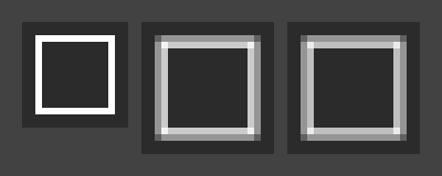
Original, vector, raster.
It’s also better to convert to raster in the program where the vector was created, as there can be minor differences in the results.
Vector lets the icons be scaled up or down without any pixelation.
Probably I’m not able to explain it to you, just try to scale the 16x16 pixels icon yourself and you will see that until the scale becomes exactly 2x (32x32), there will always be a blurring (antialiasing). No matter if it is a vector or a raster, there are simply not enough pixels.
In reality, scaling the UI more than 1.3x is unlikely you will need. And even if you need 32 pixels icons for the interface, you will have to draw other icons, more detailed versions.
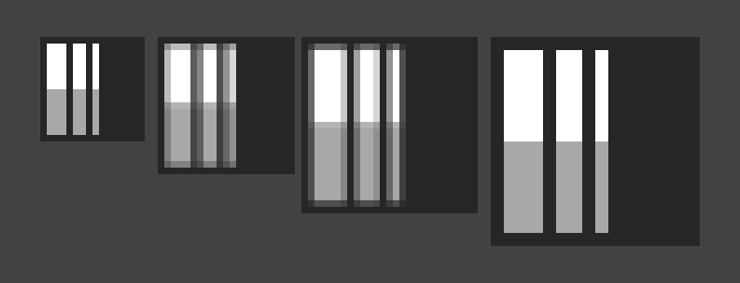
16x16 to 32x32 pixels
Actually I think the moment it was decided that we would have monochrome icons they should have been made as a font. We are already using a nice library (FreeType) that would scale, render, cache, and anti-alias them quite well. As an icon font file it would also have been easy for users to swap one for another.
Vector lets the icons be scaled up or down without any pixelation
Please, download Blender sources and find out icons first.
They were vector last time we built Blender.
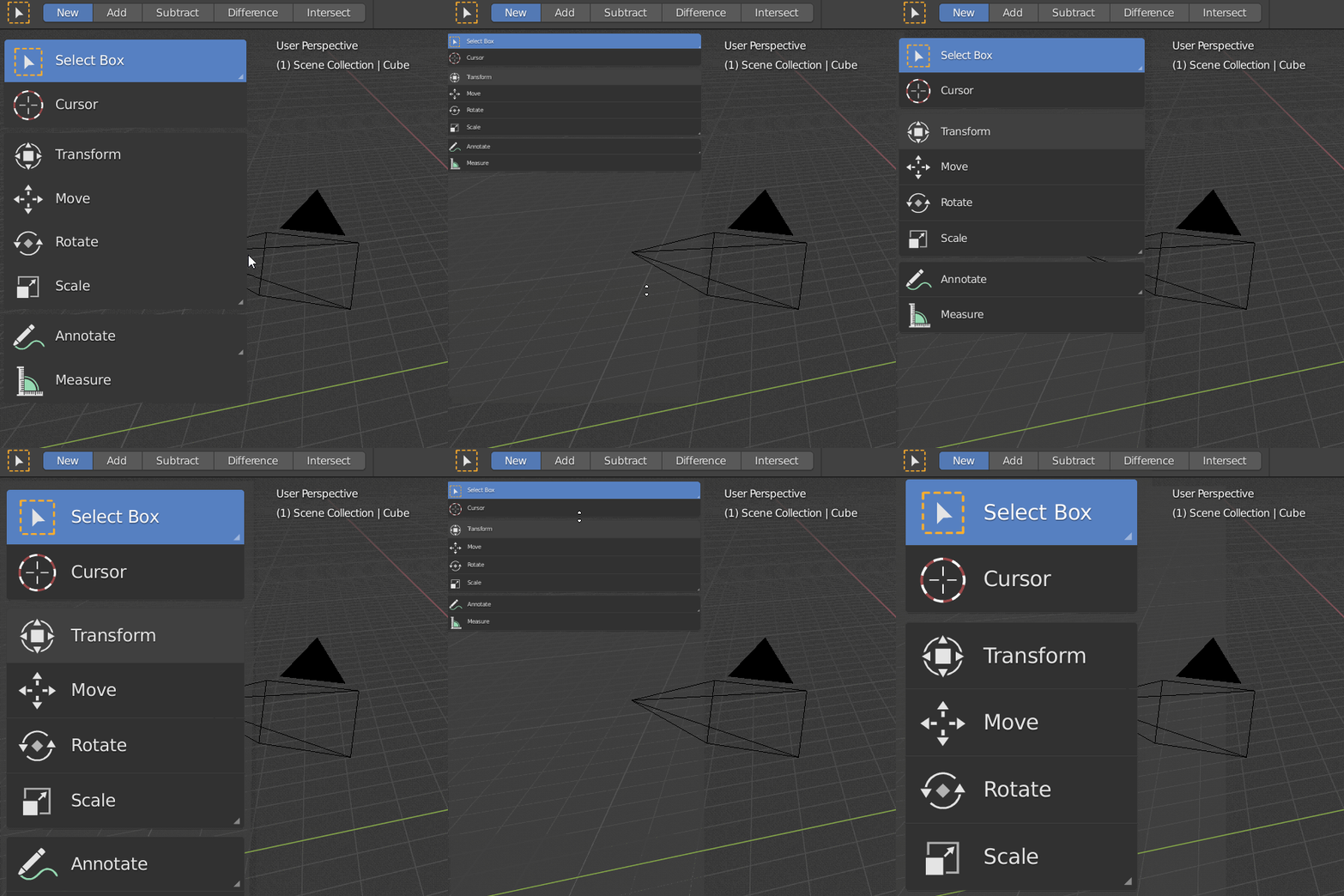
The others, the main set, are not and they also work with scaling. I gave it a look time ago and have an idea of how it works, even experimented with loading custom ones for the main set (not by replacing the data, but making the binary load PNGs).
Currently SVG have to be encoded to dat to make icons.
(billreynish) words:
https://developer.blender.org/T54662#498002
We are already making such system for FreeCAD.
I hired developer for making FreeCAD icon’s slicer.
Suddenly, we are making this slicer as Blender 2.79 addon,
mostly because it was easier for me to retrain python developer from Maya to Blender.
The SVG is rendered to PNG, then that is converted to C (one of the two kinds of .dat involved here). PNG is raster, vectors are “destroyed” in the rendering, which is what you don’t seem to grasp, pixels are being scaled because vectors are “lost”. You can ignore the SVG and create PNGs directly if you want, then convert those to C files, that is all Blender cares about, the C files (for the main set of icons).
Play with the UI scale control in Preferences and see how all the icons scale quickly.
System seems to be mixed.
So, it seems, Blender has got vector icons engine rescently (by Aslam Cader and jendrzych)?
Or everything in dat is raster?
Does that mean FreeCAD development goes ahead of time?
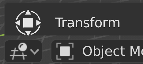
Yes, mixed, and it seems that in the .dat there are two styles (not talking about the C ones also named .dat), based in their file sizes. But only one of them is really used.
That image also shows something weird with the square center being fainter in Transform one (85% grey) and stronger in Object one (90%), so it makes one of the systems look even worse when maybe the issue is caused by something else (mixing with background? … which BTW is also different, 17% vs 19%).
For raster based icons always scale down, never up. Blender already does with 32 and 16 pixels, probably needs something bigger like 48 or 64. Same thing than mipmaps, start with best needed and use lower resolutions if smaller.
So, it seems, Blender has got vector icons engine recently?
Toolbar icons (blender installation folder …/datafiles/icons/*.dat), are binary files that contain the coordinates of the vertices of the polygons and the color of each vertex. You can play with this files in hex editor.
So it is more a 3D file than a vector file. There are no smooth Bezier curves and you can see it’s low poly if you zoom in.
Icon format and source file:
https://developer.blender.org/diffusion/B/browse/master/release/datafiles/blender_icons_geom.py
https://developer.blender.org/diffusion/BL/change/trunk/lib/resources/icon_geom.blend
UPD: This discussion can be moved to the About Blender Icons, since it’s off-topic.
That’s, actually, gorgeous 
Well, it means FreeCAD still has a way to go.
I wonder how many really read that spec, because there is at least one error. Hint: Pascal.
Also that the extension seems to be reused from previous thing is icky. No need of extra confusion.
Some problem - this icon does not give an association with visibility.
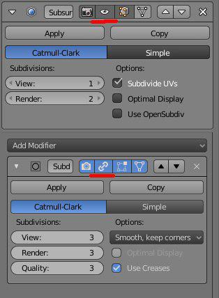
Also would like to see that kind of changes for first two icons, I can’t loose association with old tv and toaster for them.
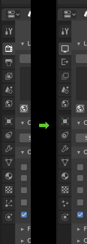
I made an account just to upvote this.
What happened to the color coding in the outliner? Everything is the same color now.
An example from gimp. When I want to merge down layers, my first thought is, that it is next to “delete layer”.
