Could You share, what route You’ve chosen? Or exactly what help You need now?
It may save all of us some time for other acivities 
It’s just like the screenshot I posted above, with the colors configurable as part of the theme. I’m not looking for help with this at the moment, it’s a simple change.
2 Likes
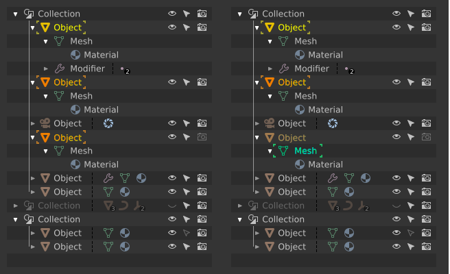
BTW it would make things clearer, if backdrop cirlces were more solid, then selection would be more prominent agains the rest of Outliner’s content. Moreover circles should be a tad (1~2 pixels) bigger, otherwise, the icons will overwrite the circles or even obscure them, denying the idea of backdrops.
Anyway I am waiting excited for the results of your work!
The only thing I see at a quick glance with that outliner is this:
I think something simpler like this might work better:
That’ why my very first mockup had uncoloured icons. I still don’t like colours for every icons. Will share my *.svg tomorrow to help you, guys, making tests and proper mockups. Now I’m in qite remote place, far from the computer.
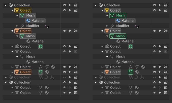
P.S. @zebus3d Your second sketch doesn’t exagerrate selected but not edited items at all. This is particularly evident in the case of data blocks in collapsed branches. Two states must be clearly visible and distinguishable at first glance against the rest of content: selected data vs data in edition.
I promised, I share: LINK.
All layouts depict the actual layout of Outliner. In mockups, please repeat the layout faithfully.
WARNING - I just spotted a bug! Camera ObData icon should be green, not blue.
Meanwhile another shot. As usual - Object mode on the left, Edit mode on the right:
7 Likes
I like it, the selection is more evident and above all it is not confused with icons, good work.
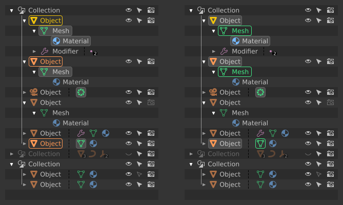
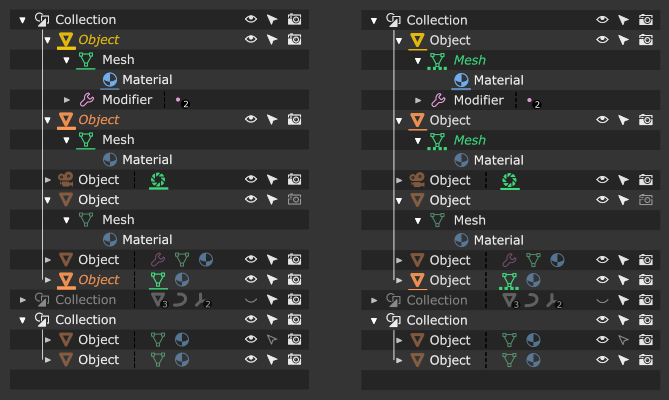
One more with filled selection backdrops - more standard look, but somehow aggresive at the same time.
3 Likes
Personally I prefer without filling, I think it is less striking, the Outliner should not attract much attention. And better represents the selection concept.
I had to. Just to make sure.
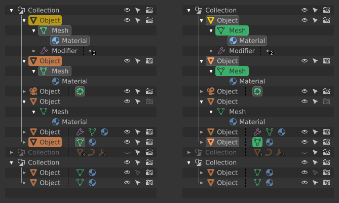
Id Still prefer a slighty cleaner version

Even more toned down:

1 Like
Last one for tonight. With seperation lines:
Thanks jendrzych for your huge amount of high quality work and to have shared the svg so we can play with it.
Here is a try of mockup of what i had in mind. I play with different values of underlines,dotted lines and italic font.
Thank you @jendrzych for the svg mockups! Based on that, I thought I would give it a crack as well:
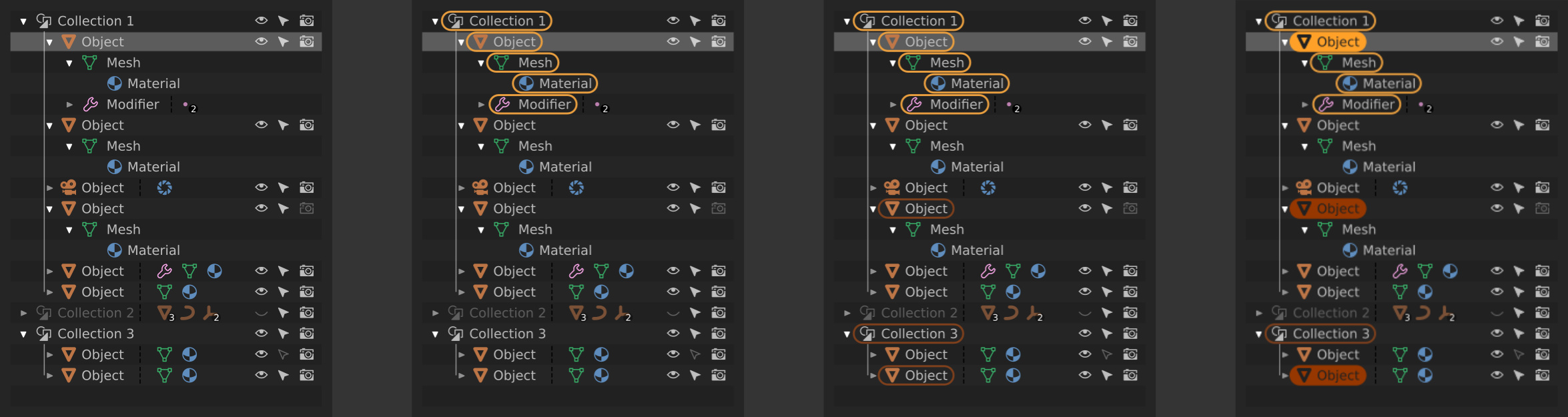
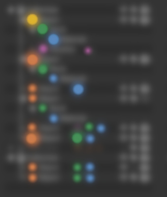
Left to right:
- Nothing selected in viewport, first row selected in outliner
- One object selected in viewport, first row selected in outliner
- yellow = active object/data blocks available in the properties panel
- Three objects selected in viewport, first row selected in outliner
- orange = selected objects that are not active
- Three objects selected and in edit mode in the viewport, first row selected in outliner
- solid yellow/orange = object is currently in edit mode
Modifying the currently edited objects via the outliner would look like this:

Left to right:
- Three objects selected and in edit mode in the viewport, sixth row selected in outliner
- A right click menu would have the option to “add selection as active,” or something to that effect
- Four objects selected and in edit mode in the viewport, sixth row selected in the outliner
- The previous active object remains in edit mode, but the border around its datablocks goes away since it is no longer the active object and its datablocks are not accessible via the properties panel
- The newly added object is now active and its sub-datablocks are denoted with yellow
These principles are held to for this design:
- The outliner always displays a one-to-one synced representation of the viewport state via “highlighting”
- Selection, edit mode, and datablocks that are currently accessible via the properties panel are taken into account
- Only object datablocks are highlighted for non-active, selected objects (rather than all sub-datablocks) to prevent clutter and provide a hint to the user as to what data is available via the gui
- Selection in the outliner is decoupled from selection in the viewport and is used to stage “targets” for potential actions (such as the example of adding to the current set of objects in edit mode)
Pros of having outliner selection decoupled from viewport selection:
- Allows for modifying the active selection without having to leave edit mode (thus updating the datablocks in the properties panel)
- Do not have to select objects in order to change their hierarchical configuration
Cons of having outliner selection decoupled from viewport selection:
- Not the “expected behavior”
- Can be slightly slower (have to select target in outliner, and then apply action)
- Perhaps clicking the icons directly could allow for more immediate actions?
I realize that changes like this are probably outside of the scope of what is going to be worked on currently, but I felt motivated to share since this is a personal painpoint for me with Blender’s UX.
guys, where the preference that changes the tonality of the new icons in the themes ???
p.s. @jendrzych congratulations, the icons seen in action are very beautiful
If by ‘tonality’ you mean the colors, the new icons now follow the text theme color of the UI widget it is in.
The icons in the Outliner uses colors set in Preferences > Theme > User Interface.
Where can we find the list and names of the new icons so we can update scripts? They look great, BTW! And very excited about Modifiers in Edit mode!
Hi, is there a way to change the brightness/color of the new icons without change the text next to it.
To make them more visible I needed to crank up the text color to full white but the icons are nowhere near to full white. I’m confuse.
Thanks.
I think it’s because inactive buttons have icons a bit dimmed.