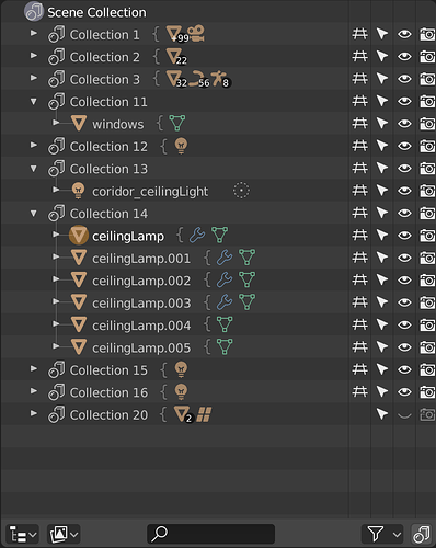
I find the vertical better and easier on the eyes. The mockups shows to much attention goes to the group or the curly brackets. Perhaps softer tone or color would be better. But why not drop the last one, 2 is taking more space than one. And use a single curly brackets also shows its a collection of something. You see this done in many design items. They use curly brackets to show a group or a gathering of objects or items. I think that will look great in a soft grey tint.
See quick adjustment
