Call for Content: Workspaces

@pablovazquez The Color Manager (Filmic, Exposure and Gamma, etc…) should not also appear in the n panel of the rendering layaout?

I can answer why it works this way. Workspaces are not just UI layouts (ie ‘Screens’) as we had in 2.7x, they are intended to make Blender’s UI task-oriented. Switching between the various Workspaces is meant for switching tasks.

For example, if you switch to the Sculpting Workspace, but don’t see your sculpting tools, the workspace isn’t doing much to help you. You haven’t really changed your task - in fact it will then always be slower than just switching into Sculpt mode, because what is now a one-step action would become a two step setup to first switch to the Sculpting Workspace and then switch modes.

That said, all this can be customized, so you can set up your own workspaces however you like.

2 Likes

Yes you are right. But Modeling and UVEditing Workspaces need to be in Object Mode, Always in Object mode.
For Modeling Workspace:

  • Modeling its not only Editing geometry.
  • It is also moving, scaling, rotating objects, matching and placing.
  • Additing objects
  • Using spaines, text etc.
  • Using modifiers
  • Using addons for generating meshes and objects
  • etc.
    This Workspace need to will bee naming like “Edit selected object Workspace”

For UVEditing Workspace:

  • Same like in my last comet. I need to be focused not only on my work, but on choosing the “right” geometry before switching on this workspace. Because if I accidentally will select height density geometry (10-50 mln polys mesh for retopo from Zbrush) or will select all scene, I will get crush or spend couple minutes for waiting.
    Yes, we can create our custom workspaces. But I think it’s good workspaces, only Edit mode ruin everything. I think 90% advance users will delete this 2 workspaces, and will create same workspaces but with object mod.
    sorry for my english
1 Like

The default Layout workspace is meant for manipulating objects. That’s why it’s set to the Object Properties so you can adjust the placement and orientation of your objects.

As for Edit Mode, we should make it easier to switch which object you are editing without having to exit and re-enter Edit Mode.

1 Like

It’s a good idea to create workspaces not only like windows ui presets, but also to orient it for tasks. But You hard pushing this idea, even in place where this not needed.
Starting with Edit mode for Modeling and UV Editing workspaces is superfluous, this can be a little confusing. Object mod for this workspaces will be more useful and isier for understending. imho.
sorry for my english

it’s not a bad idea, even if I’m used to editing one object at a time, that isolation gives me a sense of concentration on that object …

thinking about this, in the last few days, in conjunction with other things regarding the editing of objects in edit mode … I think that the whole way of managing editable objects should be redesigned: I thought in particular of this:
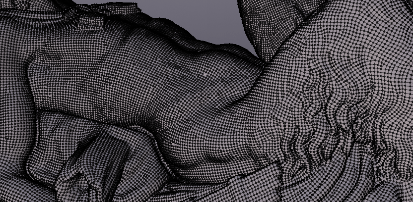
when entering edit mode, especially in objects with a high density of geomentry, blender recalculates the position of each single vertex, so if we select a nest of few vertices to move them, blender, when moving these vertices, calculate in the loop all the geometry and vertices contained in the whole object. this is bad, because it creates that famous lag that makes objects with a high density of geomentry practically non-modellable.
a simple solution to which I thought is this:
when moving the vertices, (during the execution of the function: movement or rotate or scale) blender must only calculate the vertices involved in the displacement, and must consider the rest of the geometry of the object as if it did not exist, and only at the "mouse release - execution confirmed " then it calculates the new position of all vertices of the object

I do not know how complex it is to insert this change but I think it is of priority importance … I really did some tests and the geometries are unmanageable, even hiding the vertices of the object that are not needed, the situation does not improve much … in some ways it’s even worse than how things work on blender 2.79

NB. The VSE zoom/navigation bar handle is in the area manipulation zone, and can’t be used:
ZoomBugVSE

2 Likes

Comparison of blender 2.79 vs 2.8 in a macbook pro 15, same workspace with same info and tools in the screen (I have expand N panel to show the addons that old T-shelf had).

Huge improvement [/irony]

zero interface design and user experience, basically an amalgam of buttons, letters and icons that don’t have enough space in the viewport.

@pablovazquez


I think this way of placing the areas would be more balanced and I think it is better with the new vertical tabs

5 Likes

this workspace makes more sense as a default and simple first workspace.

still makes me think of the need to evolve and make closer and more interconnected the relationship between the objects in the outliner, the property panels, the objects that can be selected in the 3D view and the “working modes”
the time to make this reorganization is mature.

Outliner on the left and properties on the right?
Sorry but this is the worst thing ever. Just imagine the mouse traveling. :v:

1 Like

not if you take the logic:
outliner: select the object
3d view: edit the object
travel on pannel edit parameters

a long outliner immediately becomes comfortable when you start having a lot of objects to process and so you do not have to spend time looking for them or sliding and widening and tightening the window and so on

1 Like

Which most of the time is not the case.
The general workflow is, you select something in the outliner and edit it in the properties below. Quick and fast.

When I have lots of objects my workspace turns into something like this:

which I think is most effective.

I can’t have them separate, just make things difficult for me, but ofc, people have different workflows. :v:

2 Likes

Normally you resort to selecting something in the Outliner only when you find it difficult to select it in 3d view.

1 Like

yes, this workspace does its job too
but I’m for a central 3Dview, I think it’s more comfortable to view, and also, I do not always want to have the outliner between the feet when I work between object and parameters :slight_smile:

1 Like

When switching to the compositor workspace, the backdrops seems to be turned on but not the use nodes. Shouldn’t this be turned on? (Who on earth would switch to compositor workspace and not use nodes?)

2 Likes

The Scripting layout seems totaly reversed for me.
I prefer this one.

8 Likes

I was searching for the relevancy of animation workspace and how to have the custom workspaces in the add workspace menu. And although i am glad that i have found those, but i didn’t expect these to find in this thread due to unrelated title.

@pablovazquez I think that, for the reason aforementioned, the name of title shall be changed to something like “Workspace basics and user showcases” or better, as this will indicate the availability of tit-bits of tips and also the call for content.

I just came here to propose the same layout as a “Scene management” workspace. It’s really handy for managing collections and the like.

Hi, @pablovazquez! Hi, everyone! I’m not sure if this thread still works as a place to suggest workspaces, but I would like to propose a new Workspace for Motion Graphics. It would look like this:

I made a proposal on “Right-Click Select” with some suggested changes and improvements to the VSE and the Outliner if you want to get a deeper look into my ideas: