OK, here’s a Godot theme I was working on and stopped. It could prolly use a little more tweaking ,but this is the general look.
godot_3_0_0_default.xml (52.4 KB)
OK, here’s a Godot theme I was working on and stopped. It could prolly use a little more tweaking ,but this is the general look.
godot_3_0_0_default.xml (52.4 KB)
That Godot theme is just amazing 

I call this one 28X Green because it’s not much different than the default 2.8 theme. Though I like it better. Because I like green.
EDIT: I edited the axis colors
I can’t upload because I’m a new user on this website, so here’s a dropbox link: Dropbox - File Deleted - Simplify your life
@k-pasta That’s a really cool idea for a theme! It’s such a good resemblance to XP!
Hey kame, really diggin this theme! Hope this will get into trunk!
Best regards!
This is nice, as someone who teaches both Blender and Maya, I think that many of my students would appreciate this theme to help them feel more at home. I would love to see you finish it. 
I like this one a lot, It’s got an odd rustic and leathery vibe to it.
It’s unique without being over the top.
I really really miss the Amaranth theme  the best color scheme I’ve seen for a 3d app.
Pro3_modified is great for long hour blending. Maybe showing in sliders the chosen amount in your active blue colour would even enhance how easy this theme is on the eyes.
Your blender_medium themes node-type headers with strong colour code is a great idea, this will make big node systems a lot more understandable fast. I would love to see this as a standard in all themes in 2.8
I use energy in Blender 2.79 and it truly is the best theme I’ve tried. It has really excellent contrast and I quite like orange as a highlight colour (the Blender logo is orange too  )
)
Nice work!
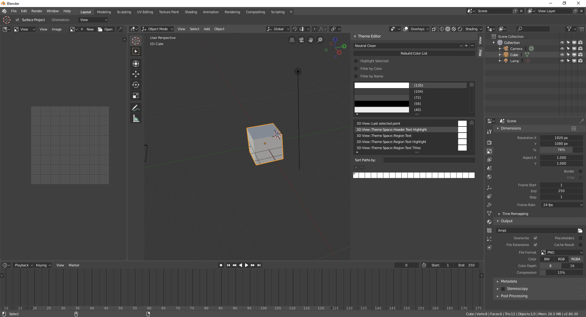
Hi,
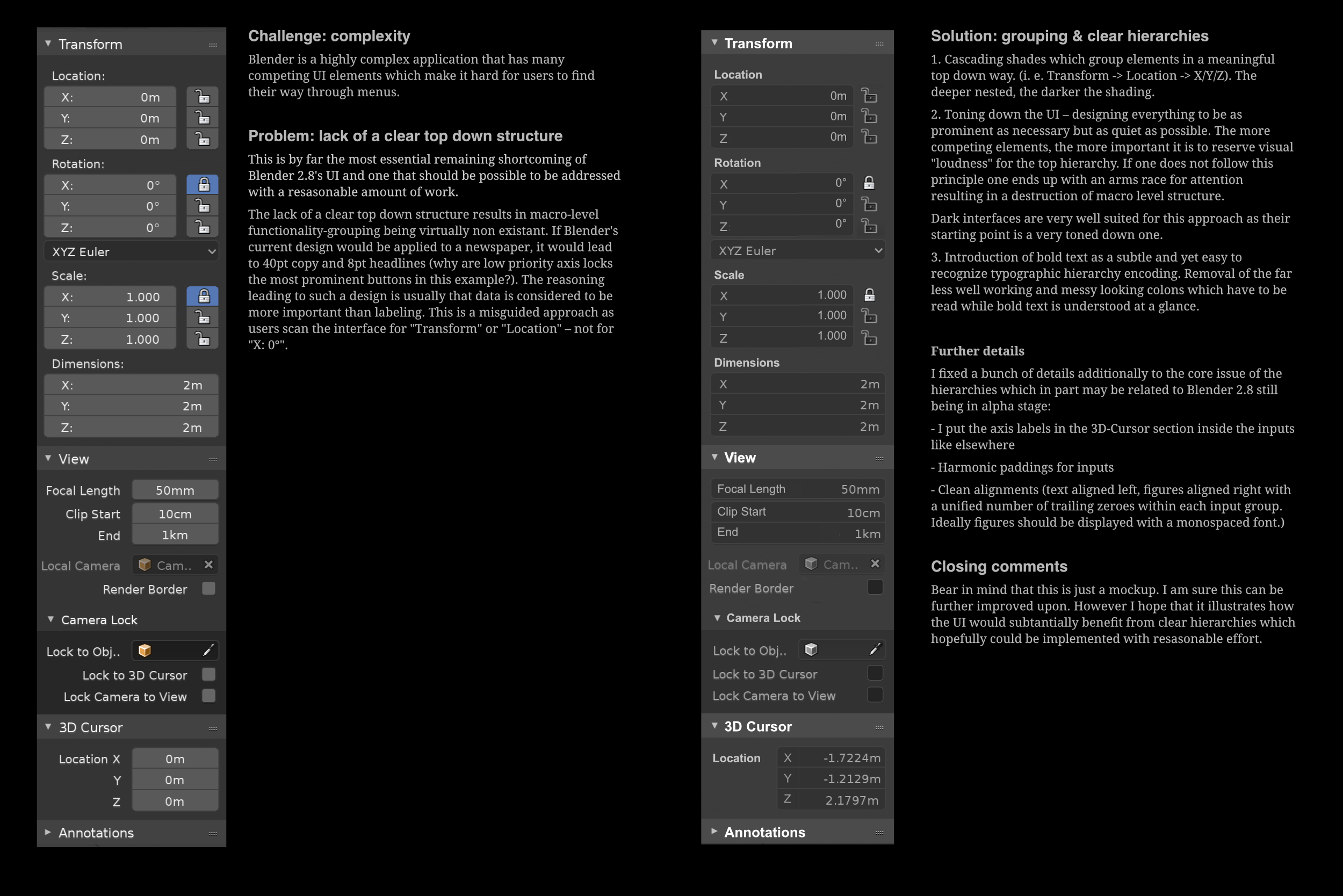
this theme is more of an improvement on the new default theme rather than a new one. The new default theme has two essential shortcomings in my opinion:
the visual hierarchies are going up and down randomly which makes it hard to navigate the interface (and from an aesthetical point of view make it look messy). I rose this point a while ago and created a mockup in which i explained the issue in greater depth: http://dropbox.kuen.info/blender28_menus_hierarchy_issues.jpg
(Sorry as a new user I am apparently not allowed to embed more than one image per post.)
Labels, buttons and inputs are not easily distinguishable in the all flat default theme. There are subtle gradients in mine: buttons bulge out a bit and inputs bulge in.
Sadly as a new user I was not allowed to attach the xml-file so I uploaded it here instead: http://dropbox.kuen.info/okapi-dark.xml
I love this theme mainly for its easiness on the eyes. Very good idea.
Thank you! Not much time for tweaking last month, but I will continue when I’ll have a procrastinating mood
Hey guys !
I recently released a Theme Editor addon. I guess most of you might find it useful:

It’s available on Gumroad and BlenderMarket.
I’m working on my own theme too.
I’m trying to build something clean, readable and low contrast, but still needs some work IMO.
Check the new posts if you want to test them out. I already spotted a few little things I need to change but nothing major.
Glad somebody likes it, LOL. After looking at the screenshots I posted, I see a few things that needs tweaked. I started with the 3D View and made other editors match. The sidebar/properties in the node editor matches the background to much.
Will you provide the theme itself too? The issue with the toolbar you can update later when we add theming for the toolbar icons
This is still a work in progress. Would like to have custom “selected” colours in the 3D view, but still keeping it familiar to current blender users.
Can’t upload my them directly as I’m a new user, so here is a google drive link. https://drive.google.com/open?id=1QEWeeQDddCE6tYJLgx20PoZOJawA8gcI
When making this I found that the “User Preferences” window would change when clicking on the layout tabs.
