then again it is supposed to fit in with the desktop theme you’ve got there so which it does wonderfully
Yea the coloured text might be a bit much. Maybe I will tone it down a tad to give it some saner defaults.
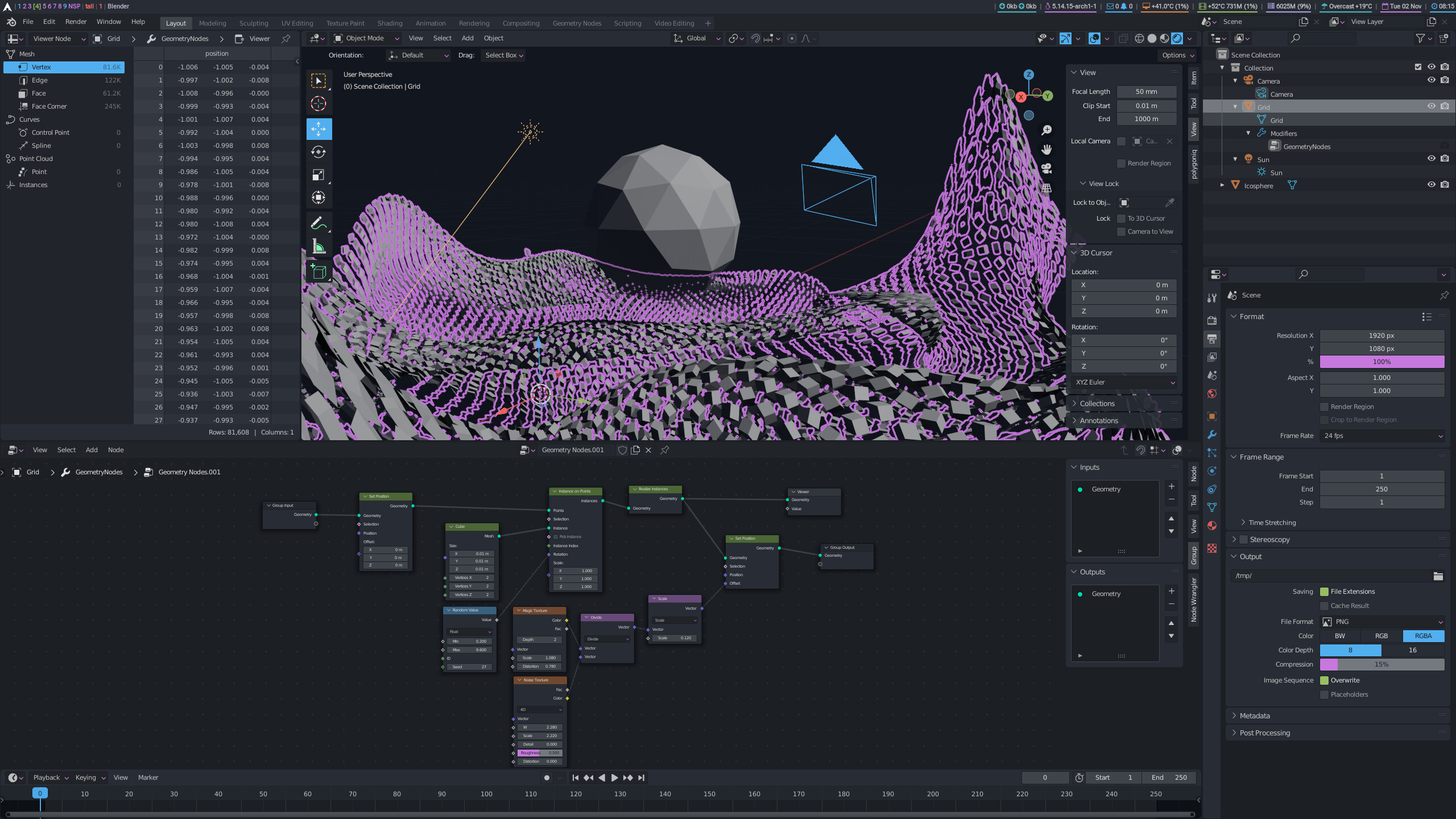
I’m pretty happy with what I’ve got now. What do you guys think? I tried to make things a little easier to read and just toned it down somewhat.
9 Likes
It looks pretty good! Do you intend to share it with us? I’ll definitely try it out. 
Hey-hey man, it looks slick and very linux, please share!
Ok this is what I’ve settled on. I’ve also uploaded it to Github for you to download. Please report any issues there.

8 Likes
This theme is really fun. I like it alot. Thank you very much!
Hi! I’ve updated for 3.0 a couple of themes that I had posted here in the past.
-
Blender 2.7x theme: Blender_27x-300.xml (45.1 KB)
-
Blender Medium: Blender_Medium.xml (45.1 KB)

9 Likes
Hi, here’s my Onyx theme ![]()
I never got to share it officially, since I’m always changing it and it’s not perfect… But here’s a github link which I’ll keep updated, so give it a try and let me know if there are any issues, stuff invisible etc.
It’s made for 3.1, looks wrong in 2.93.

13 Likes
Pretty Cool theme! Thank you for sharing!
1 Like
I’ve tried countless themes and this is by far the best one! I can only agree about being able to notice fast what you’re looking for using this theme. This is a problem with most of the themes.
Been using this theme for months now and its just the best! Thank you
I only wish there was other color combos, sending screenshots of my pink blender for my colleagues is a bit awkward…
1 Like

nice theme …i love it. however, its difficult making a selection. selected edges are hard to read
Updated Blender Light Cherry

Most noticeable changes are fixes to make nodes readable and closer to 2.93, use similar header tints as Blender Dark for consistency and also use of new panel style for properties:
Version 1.1 last updated for 3.0
Blender_Light_Cherry.xml (46.7 KB)
1 Like
Oh I see the problem. It should be fixed now.
If it’s still an issue please let me know. Thanks.
i like this grey-red color scheme! would be cool to see more red accents 
nice job!


9 Likes

I like the way it don’t burn eyes.
But properties section from medium theme is better recognisable than in 27-300
I would recommend to make properties background in 27-300 darker in the same way to get clear sections separators.
And I’ve also made a OneDark version, for anyone interested:
Minimalistic_OneDark.xml (46.7 KB)
EDIT:
Made also one with green accent color:

Minimalistic_OneDark_Green.xml (46.7 KB)
EDIT2:
Would anyone be interested in versions of the theme with other OneDark palette accent colors?

(Yellow, Blue, Violet, Cyan or Gray?)
14 Likes