Please create C4D R25 with matcap file.
Try. Now in the process, while I think it is convenient to combine colors.) Thank you for your attention and feedback.
2 slightly different versions, not decided which is more like the original R25. Both versions in the same folder.
DOWNLOAD : Blender Themes – Google Drive
3 Likes
2 Likes
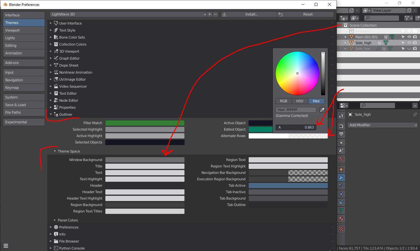
How do you get rid of the zebra outlines in the outliner?
Tyvm you don’t know how many times I passed that loll
LightWave_3D_2020.
DOWNLOAD : https://drive.google.com/drive/folders/1M_xLQRp8AqKzmOrJuPfTE4QeB1sjLvMd
2 Likes
Update to Alien Pink v 4.4
-Fixed Non Linear animation palette
-Fixed graph editor to be a bit darker
-Fixed Video Clip editor palette
-added VERY BRIGHT pink header and footer
(You can change it in Status Bar>Theme Space>Header and Top Bar > Theme Space > Header)
-And overall small color nitpicking and fixing
-Added Asset Browser support
-Added Spreadsheet support
-Changed video sequencer preview selection outline from orange to white
-And many other nitpicks and improvments! Ready for Blender 3.0 ![]()
Enjoy!
Alien_Pink_v4_4.xml (46.6 KB)
4 Likes
I smell toast… 
Seriously people. These are fun exercises for personal use, but have imho no place here.
The colors are messing up your ability to properly see/adjust colors while working.
There’s a reason most graphical UI’s are a shade of gray.
It’s obviously just a joke or meme  No need to point out why such theme wouldn’t work.
So post them on blenderartists
There’s a reason most graphical UI’s are a shade of gray.
there’s a reason why programmers use colors to identify syntax.
High vibrancy theme relies both on chromatic+value contrast rather than only value contrast
Pure value contrast is pretty painful on eyes during long work sessions, since you constantly need to focus your eyes in order to delimit the boundaries of information
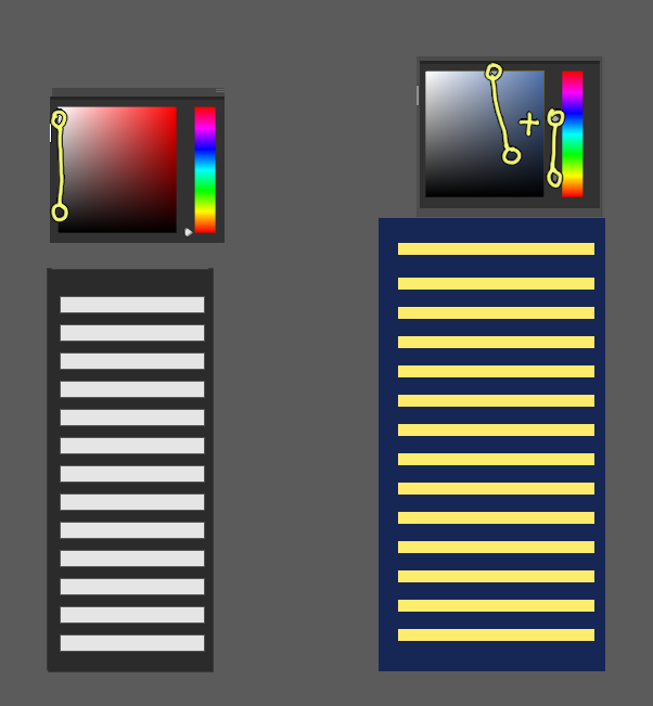
While color, you don’t need to focus your eyes to understand that something is pink, blue or green (unless the user is colorblind)
just look at the image below and see which one requires less effort to quickly notice toggle boxes, text, window limits, and all other relevant information
Plus, I easily spend >10 hours a day in blender, and i love colors, I’d choose crazy colorful over gray workspace any day
be a bit nicer to others, i’m sure some users enjoy colors ![]()
6 Likes
Hi. Please let me know if this is a theme you’re interested in and I will get it finished. I call it Atomic Doom. I made it to match my desktop theme.
15 Likes
Yes, please. What desktop theme is that?
Custom xmobar & xmonad theme, based on Doom Emacs theme, which is based on Atom One theme.
1 Like
I would say that there are much worse themes than this. I do see why this theme would apeal to some poeple, personally I wouldn’t use it but I like what you where going for. My main critique is that the colour for the border between editors is a bit to bight and makes it visually distracting but otherwise nice work!
1 Like
cool! I love the colours! I might even use this myself! Cant wait to see what becomes of this!
1 Like
I think I’m settling on these colours (keep changing my mind). Everything seems to be working ok. I’ll upload to it github in a few days then if anyone wants to try it they can report issues.
7 Likes
nice! I’m not to sure on the coloured text