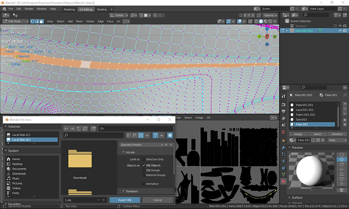
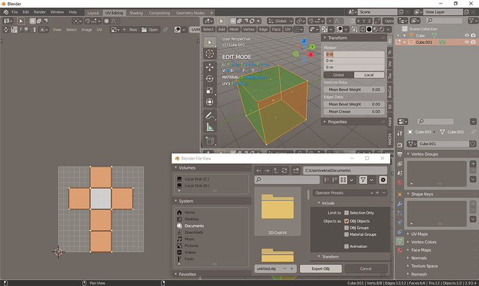
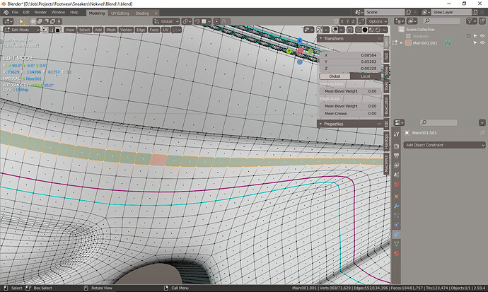
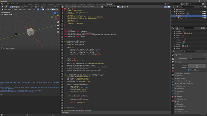
Is already uploaded if u check the replies: i can not sent you the link here check the replies i uploaded it on google drive
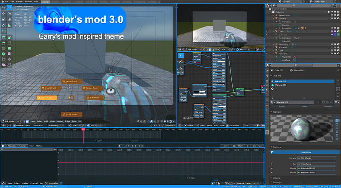
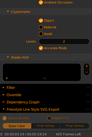
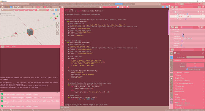
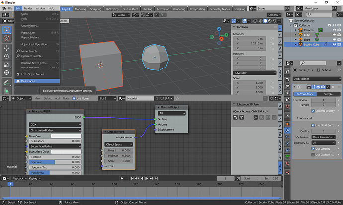
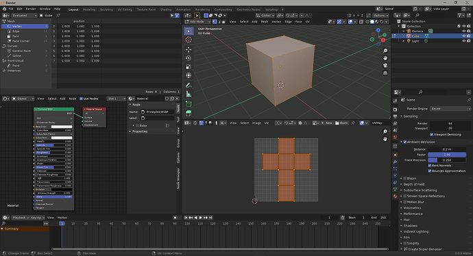
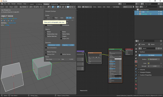
I made a fun theme for upcoming Blender 3.0 inspired on of my old favorite Sandbox game :3
feel free to try it out if you used to play the game back then!
Garry_s_mod_3_0.xml (45.9 KB)
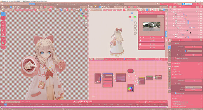
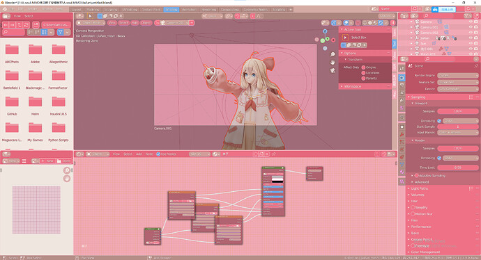
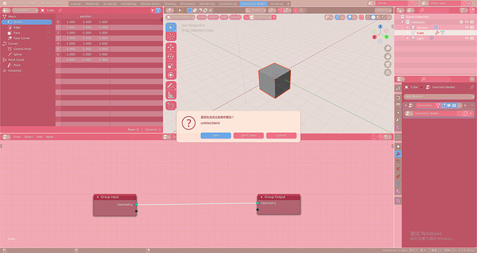
The theme ‘Print Friendly’ and ‘white’ are colorful but too bright for me, so I creat this ‘Diana’ theme, a smooth and pretty pinky theme:
Diana.xml (46.0 KB)
Preview
I have to ask, but are some of you colorblind in some way? 
It’s fun to see these wacky color schemes, but hardly usable in a day to day kind of thing 
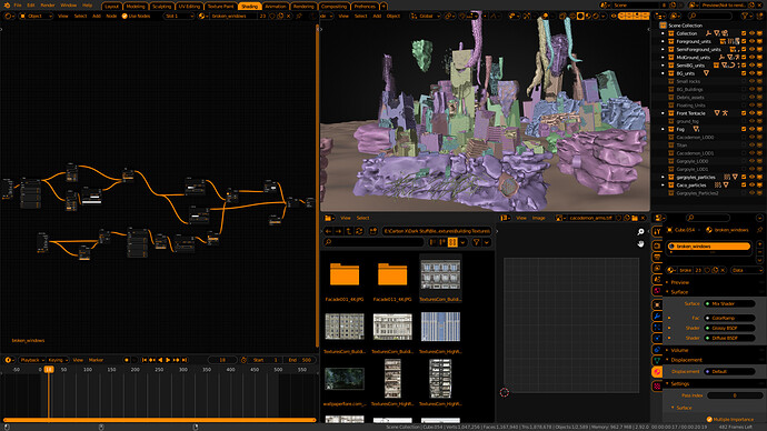
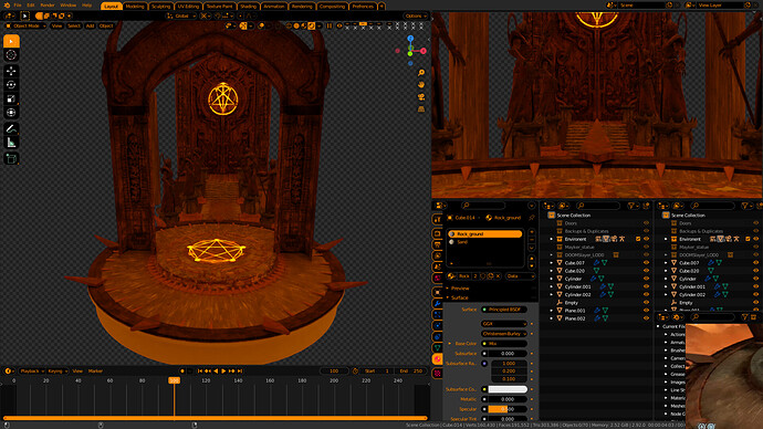
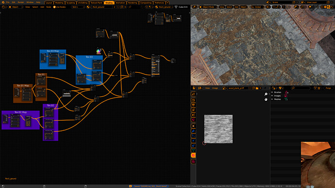
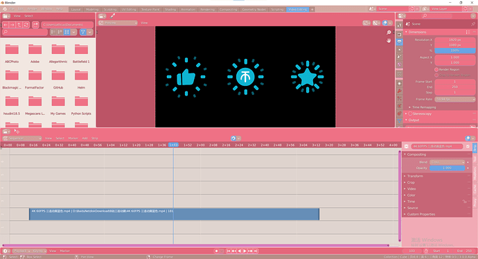
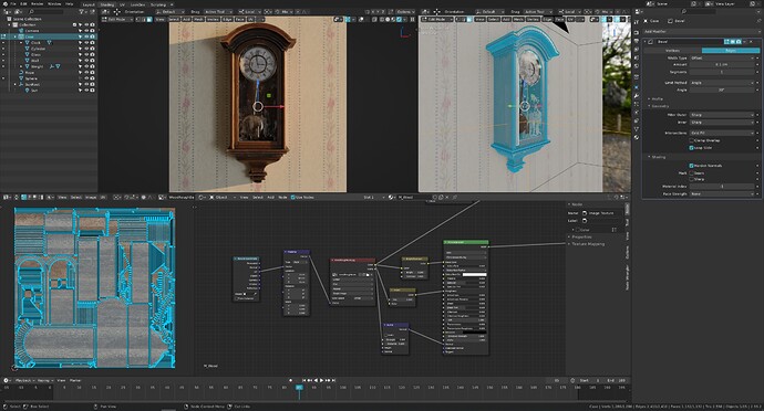
Hi. My several redesigned themes. I hope it will be convenient for those who have downloaded it.
DOWNLOAD :
https://drive.google.com/drive/folders/1Mz1MH_TbVowaNO0nEdSodo5ump4iJuJr?usp=sharing
Uploading: Grey_Orange_1.png…
https://drive.google.com/drive/folders/1Mz1MH_TbVowaNO0nEdSodo5ump4iJuJr?usp=sharing
Uploading: MODO_15v1_1.png…
https://drive.google.com/drive/folders/1Mz1MH_TbVowaNO0nEdSodo5ump4iJuJr?usp=sharing
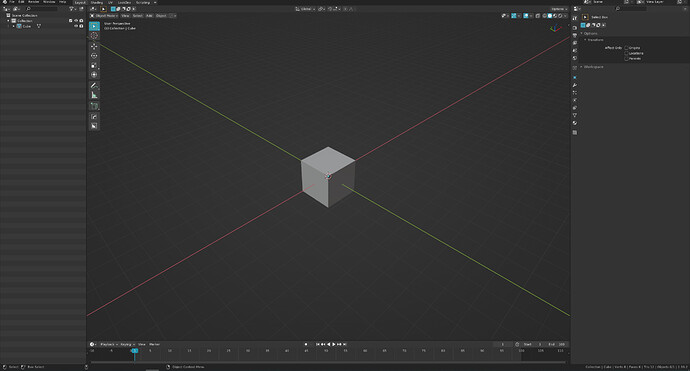
I’ve been progressively improving my Minimalistic Dark Blue theme as I used it on daily basis, and I am pretty happy with where it is now, so I am sharing updated version:
Darker_Blue.xml (45.7 KB)
nice! it kinda reminds me of the KDE breeze theme
Indeed, it is not a problem to design a good looking color scheme, but it is incredibly hard to design a scheme for an extensive daily work, not dim, not distracting, unform for day and night, succesfully withstand any viewport overload, supportive for different monitors contasts etc.
Too many subtleties to be taken into account to design a professional approach.
The same is fair for scene shading or matcaps which was randomly generated by community in a very short time, randomly selected by devs, and none of them was actually tested in practice, so we got a bunch of trash with heavy usability issues.
The problem is that a balanced professional versatile approach may look quite boring, so it has a marketing issue.
Thats why it is impossible to reach it, for example, during artistic contests.
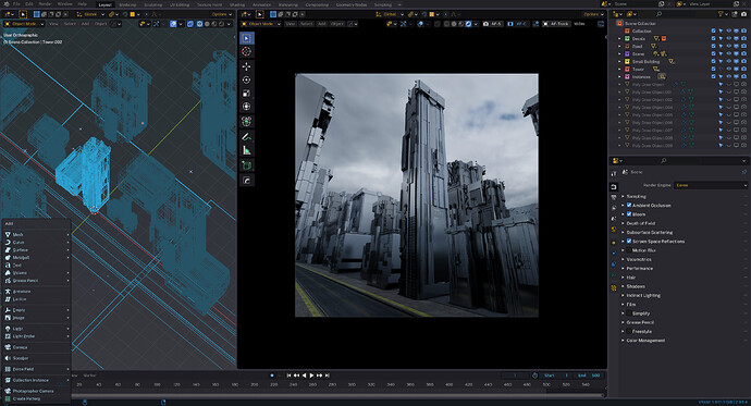
An update for my Fusion theme.
I keep tweaking it, trying to get the best balance in terms of tones/values.
This time, I’ve been able to attach it here:
phoenixart_fusion.xml (45.7 KB)
I really really like this one! 


Glad you like it, @BossTony !
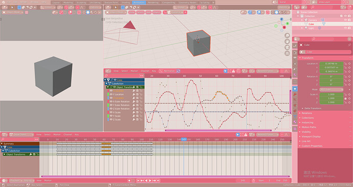
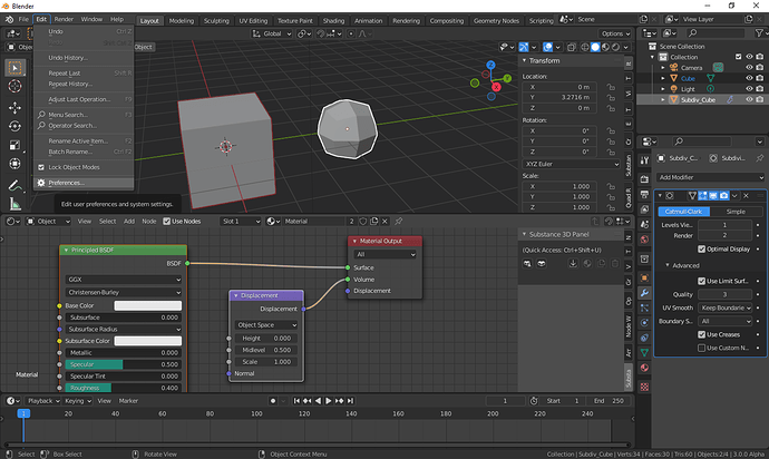
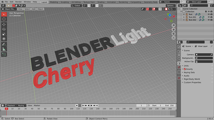
Blender Light Cherry
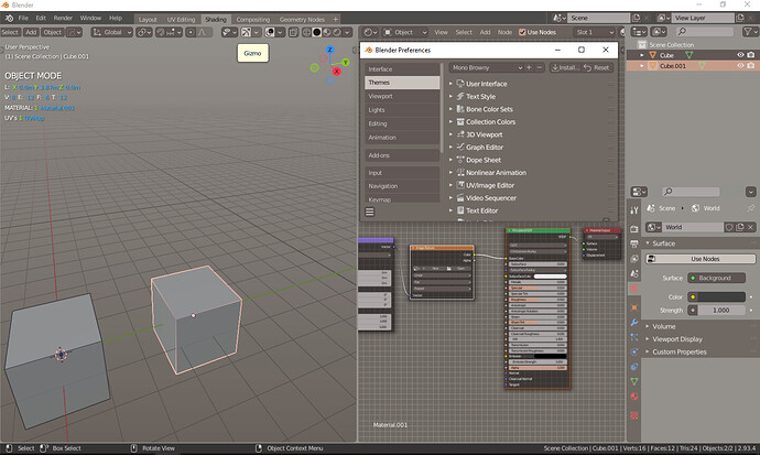
Modification of Blender Light inspired by older Red Platinum theme but more conservative in changes and easier to update. I made it because there are a lot of dark themes but very few light \ gray ones.
Features:
- white wires (personal preference, there are no bundled themes with white wires)
- less contrast in inactive areas (tendency toward 0.5-0.6 gray)
- more contrast in active areas (red highlights instead of blue)
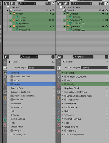
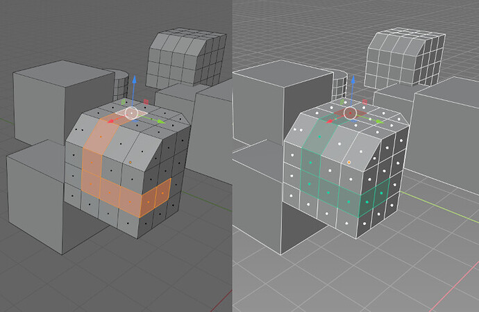
- more internal consistency (outliner selection colors match 3d viewport, green edit mode geometry data like in T74358, properties search and outliner filter use same color and more)
- more polish to areas that feel unfinished in blender light (scripting editors for example)
Version 1.0 last updated for 2.93.4
Blender_Light_Cherry.xml (45.7 KB)
