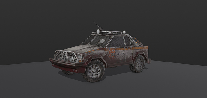
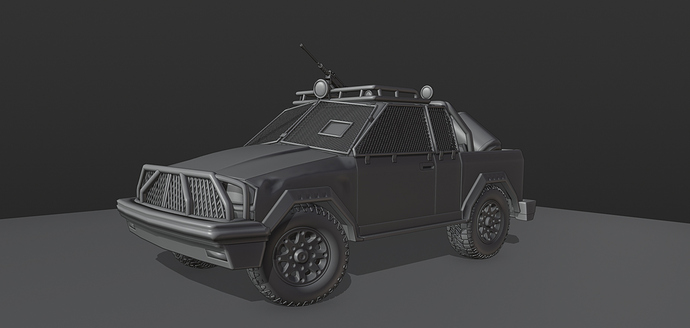
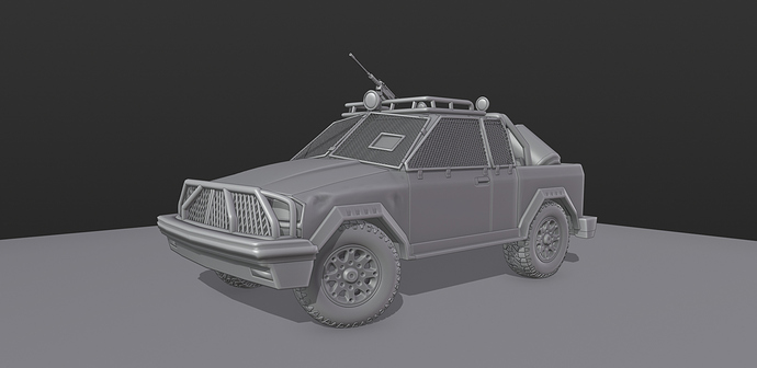
something from an overcast rainy maybe even stormy day might be nice if you’re trying to cover some typical lighting conditions.
these seem to have fairly strong light sources that you don’t see a lot of on rainy days.
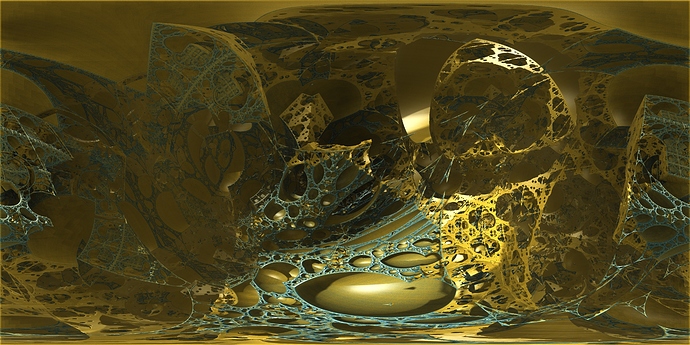
Hey Guys, I took a good amount however they are more on the outlandish side. I’m not sure if they are too niche to be set as default but I also thought they were too unique to not share.
To me it gives an interesting steampunk fantasy feel however, others may just think its ugly though lol.
An Interior exterior, a cave on the beach that gives pretty dynamic lighting.
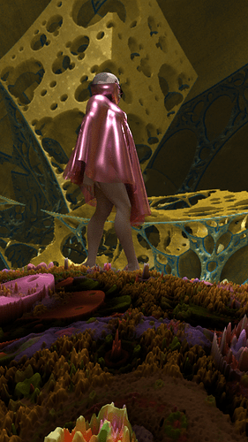
Inside a fractal, as strange as it gets but reminds me of the quantum environments in the Ant Man movies (only more opensource). So yeah if these interest anyone I can post more or do touch-ups and export them as exr. but to be completely honest it’s hard for me to imagine these having a purpose with the general user.
Although I do agree with Rainer. But would love to see any type of zebra that works good.
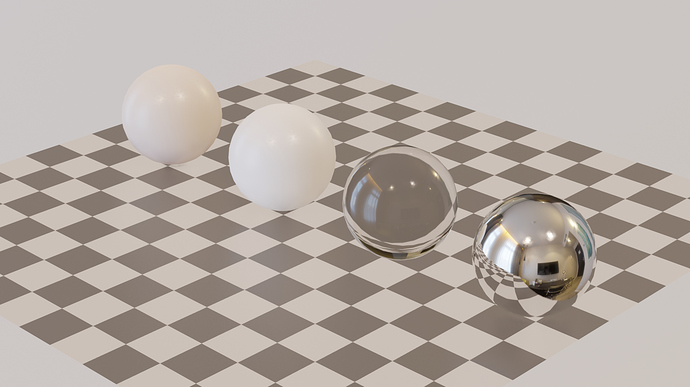
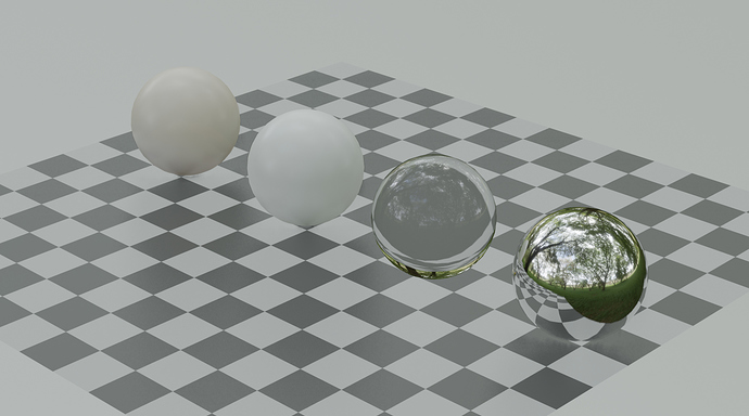
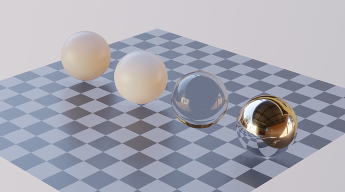
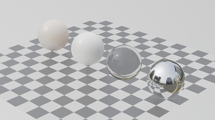
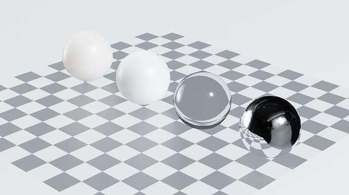
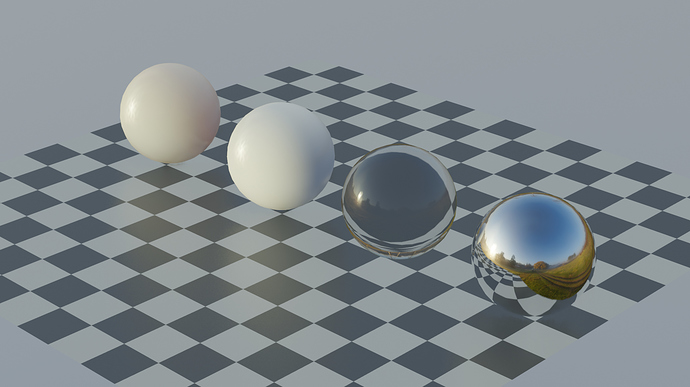
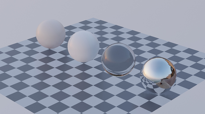
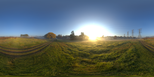
OK, so I’ve gone ahead and compiled a list of 10 HDRI’s from HDRI Haven. I’ve attempted to collect ones that are as different as possible.
Update Sep 26: Now there are only 10 HDRIs for inclusion
Here’s the list so far:
Hotel Room:
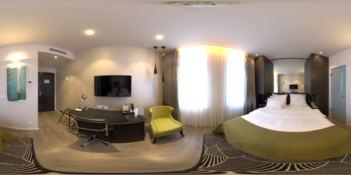
Shady Patch:
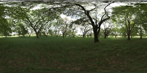
Courtyard:
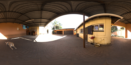
Portland Landing:
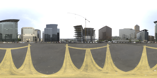
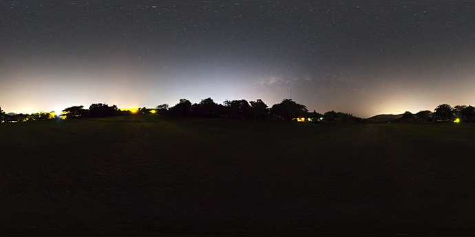
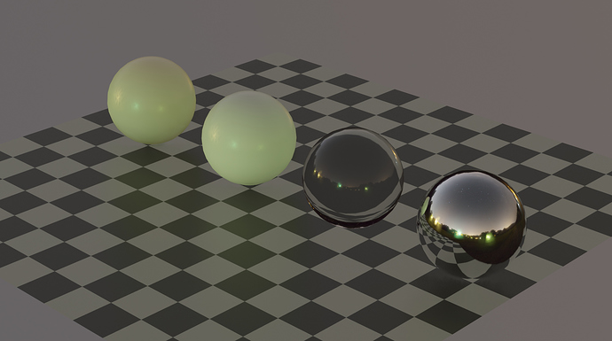
Moonless Golf:
Studio Small 03:
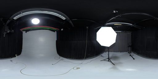
Spruit Sunrise
Venice Sunset
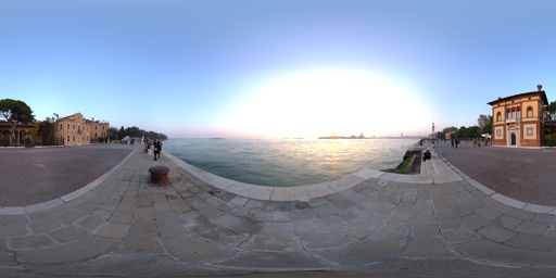
They look good!
The last two ones, apart one being more bluish than the other, to me they seem to give similar results though, maybe we could drop one of those and add another night one?
I would personally like this one Moonless Golf HDRI • Poly Haven , it’s a bit more neutral than the other one.
(Moonless Golf on the left, Satara Night on the right)
Yes I can see your point that Moonless Golf is more ‘nighty’. Maybe you are right that that one is a better pick for a night HDRI. I updated the list and replaced it.
Ah, I probably should have written it better, I don’t really consider it a better pick by itself, though I think that it gives different enough results from the other to make it worth it to also include it on the list, so to have two different night cases. 
That’s why I also proposed the removal of one the last two sunsets, that are more similar to each other, to make space for it.
I took a different approach to a few folks and went for a synthetic lighting setup that provides a clear look at geometry of curved objects. It is basically a 5% wide stripe at an exposure of 5.0 units brightness on a solid black background. There is a vertical and a horizontal stripe. This really helps to see how an object would be shown in a ring-light type setup where it is surrounded by a narrow strip light.
You can grab the EXR files here: https://1drv.ms/f/s!AOEtc9_MKTSigRY
Could you please link to the correct one? And examples if you have them. If we clearly pick the wrong one then replacing it is no problem, we all want 2.8 to ship with the best we can. Thanks!
Hi Pablo,
The link to a more precise / correct one is here: Call for Content: MatCaps - #143 by RainerTrummer
The OpenEXR files are linked at the bottom of that post as well.
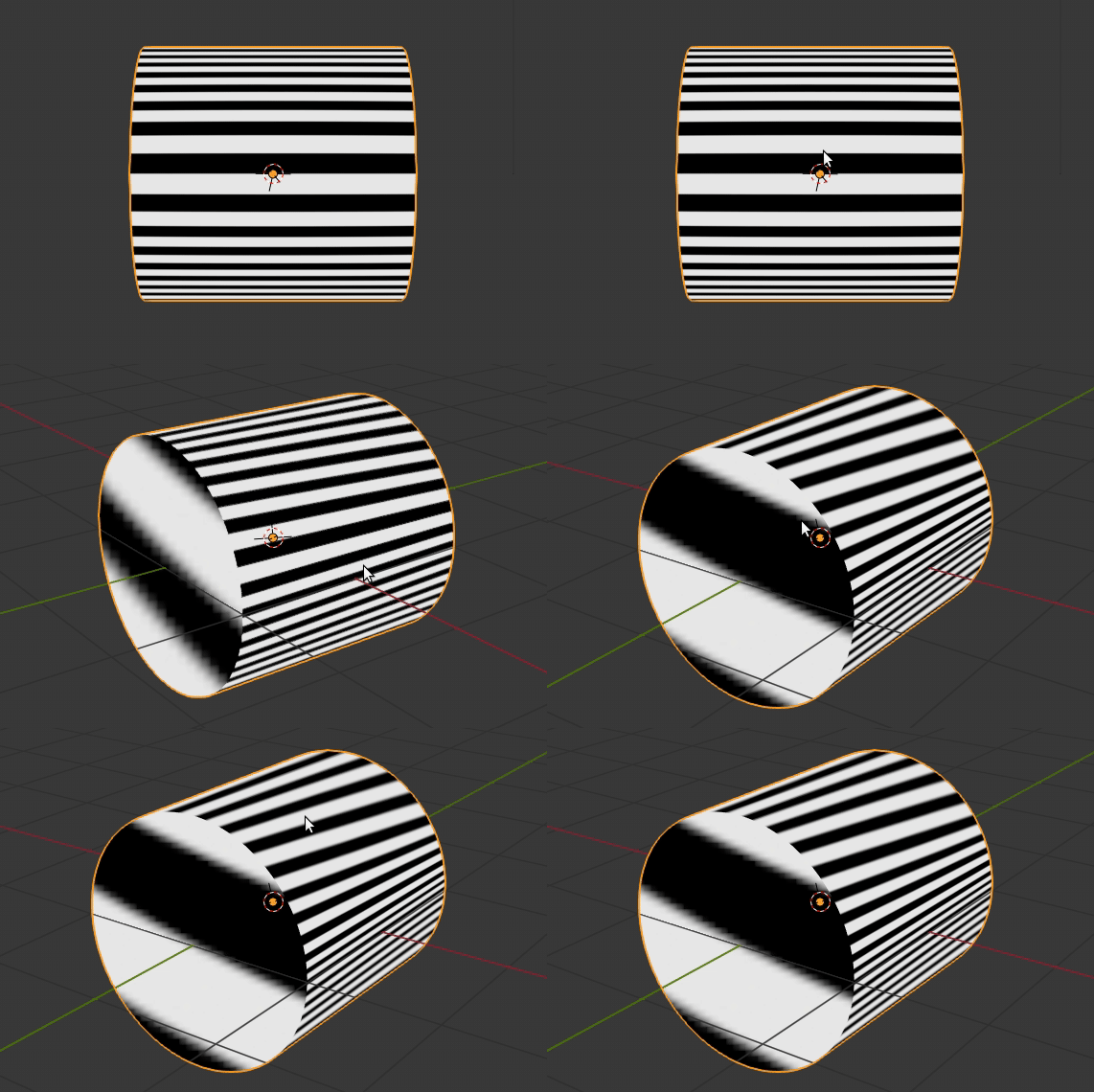
To demonstrate the issue, see the comparison below. First, the one shipped with Blender. I have created a simple cylinder, oriented along the Y axis, shading is set to smooth, and the Edge Split modifier is on the mesh, followed by a SubSurf. That means, the cylinder side wall surface is accurate. When shading it using the shipped MatCap, and rotating the view to the side, you can see the Zebra lines first of all fail to be parallel (they all of a sudden pinch towards a vanishing point). Secondly, they also change their width, which must not happen. When doing more precise design modelling, you spend a lot of attention to these width changes. The width tells the modeller a lot about the curvature on a surface, so having it change just because you look at it sideways is misleading:
My go on a Zebra MatCap handles this quite ok:
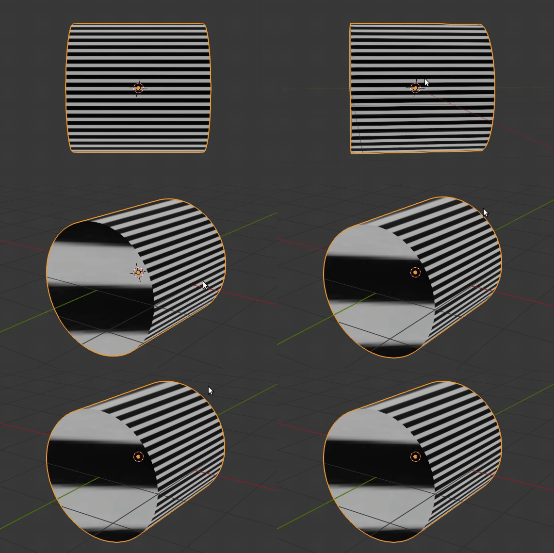
There might still be rome for improvement. Maybe I can find a way around the noticeable width change on the top of the cylinder, maybe this cannot be fixed because of how MatCaps work. Needs further investigation. Keypoint is, these two MatCaps (Both the horizontal as well as the vertical one are needed!!!) were rendered in Cycles, so it’s easy to improve / fix them in case more adaptions are needed. I can share the Blender 2.79 scene with you if you like.
Another thing I deliberately chose was to not go towards full white stripes. It’s a bit hard on the eye if you do, and not really mandatory for interpreting what goes on in your model.
I do appreciate the effort the OP has put into his version of Zebra shading. But it is important to note that there is a convention on how to read the shading, which has to be followed, otherwise the MatCap is useless.
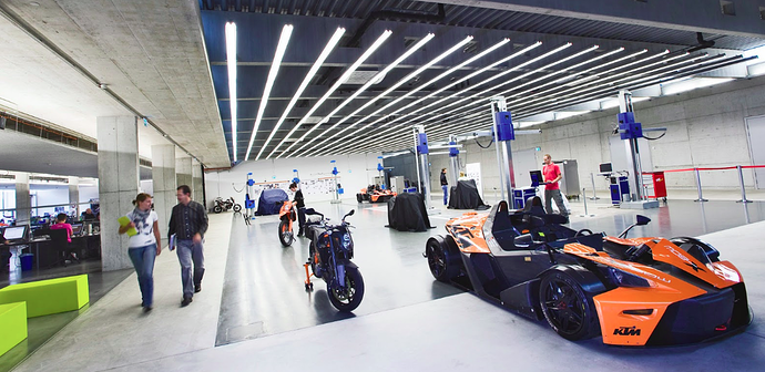
It’s also worth noting that there is a real world representation of this. When clay modellers do their job in the Automotive Industry, they use large neon lights mounted on the ceiling to cast linear reflections onto their models. See this image from our own studio here:
You can see that the bright lanes of light on the top cast a strangely familiar reflection onto the car in the foreground. In my Cycles scene I used a similar setup, I just replaced the flat ceiling plane with a cylindrical tunnel encompassing the rendered sphere.
Thanks a lot for the detailed explanation! Yours is clearly better. We’ll swap them soon!
soon-ish I guess? 
It seems that I totally missed that.
I believe that the reason the current matcap isn’t working is this issue being “fixed.” Also, if your matcap is swapped in, I would prefer it to be solid BW since the user can manually adjust the brightness of matcaps (default multiplier is RGB 0.8,0.8,0.8) and it appears their colors are put through filmic now which means 1.0 will not display solid white.
Finally, I created one more version and posted it back on the matcap thread here. It is as perfect as I could manage. I found that straight lines work flawlessly as any curve will distort cylindrical reflections (No AA needed!). Please try it out and tell me what you think.
Thanks for your efforts to make the diagnostic Zebra work better. The one you provided already works really well. I don’t care if Blender ships with yours or mine, it should ship with one that simply works and does what users with experience in the Automotive industry expect it to do. If it is white or not is rather a matter of personal taste, you can choose as you feel fit.
The trick of using only horizontal lines gets rid of a lot of the artifacts indeed. Blender seems to do the rest by interpolating the reflection. Well done! If you could add a vertical line version as well, the set would be complete. It is needed to check objects which stretch a lot in the vertical direction (for example a vase). Also with cars we tend to check both, as surface errors can sometimes only be seen in a specific direction.
Last thing I wonder is if you could test a version that has a zebra thickness falloff in it. See the following two screenshots:
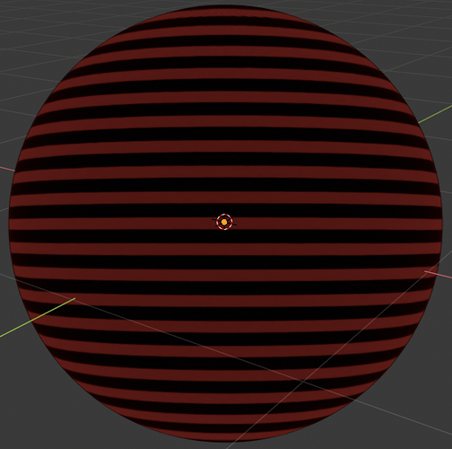
Using my Matcap, line thickness gradually thins out towards top and bottom of the sphere:
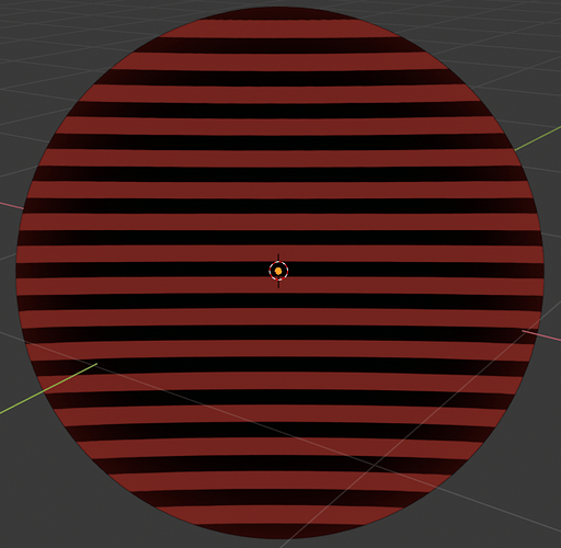
Using your Matcap, there is a thickening happening instead:
The reason why I point this out is, the Zebra is supposed to be a reflection of something very wide, stretched along the horizon. The reflecting object has constant height in reality, hence its reflected image on the sphere (each stripe that is) should thin out as in the first image. Maybe you can just extract the thicknesses from the Matcap I already provided?
Hey, so I got a little spare time and made another one. Thanks for more good tips! I edited the widths and it turns out whether I use object or reflection coordinates the distribution of lines is the same (just twice as many lines with reflection). Also, I added the vertical version. If there is anything else that could be improved, don’t hesitate to mention it!
Totally! If you want to upload another or improve upon mine, go right ahead! ![]()
I have created a patch at https://developer.blender.org/D4816 to poke the Devs about integrating these matcaps into Blender. The patch deletes the old version of the Zebra MatCap, and adds these two new ones. Let’s see if that helps to get them integrated.
…aaaand they are in master, Brecht committet them a minute ago 
I realize “Studio Lights” have a different meaning now then they did when this thread was started, but I’d like to submit my custom studio light that’s much softer than any of the current defaults.
It also has a back light, so when you set it to world instead of view it doesn’t way overly darken one side.
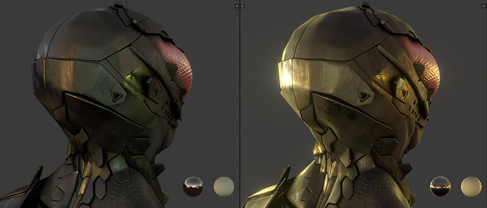
Current default:
My default:
It’s also much better for viewing textures since it gets much closer to the real values.
Current default (view and world):
My default (view and world):
It works decently as the default for when all fancy effects are disabled, but looks particularly better when they are enabled. A bit more like a sketchbook.
Current default:
My default:
It’s not better in every situation, but it does the trick in the situations where none of the current ones work well.
Download:
https://www.dropbox.com/s/sd0qx52q6tk00mn/UltraSoft.sl?dl=0
