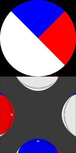
Not sure if this the right place but I would like to point out a problem with the matcap rendering.
In the bottom of the image four spheres are shown which are shaded with the matcap in the top portion of the image. The matcap is a “perfect” circle on a black background. As you can see the background bleeds into the image at the borders. This is kind of expected an can easily counteracted by making the sphere slightly larger. However the matcap also seems to wrap around and for example take colors from the left side of the image on the right side on the sphere. This cannot be fixed by making the sphere larger. Also it is common for matcaps to be light on one side and dark on the other. This causes artifacts when viewing something not centered on screen while a perspective camera is used.
Both these problems could be fixed by shrinking the radius of the circle the matcap actually uses by one pixel.
