The icons should add context that isn’t visible from just looking at the thumbnail alone. They should explain a vital but hidden function via their shape and color.
The add/subtract brushes like “Draw” and all the others do not have an icon because they are perfectly understandable on their own. Same for the Grease Pencil Draw brushes and simple Paint brushes.
The exception for this would be “Anchored” brushes for example, which need to communicate this behavior via an icon.
The icons are also generally in the top right corner. But some that use arrows and lines should then at least keep them away from the left and lower parts of the thumbnail.
I don’t mind if the icons are sometimes placed a bit inconsistently in the case of arrows, since it also helps make those thumbnails more recognisable.
I agree, I feel they add clutter and inconsistency. I don’t think they’re necessary, the spheres communicate the brush effect very clearly.
Addendum : it’s not just that they’re unnecessary, I feel they actively detract from the effect. When I look at those, I see this little icon in the top right, and the meaning that I get is that “there’s something special about those brushes”. But turns out no, the icon is just there because without it the brush effect wouldn’t be totally clear. I think these should either be everywhere or nowhere at all.
Not the feedback on the thumbnails, but looking at mockups of asset shelf I know UX issues that I will have. Since I’ll have at least double of what brushes/tools we have now (and you mentioned more brushes will be shipped than we have now). And they can’t be fit into single line, or even two, we’re gonna need some way to quickly access the list/grid of brushes to select.
There needs to be a shortcut that gives you list/grid of all brushes that you have, similar to B in Zbrush, or currently Shift+Spacebar in Blender, but for brushes instead of tools.
I use shift+spacebar a lot, and I worry about losing ability to select brushes like that, especially with tablet when reaching shortcuts is harder. Same thing for brushes, but grid view instead of list (so that it can display much more) would be perfect.
I can also agree that the icons become a bit redundant when some have them and others don’t. Either have icons for most if not all brushes or leave the thumbnails alone. The silhouettes are practically all readable without them.
A shortcut is definitely needed, yes!
There’s a shortcut currently with the experimental pie menu on N. It’s available in the keymap preferences if “Developer Extras” are enabled.
This pie menu let’s you quickly toggle the header, sidebar, toolbar and asset shelf with quick directional gestures.
But assigning a shortcut to Shift Spacebar also sounds nice and anyone can assign it for now by right clicking on ‘Header → View → Asset Shelf’.
There’s also the idea of a popup version of the asset shelf. But this is not a priority atm. There’s still lots of things to do to properly support the docked asset shelf at the bottom.
About the corner icons:
They do fulfill a specific purpose (provide info on the type and settings). So just removing them isn’t an option. I also don’t have any alternative suggestions outside of what already has been explored
Without that extra info some thumbnails would be very vague on how they behave and what they do.
Like Nudge, Boundary, Elastic, Cloth, Smooth and Multiplane-Scrape.
Many other planned additions like many Cloth, Anchored, Elastic, Pose and Boundary brushes (which are highly customizable) benefit from extra iconography and color to categorize them.
I don’t think it’s a good idea to try and define exactly what the brush does in a thumbnail icon. It doesn’t matter we don’t know it’s an anchored brush, or it’s a variation on the grab brush… the user will explore and try those brushes, and they will know exactly what each brush does within a couple seconds. What matters is that the thumbnails are distinguishable and can be mentally associated with their effect. Right now these corner icons make the entire thing less legible because they’re next to each other
Thanks for the feedback! Later this week I’ll do another pass of a more minimal thumbnail design.
No icons. Minimal use of color and graphical lines. Stronger communication from the thumbnail about brush behavior.
That one is just a visual example. There won’t be an “Anchored” brush shipped with Blender with such a specific textures.
The purpose of this thumbnail was to make sure that anchored brushes can make this specific brush behavior obvious in the thumbnail and have enough space to make the texture itself very clear.
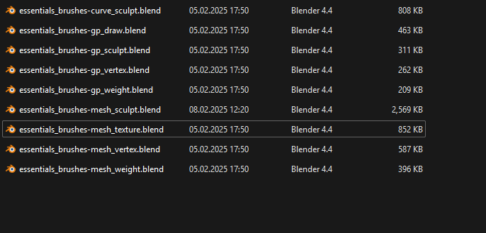
Where do I find the official .blend file the brush thumbnails were made with so that if I want to make custom ones that visually match the stock ones?
I tried opening for example Blender 4.4\4.4\datafiles\assets\brushes\essentials_brushes-mesh_texture.blend hoping I would find a blank sphere and locked camera in there, but the scene is empty
I’ve been looking all over the internet including this thread, but I can’t find the source thumbnail blend files.
I think the thumbnail scene should be shipped right within the asset .blend files:
So that each of these files contains just a sphere mesh, fixed camera and is set up so that one can just enter texture paint mode, draw a stroke, hit F12, and have thumbnail visually matching all the default ones ready to be saved.
I really think it would help if they were directly in the brush asset files bundled with blender, so users would not have to find them on the internet. One mesh sphere would probably not make them much larger or interfere with anything, and since the installed files are by default read only, there’s low chance users would modify them by accident.
If everything is in prepared state, it could really just be a process of opening one of them, entering texture paint mode, making a stroke with the new brush, rendering it using F12, saving the image but not saving the file changes.