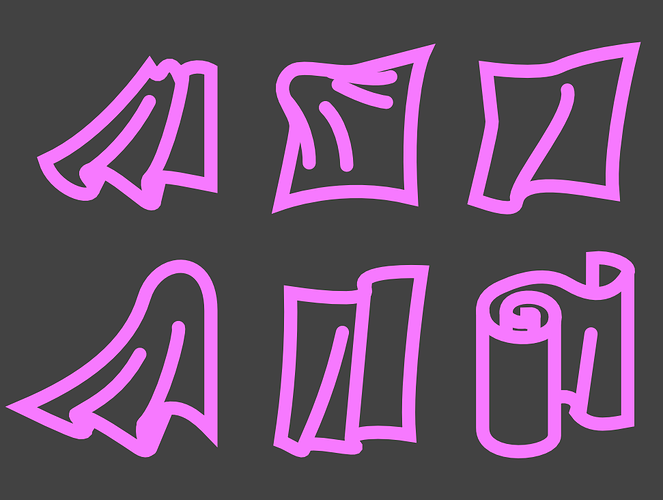
@JulienKaspar One piece of feedback I have about the iconography is that I think the cloth icon could be a bit more readable. The shape to me doesn’t read that well as cloth from a distance. It has too many tiny shapes and the silhouette isn’t as clean as other icons like the hand and joint icons for other brush types.

Here are some quick ideas on how the shape language could be improved.
Here they are from a distance:

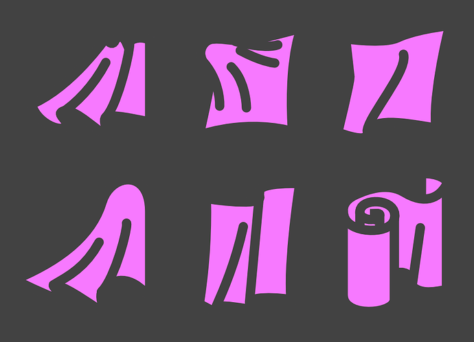
Inverted filled versions:

The basic idea is to have some contrasting shapes of curves and sharp edges to give the illusion of cloth being bent. Personally I prefer the one in the middle in the first row for how it has one round corner from the fabric being pulled from the centre, which is contrasting with the sharpness of the corners.
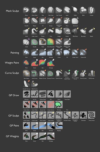
As for which design language I personally prefer out of all the ones being shown in this thread, I think that Julien’s original idea is the most solid. However, with some notes.
The way I see it, having the brushes be just grey with dark contrast like this one is how all 3D sculpting brushes should be done. It is simple and to the point. It also avoids the issue where 3rd party brushes are not following the colour guidelines when most people are already just using grey matcaps, so having simplified icons that explain which brush tool family it’s from is a way to circumvent that problem.

However, I think having icons in the corner that are coloured are a good idea. They don’t take a lot of space and the bright colour contrast works in most contexts:
Like these:


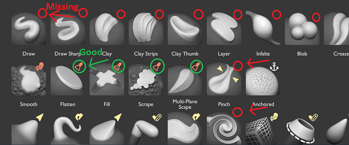
Move the icon to the top right corner however. Since most brush thumbnails are being stuck in the left bottom corner, the icon won’t be overlapping with the thumbnail underneath.

Having icons that indicate directions aren’t necessary however, because the brush thumbnail is good enough.
Avoid stuff like these icons:


Just have a select few icons for each colour. Joint and hand icons can share colour for instance. One exception being the cloth joint brush, which can have the same icon as the joint brush, but the colour will instead be shared with other cloth brushes.
Pose Brush (yellow joint icon):

Cloth Pose Brush (pink/purple icon like my cloth icon designs and I also change the positioning the thumbnail and icon to follow my design suggestions):

The only time I would break from this type of icon design would be for these brush tools:


When certain tools do very specific functions such as Simplify, Draw Face Sets, or Mask, I think it is fine to have only a thumbnail with some colour to indicate what they do. So no additional changes as I see it.
As for paint related tools such as these:
The tint to the paint helps differentiate the colour from the completely grey sculpting brush thumbnails, so good idea there. I would suggest going back to the green iconography for these brushes however. Make the tint slightly green since blue and grey look too similar still. Plus, the eraser icon is orange coloured, and orange and green fit a lot better as contrasting colours than orange and white icons.
Also, move the icons to the top right corner as previously mentioned.
As for which colour that regular sculpting brushes should have for their icons, like these:

I think blue should remain as the standard colour, especially since orange is already used by the erasers and smoothing/trimming brushes. No need to re-invent the wheel.
Good work so far! 


