Brush Thumbnails Design Feedback

I think why it doesn’t work is gradient background. Especially with those colors rounded corners makes them look like app icons in iphone 8. They’ll also be harder to replicate for custom brushes. Single-colored backgrounds will be better I think, if we’re going with strokes.

Not liking colors at all. All black is better in my opinion. Some brushes also lose volume, like on Marker Bold and Pencil Soft it looks like one big stroke, overlays of different opacities onto each other is lost. I especially HATE green color in Fill Area.

5 Likes

Not a fan of the gradients on the GP thumbnails, they look weird and don’t help with readibility. I still don’t fully understand why GP brushes can’t have transparent background but if they must then a light grey color seems to be the better option IMO.

Also, if colors are going to be used for the thumbnails in general then I think they should be brighter and a tad more saturated, otherwise it all start to look muddy and not clear enough.

7 Likes

I can see “snake hook” and “push stroke” almost has same icon , are we need to change their name to match them.?
also the gradient tool icon is missing for weight paint. great effort

I do prefer this overall look you have, honestly - with the colors as part of the mesh.

Still don’t like the colored icons in the corner. :wink:

It feels like the rounded corners on the boxes are a mobile phone design element that don’t need to be there.

1 Like

@hamza-el-barmaki Yes it would be great to rename the grease pencil brush at least to “Pull”. It’s not quite the same as the Snake Hook brush but similar enough to give it the same shape.
Same for the Snake Hook in Curve Sculpt mode. That would would ideally be called “Pull Tips”, since that’s what it’s doing specifically.

The gradient tool is not a brush so it doesn’t need a thumbnail. It will just be in the toolbar.

@thorn-neverwake Kinda sad with the rounded corners. I think it looks really nice and and can fit really well into the Blender UI … but yes the association with App icons is strong :smiley:

Could you please try to let the small feather symbol of the “Smooth Curves” icon stand out more? The white curves are a bit too close to it and thus feather and curves seem to be one thing somehow. That’s a bit hard to read at a glance. Thx :wink:

1 Like

Hey @JulienKaspar, sorry if I’m being a pain in the ass but I still fail to understand the issues about the GP icons.

I’m unable to understand this. So each “brush” has a predefined color the user can not change? Let’s say you get a red brush with a red icon and that’s it? What if I want another color? Do we need thousands of “brushes” to paint a colorful picture? Surely this is not how it’s supposed to work :upside_down_face:

And why does the background need to be white? Why not black? Why not grey?
Is it because the color will be dynamic and you guys think it will be the most readable if it’s in front of white? That’s pretty arbitrary. What if the user chooses white or light grey as a brush color (the same as the thumbnail background), will it become invisible?

Let’s say the user picks a brush he likes, chooses a blue color for it, and saves it as a new brush … will the brush stroke of the thumbnail change its color to blue? If that is not the case and the thumbnails are not dynamic but static, why on earth would you want colored thumbnails? So if the user likes the brush shape, feeling, and settings of a red brush but wants to use another color, let’s say blue, will it end up being saved in the asset shelf with the original and arbitrary red-color thumbnail?

Based on this screencap the brush shelf might end up looking like this:

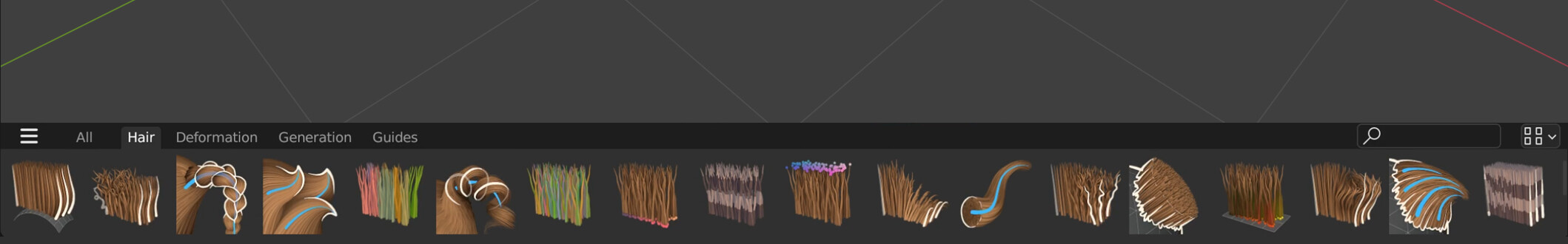
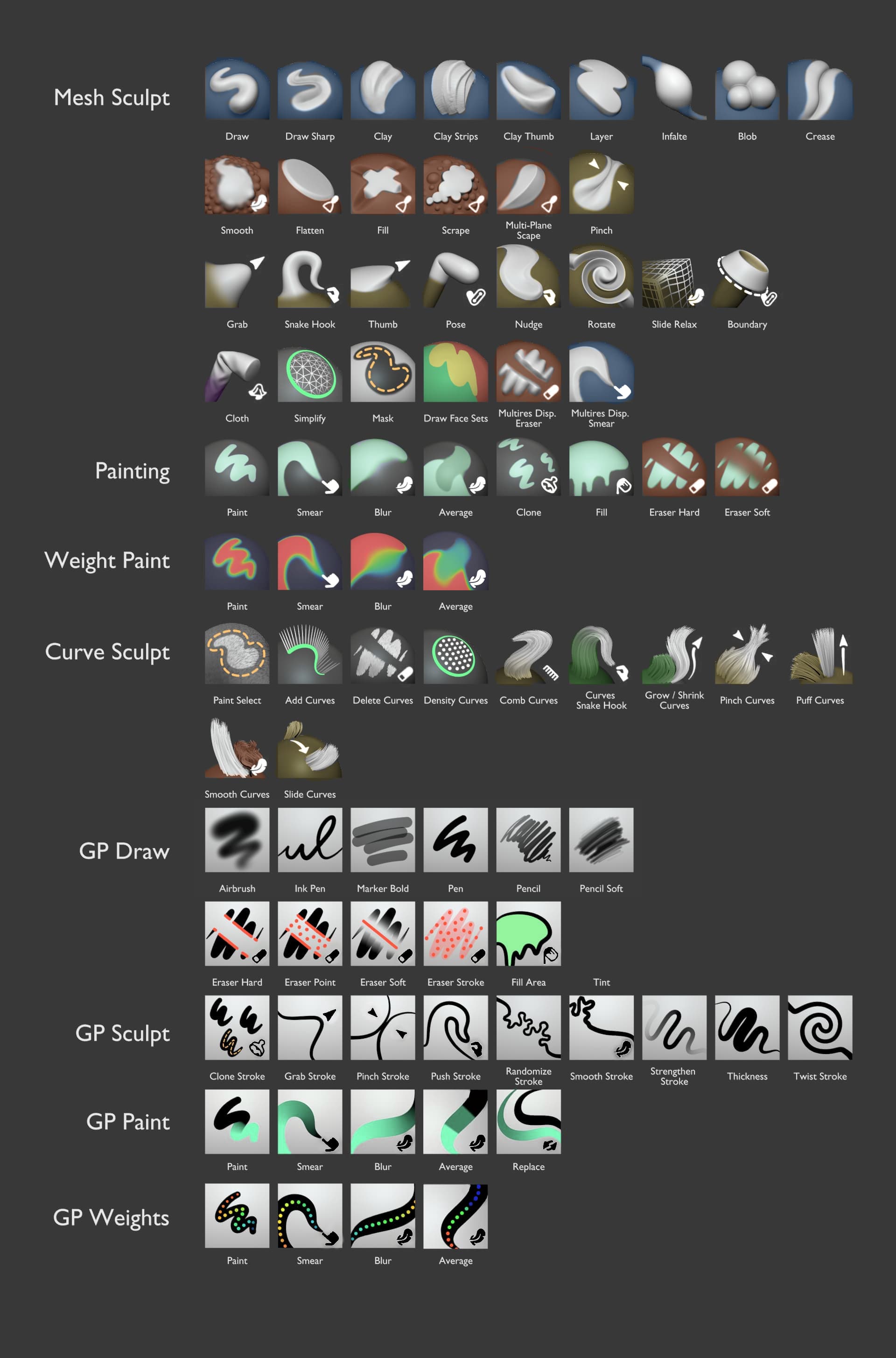
This is how it would look like with your mesh sculpt brushes:

They look fantastic!
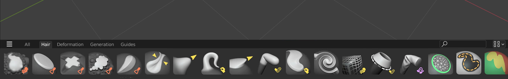
Now let’s have a look how the asset shelf looks with the GP brushes:

Uff, that looks extremely dated. Getting some Krita vibes here.
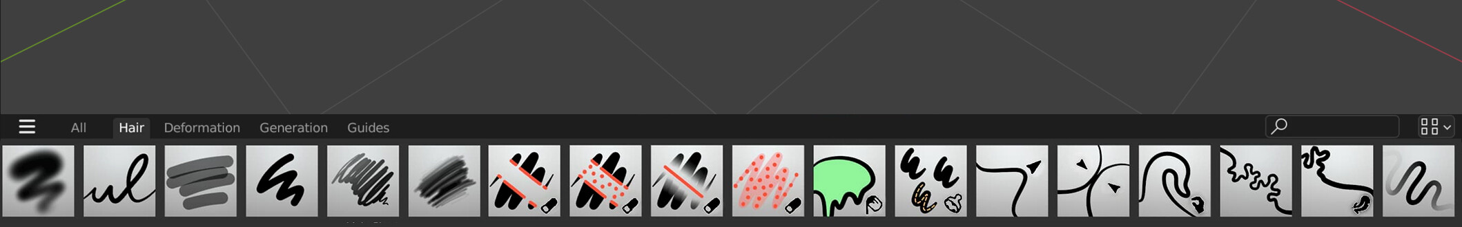
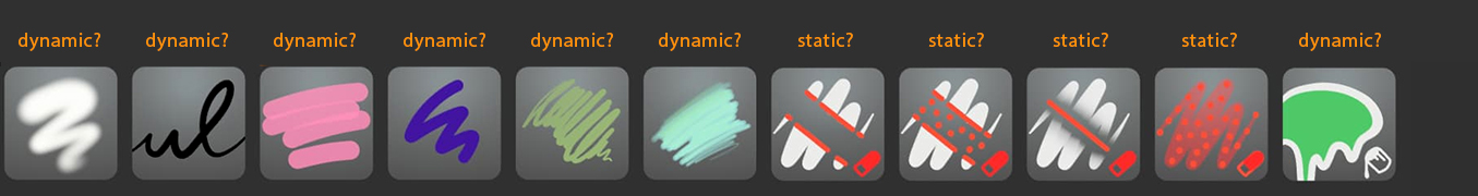
Then you posted these icons:

Better, but still confused about the colored brush strokes. (I do like the rounded corners :slightly_smiling_face:)
We do have some inconsistent use of color here imo; some colors represent actual brush colors and the red of the eraser (and green of the bucket fill?) for functionality.

Are these dynamically colored?
If yes, then we’ll run into some problems; grey or muted midvalue colors are barely visible and even worse, brush characteristics are not distinguishable anymore. Red brushes look similar to eraser brushes and the bucket fill brush looks like it could either fill-with-red or delete the fill of a GP object. Very confusing imo.

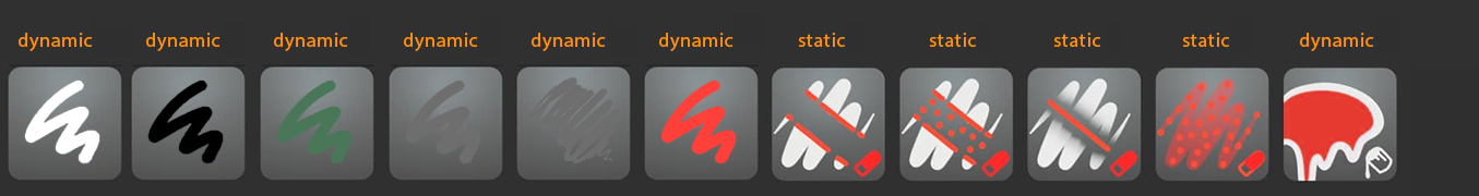
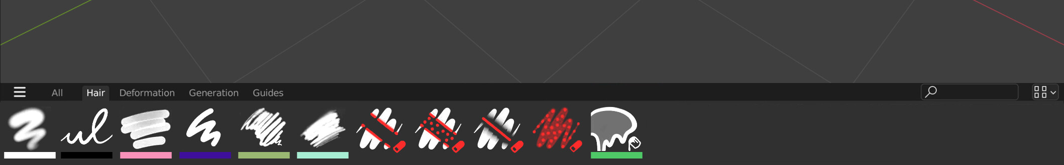
What about leaving the shape of the brush in white, ditching the background, only using colors on the thumbnail itself to indicate functionality, and putting the actual brush color underneath the brush icon?

This approach would make the most sense I think.
On the other hand I probably just don’t get how it’s supposed to work.
Is there a build anywhere to test this?

12 Likes

To be clear, the thumbnails will not be dynamic.
The best case scenario is that they will be very easy to create just in the viewport.

So if the brush is storing a specific material (stroke color, fill color & texture) in the case of grease pencil, then this needs to be represented in the thumbnail. It would be good to get some examples from the grease pencil team for that.

It’s hard to make arguments against ‘ugly’ or ‘dated’. Primarily I’m trying to make the thumbnails useful and readable. And to be fair the Krita brush thumbnails are very functional, useful and easy to read. They did a fantastic job there.


Representing the stroke and fill color underneath could work :thinking:
Or as a circle with an outline in a corner … I’ll try it out.

2 Likes

I don’t believe that “dated” always equals “poor” when it comes to UI.

Sometimes dated is bad - for example, when Apple started making all their icons a rounded square with a drop shadow and a gradient highlight (or those terrible jelly beans)… and the rest of the world decided to follow that trend, because if Apple did it - it must be the way everything else needs to look for the next 2 decades (sigh).

Other situations, it’s perfectly fine. Certainly UI has made use of greyscale/monotone looks since the past 30-40 years… because it works well. Krita uses basically the same brush icon styling that ##### used for #### back in the 90’s… i think it works well now, just as it did then. Sometimes a brush + stroke is best represented by a brush and a stroke.

2 Likes

Considering the criticism on the background colours, can’t the thumbnails be transparent for any brushes saved without any colour? Then the brush stroke could be black/ white depending on the UI theme. For any brushes saved with colour, they’d get a thumbnail to best show the colours. But this also makes it clear which brushes are generic (for any colour) or a specific colour.

If not, a coloured dot might also work. The lined strokes are personally a bit too much colour for me and they make the stroke thumbnail smaller. But a coloured dot (i.e. just the tip dot) would be sufficient and would fit in the top left corner, for instance.

1 Like

I understand the reasoning behind the sculpt brushes, but the curves and gp brushes worked much better for me before.
For the GP brushes I understand there will be accurate displays of the stroke/alpha/colour etc, so those make sense (without the gradient), but the curve tools still feel like tools to me and would be better served with icon-like representation, as before, as there’s no benefit (…that I can see) to this new direction

I love design for curves brushes but I am also lost, I never thought of them as brushes. I thought they were tools. Making them brushes really blurs the line between those two. And I also cant imagine what custom brushes can be created there. Accessing them will be harder too.

Also, its awful that add and subtract are different tools/brushes instead of working with Ctrl like everywhere else now. Really tiring and also incosistent with other modes.

2 Likes

Grease Pencil drawing brushes are tricky, the look & feel depends on the stroke settings, materials and also vertex color used. Applying just a material over an existing stroke not always represent well the brush purpouse, you have to draw the line with the actual brush/material to obtain the effects.

For GP Draw, now that we avoid icons with the tool representation, just making a quick strokes with the actual brush is enough to represent the brush effect and also is easier for user to extend their own brush library.

Even do black strokes is not working so well over dark background, I’d avoid an icon background for consistency with the other icons. Maybe we can explore a lighter asset shelf background color that work well for all cases.

Here is a sample with all the current Grease Pencil drawing brushes, including all that bundle with the oficial Grease Pencil add-on

and here with a slightly lighter background

3 Likes

I personally would like to see a comparison with the brush strokes in white. Most dark UIs use white brush strokes, that way, you don’t have to arbitrarily modify the UI.

You are making it sound as if it was choice between ugly/dated and useful/easy to read. These two are not mutually exclusive and there’s way too many pieces of software being living example of that being the case.

Why do we even need to see stroke color in the thumbnails? To me that’s really weird because there should be a very clear separation between brush settings and the tool settings.

Changing what the brush tip shape looks like should not be tied to the color you are painting using that brush. If this currently is the case, then that shows a deeper design issue and design of the brush thumbnails should not be shaped by this design issue.

Do the GP brush settings really store also the paint color with them? O_o To me that sounds like a hindrance rather than a benefit. I can’t imagine for example using Photoshop and having to manually reset the paint color back to what I want it to be every time I’d change the brush. I must be missing something.

EDIT:

Ok, so if they are not dynamic then I once again don’t understand the argument for them having a background unlike all the other brush assets.

1 Like

There is an option to store colour settings with brushes, so you can both have no colour assigned to brushes or decide to save particular colours with a brush. The advantage of the latter is that you can distribute a set of brushes to a team of artists and be sure they all use the same brushes and colours across their artworks.

1 Like

Photoshop has a color palette feature, that allows the artist to quickly have a grid of preset color chips and quickly choose from a bank of them. Illustrator, Krita has the same.

I haven’t found one in Blender, so perhaps it’s meant to help artists not have to use the color picker (which is color-formula dependent) every time they wish to use an existing color.

Yes, but in that case, if the brush thumbnails had dynamic color (which they don’t), then if I created a bright gray brush, then it would have same issue with readability on the bright gray square background Julien proposes.

And since they don’t, the argument for the background square ceases to be valid completely.

1 Like

Not only that, but Photoshop (and Krita etc) have options to store a Tool Preset that also stores the colour. It’s not that crazy. I do think basing the entire system around white backgrounds for readability is an odd choice. If they’re not dynamic, it should be up to the user, but in none of the cases I can think of will a gradient background be an improvement over a regular flat colour.

1 Like

@LudvikKoutny I agree with you on that. Besides, dynamic background colours make the entire list of brushes harder to navigate imo, because you’ll get colour popping between black and white.

This is why I would rather see a swatches/ colour presets panel. To me it makes sense to create a swatches library for a project first and to then associate the swatch with a brush. Using such a system, you could display just a colour dot over an otherwise monochrome brush, the dot then shows that a swatch or colour is associated with a brush.
The only exception should be for pattern brushes, those should be coloured to see their effect.