What if I’m making a white brush? Chalk Brush ![]()
You mean you want a brush with an invisible thumbnail? Go ahead!
It wouldn’t be invisible if there was no white background
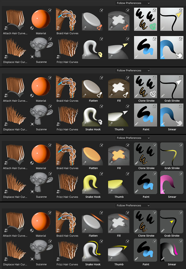
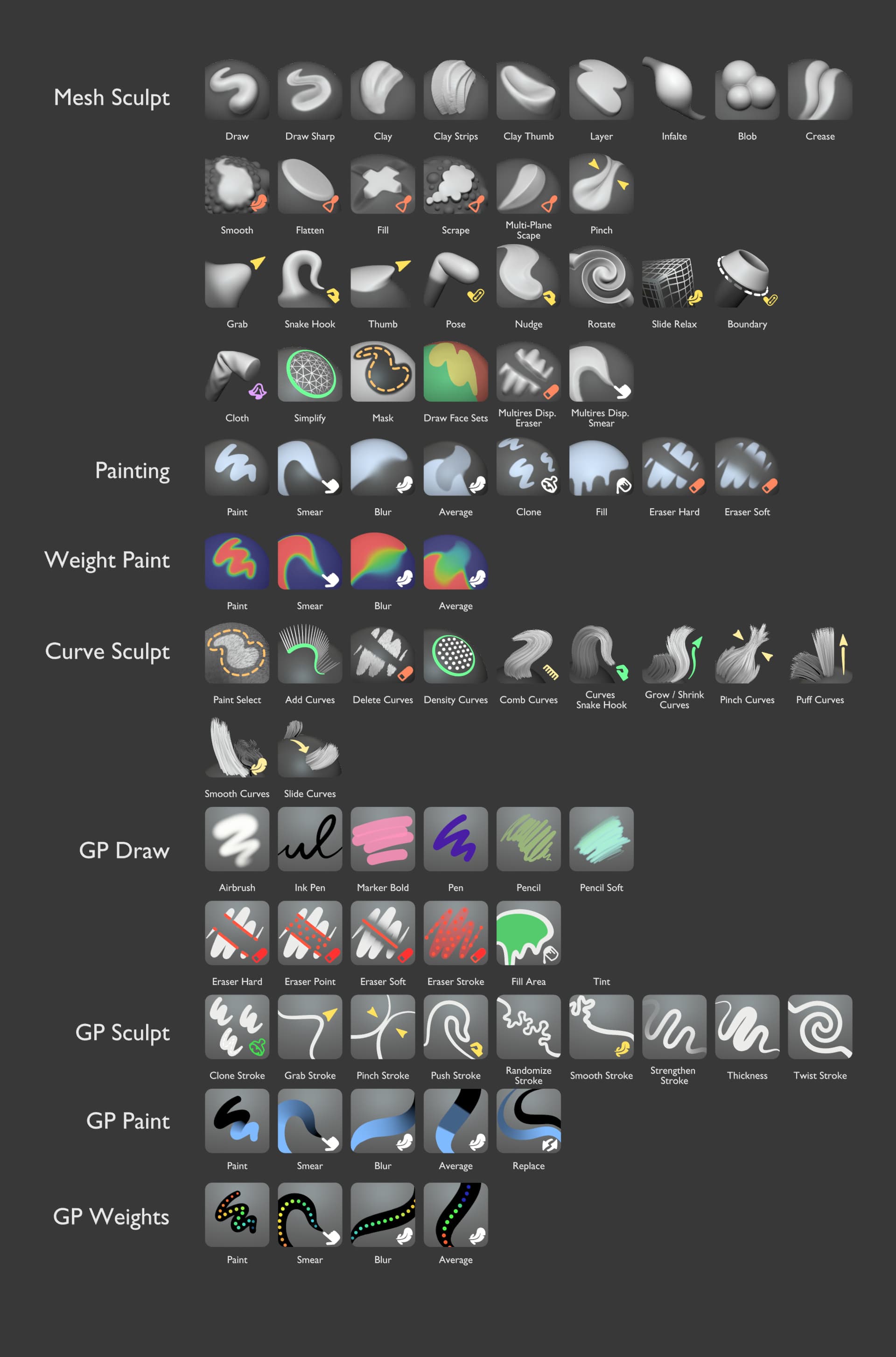
I have done some tests to see how the miniatures of the current assets fits mixed with the future painting and sculpture assets. I have also added the specific icons of assets that are superimposed, although some of these do not exist yet or not will always overlap.
The first two rows represent the initial proposal, here described at the beginning of the thread.
The next two rows and the next two address some feedback that has been mentioned here.
Rows five and six are the proposal I would choose, if there were never the possibility of sculpting and painting at the same time.
The last two rows only add color to the gestures.
5 Likes
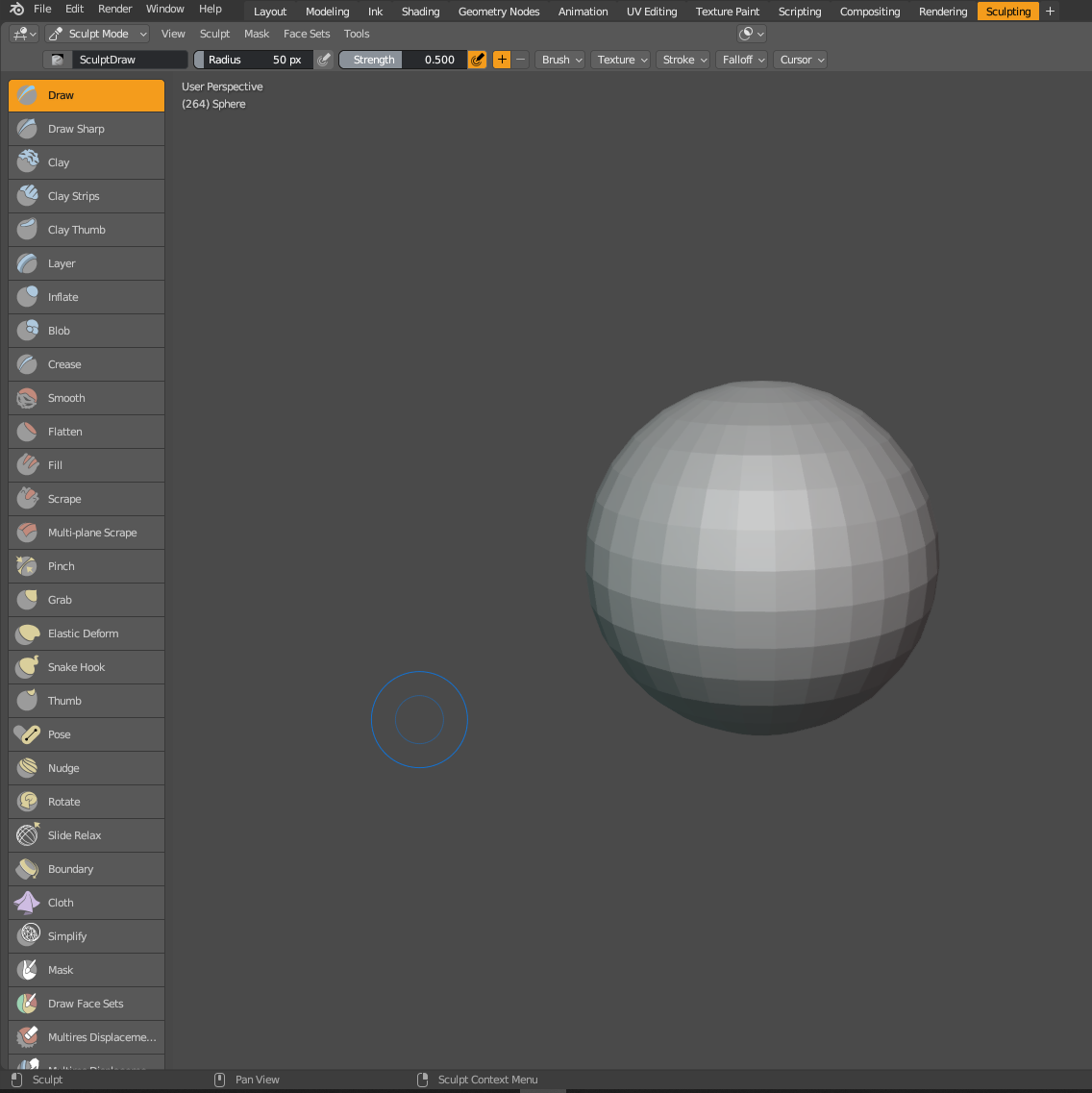
forth is most readable for sculpt brushes. I’m gonna die on that hill. It doesn’t need any more color than that. Too much color makes it less readable and uglier
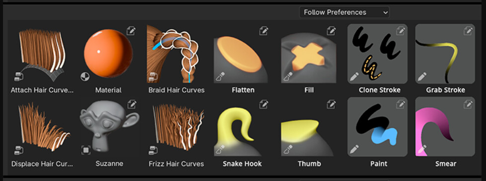
This is the one that looks best for me, specially for the grease pencil brushes, the white background with and without gradient is too distracting, so if those brushes are going to have a solid background I think a neutral grey works best.
5 Likes
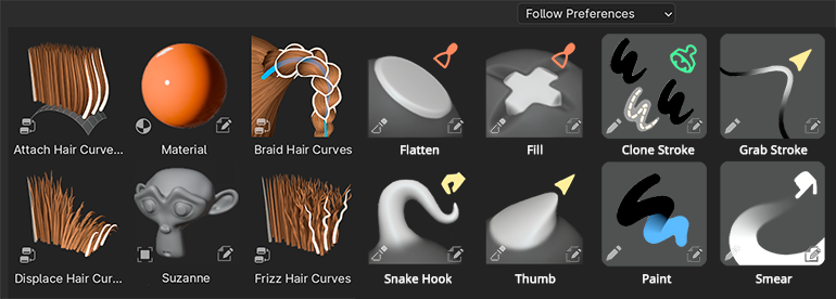
It starts to look like a bag of Skittles exploded…
I kind of like Julien’s first design better. It doesn’t feel like an assault on my eyes like these other attention-grabbing color icons.
5 Likes
It seems that in general such intense colors are not convincing, but I do not think that dirtying them is the solution, either the bet is decided or it is not worth it.
I like the JulienKaspar icons, but I prefer the previous versions where the Asset Editor decorators were not taken into account, and the upper right corner was not reserved, I saw them as more balanced.
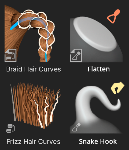
I don’t know if this editing icon is completely immovable, but I have lowered it, simply to evaluate the composition. I understand that this icon only appears when the asset is included in the scene itself, so generally it should not appear. Perhaps the asset type icon that is always included could add some color or indication that it is from the current scene.
5 Likes
Very good point. That file icon is important. And having them icons all in one corner makes them quickly distinguishable from other data types
1 Like
Why does one need an icon that represents a material in the corner of a preview that IS the material?
Thumbnail can be square plane, or custom image. It doesn’t always show shader ball
The last test XD.
With the intention of deleting the icon in the upper right corner of the assets, which indicates that the asset is in the current scene itself, one option would be to mix it with the type.
This combination is shown in the row above, in this way the thumbnail’s own symbols are not mixed with the generic ones. On the other hand, its size is a little larger.
3 Likes
Thanks for all the involvement! I believe this direction could work really well.
I’ll check with the asset browser team if the “current file” icon could be moved to the bottom right. It helps a lot to have the thumbnails have some space in the top right corner for icons. I’d like to go back to the thumbnail versions with the top-right icons.
I’m not sure about the grey background for Gpencil brushes. It’s too dark for black strokes. I’ll test it out a bit and maybe brighten the dark sections just a bit.
The rounded corners are super nice. Would be great to have that as part of the theme preferences.
8 Likes
I think that the option to have only two glyph placements as in the @wevon mockup above is better than having 3 different glyphs per asset thumbnail.
3 Likes
Third one will only appear if brush asset belongs to current blend file, so basically never for essential brushes and very rarely for user ones.
these look so much better- I sculpt somewhat infrequently and find that I almost always have to read the tooltips to tell them apart. the ones posted here seem much more intuitive to me
Another experiment.
- Used a dark grey (slightly lighter than the upper thumbnails) for the Gpencil thumbnails.
- Changed the strokes to white for Gpencil thumbnails (Except for Paint & Weight)
- Used various different colors for “GP Draw” just to see how they look
- Added colored icons back to Gpencil thumbnails.
- Added rounded corners to all thumbnails
Overall I must say … I’m not convinced. Some thoughts I have:
- Round corners work great. Definitely should get that in
- The grease pencil brushes are more inconsistent among themselves. The Paint and Weight brushes didn’t work so well with white strokes, since it distracts a lot from the colored parts that are the main focus
- Colored GP Draw thumbnails are readable as long as the value is not medium. Very bright and dark values work best. If the bg is very bright grey it makes more colors readable
- Any colored icon turns out to be very hard to see for color blind people. In a lot of thumbnails the icon would become imperceivable in front of grey backgrounds. Having the icons always be pure white/black depending on the bg value is far more readable
I am tempted to keep exploring this direction, tweak the colors and values and improve the look of the Curve Sculpt thumbnails.
I am waiting to get some feedback from grease pencil artists to know for sure.
3 Likes
Another experiment.
- Used a dark grey (slightly lighter than the upper thumbnails) for the Gpencil thumbnails.
- Changed the strokes to white for Gpencil thumbnails (Except for Paint & Weight)
- Used various different colors for “GP Draw” just to see how they look
- Added colored icons back to Gpencil thumbnails.
Overall I must say … I’m not convinced. Some thoughts I have:
- The grease pencil brushes are more inconsistent among themselves. The Paint and Weight brushes didn’t work so well with white strokes, since it distracts a lot from the colored parts that are the main focus
- Colored GP Draw thumbnails are readable as long as the value is not medium. Very bright and dark values work best. If the bg is very bright grey it makes more colors readable
- Any colored icon turns out to be very hard to see for color blind people. In a lot of thumbnails the icon would become imperceivable in front of grey backgrounds. Having the icons always be pure white/black depending on the bg value is far more readable
I am tempted to keep exploring this direction for now, tweak the colors and values and improve the look of the Curve Sculpt thumbnails (oh and remove the bg gradients).