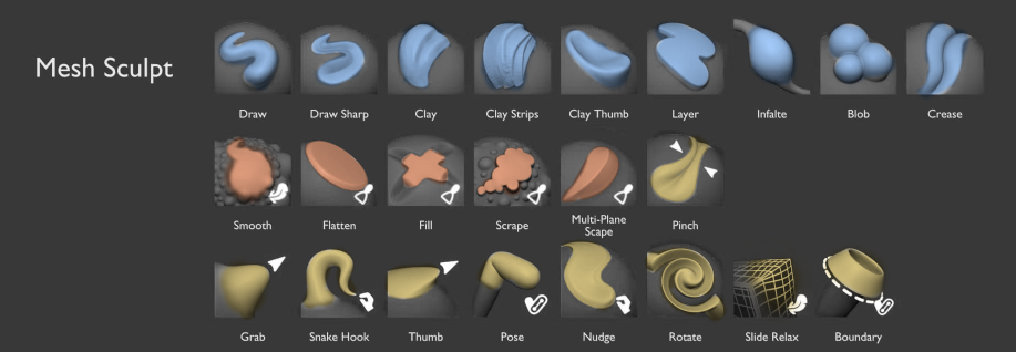
Looks really great with color! But something like this coulde be more readiable, it feels more like the important part of the icon is in focus now. When I zoom out very far in the other proposal I only see the background colors and the white color is to low contrast to make out any shapes, whereas here I focus instead one the brush icon and can read and recognize the icon way easier.
@JulienKaspar Apart from inverting the colours for the brushes, I agree with the changes. Looks much better llike this for the sculpt brushes. Though the Cloth, Mask and Simplify brushes deviate quite a bit in terms of colour usage. I consider Painting and Weight Paint brushes done. For me the GP Sculpt brushes are rather thin, so maybe you could do something with a more bold stroke to make them read better. I miss contrast between the brush variants.
Overall, happy to see your progress.
Love the thumbnails in your latest proposal @JulienKaspar !
Dangry’s edit improves the readability even further in my opinion. Looks slick guys!
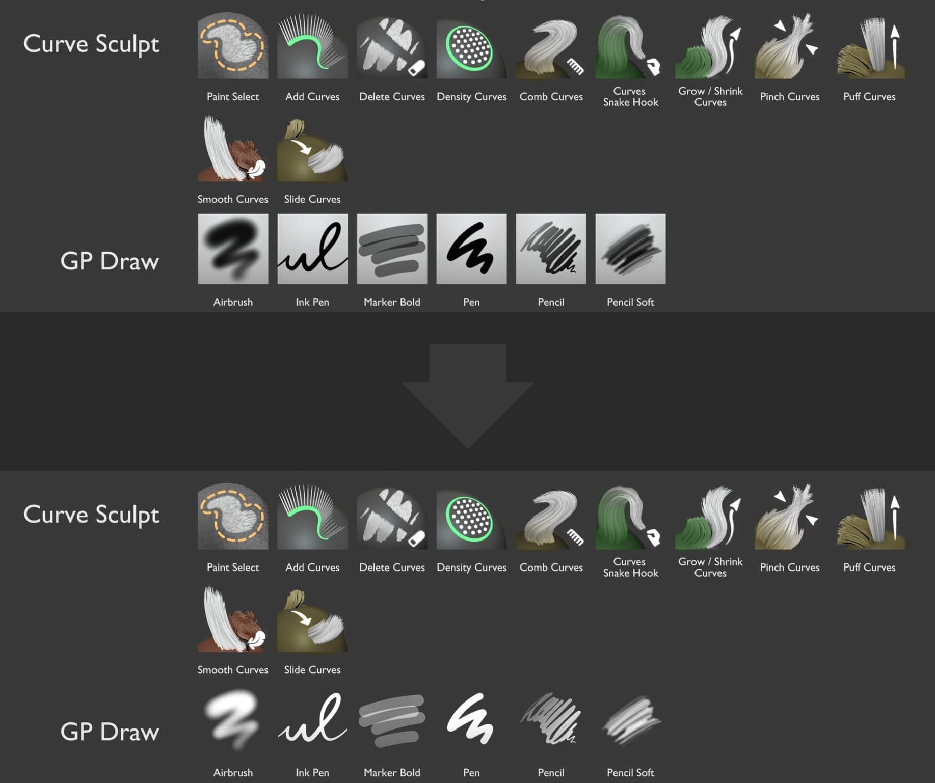
I can’t help but wonder about the background of the GP icons.
Especially the random-oriented gradient throws me off and gives a bit of an early-2000s vibe.
What about something like this?
The only drawback is that I’m unsure of how well this works with a light theme. The rest of the thumbnails will face similiar readability issues if the background is white though – at least some of them (like the Pinch-Curve thumbnail).
Agreed, I think this looks quite a bit more readable with inverted colors ! Other than that I like the design. Perhaps “Scrape” is a little too busy, I would try a simpler shape.
Yes, this looks much better. GP thumbnails should be just stroke shapes with alpha, and have inverted value if the tool button background color value is above 0.5 or something (so that they work with bright themes as well).
I hate to swim against the currents and the feedback is really appreciated … but imo the inverted color makes the thumbnails too dark and dull. It places the emphasis exclusively on color rather than shape and value contrast.
Brushes that need to convey smaller details from texture brushes will need value contrast. Making them blue/red/yellow surrounded by dark grey will make this difficult.
I tried out to brighten the colors a bit can make them more noticeable but it overall becomes more punchy. Not quite happy with this yet. Needs fine tuning.
The reason why the background is white is because many custom GP Draw brushes will use materials. So color & textures will be a vital aspect of brush thumbnails. This was the main feedback from the grease pencil module. A white background makes sure all brushes are always perfectly readable.
To make sure the Gpencil brushes are consistent among themselves they use the same background in all modes.
Can’t the cloth brush really look like cloth? (A piece of fabric or something)
That right there looks like you’re trying to showcase a bend feature that happens to have some folds. Not to mention that it’s very similar to the bend brush icon.
This example is actually a Pose brush, but it’s using cloth physics.
The thing about the Cloth brush is that there’s isn’t a single one. Almost every typical brush type that you know has a Cloth version: Pose, Boundary, Grab, Snake Hook, Pinch, Draw, Inflate.
On top will be many more unique brushes for cloth.
The difference visually between regular and a cloth brush will be:
Cloth looking mesh deformation
A purple accent color
A cloth icon (maybe. The same icon as the usual brushes could instead be used)
I don’t think you really need much to illustrate than whats there to call it a cloth brush.
If the user, can’t wrap their eyes around the fact that cloth brush is color coded “purple” while the bend brush is “dull yellow”. That’s just being picky, which won’t help Julien with his revisions to the design.
Can you elaborate this a bit more? Is there an example which brush is crucial to have a white background? How is this different from lets say photosop brushes? (just search for “photosop brush ui”).
A user is free to use whatever color or texture he wants per brush, why would a brush thumbnail need to show pre defined color or texture on white background? I’ve never seen something like this i think. Sorry if I’m missing something obvious here.
Also that gradient sometimes goes top-down, sometimes left-right and so on, why is kinda random? To me it looks like the gradient doesnt serve any purpuse and on top of that looks a bit dated imo.
Yeah, I am equally as confused. If the brush thumbnail strokes aren’t dynamic (like reflecting the current primary color) which they almost certainly aren’t, then that explanation doesn’t hold any water for me.
In grease pencil specifically this isn’t the typical workflow. While you can define the color via vertex colors freely, it’s actually more common, especially in production, to define a fixed Material for each brush. This is a unique concept to Grease Pencil. You choose a brush that already comes with a specific material, stroke/fill color and textures.
This way the strokes are non-destructive and can be easily updated across files.
Meanwhile other painting modes are not working this way. There the color is always user defined. So it’s safe to pick a single color or monochrome thumbnails to represent the brushes.
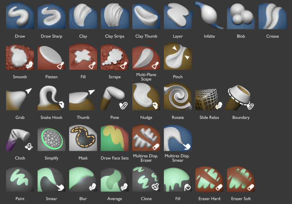
It’s just a quick paintover. I rotated the thumbnails for Average brushes
All thumbnails use the same matcap. The white background is a flat plane with the gradient coming from the matcap
I still don’t understand what this has to do with iconic representation of the GP tools on the toolbar buttons?
To an average user, outdated, Windows 95 looking square gray gradients fail to communicate to me that “while you can define the color via vertex colors freely, it’s actually more common, especially in production, to define a fixed Material for each brush. This is a unique concept to Grease Pencil. You choose a brush that already comes with a specific material, stroke/fill color and textures.”
To the average user, they will just communicate something along the lines of “Sculpt brush tool icons were updated for Blender 4.0 but someone forgot to update Grease Pencil ones since Blender 2.5”
Or am I misunderstanding it and will the GP brush icons change based on the material set in each brush?
These aren’t icons in the toolbar anymore. These thumbnails would only be used for brushes and are shown in the asset shelf/browser. The toolbar icons will no longer be relevant.
The point by @ManuelGrad was to remove the white background entirely and have the stroke value inverted depending on the theme.
My point is that this isn’t possible because the grease pencil draw brushes will make heavy use of predefined colored strokes on a white background (despite the default brushes being black on white).
The color outline is quite messy. Just because it’s a mockup, right?
Maybe the colors themselves need a bit more tweaking to fit the Blender default theme color palette?.. Maybe that brownish color should be orange, for example… Apart from that, these are pretty good.
No matter how many times I re-read this sentence, I just can not understand it. Non the less, I trust you know what you are doing. It’s not like I use GP anyway. I just saw @ManuelGrad 's mockup and it looked like it brought GP brush thumbnails into current decade of the current century aesthetic-wise
The point Julian makes is that, if you save a brush with colour and create a thumbnail for a brush, you can see the colour better when it is against a white background.