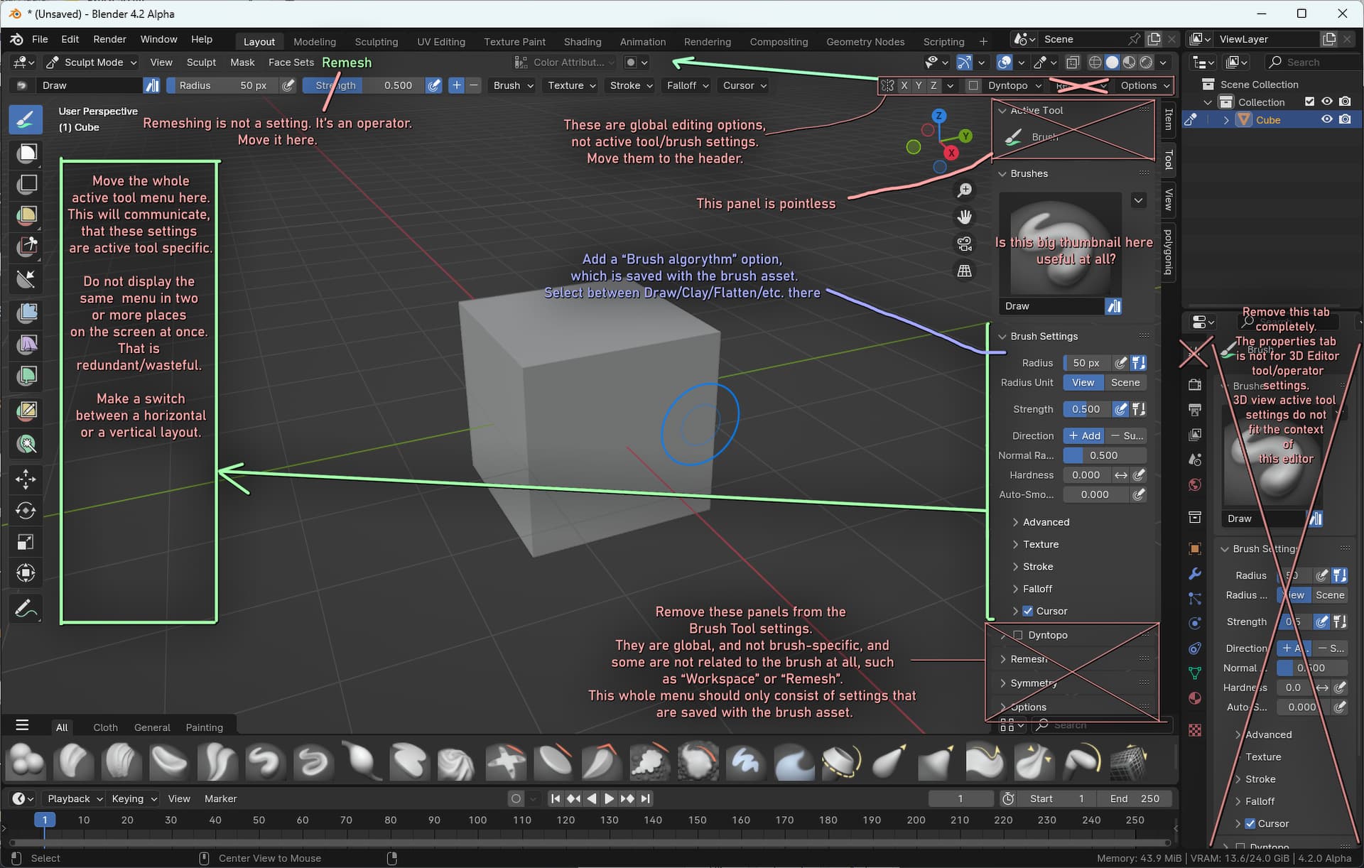
EDIT: The content under “OPTIONS” seems misplaced as well. The View checkbox options should be in the “View” menu, and the gravity should be among “Brush settings”. Without these, the “options” menu is empty, so it no longer needs to exist.
@FreeMind Remesh should remain next to Dyntopo, but I agree with the rest about moving the settings to the centre next to the Masking options. I once made that very same suggestion. Makes a lot more sense to have these important settings at the centre for the sake of visibility.
My only request is that the 3D view does not become narrow due to additional UI. Many modes of Blender are always controversial. However, there are advantages. Depending on the mode, unnecessary UI does not fill the screen. If the Asset shelf forces horizontal, at least in the pop-up, I hope to give various degrees of freedom.
In my case, it should be in the n panel. I often use toggle maximum area for performance. Especially in image painting, there are more performance benefits.
It may be a good idea to allow the user to flip the Asset shelf to the top of the editor. Let’s see.
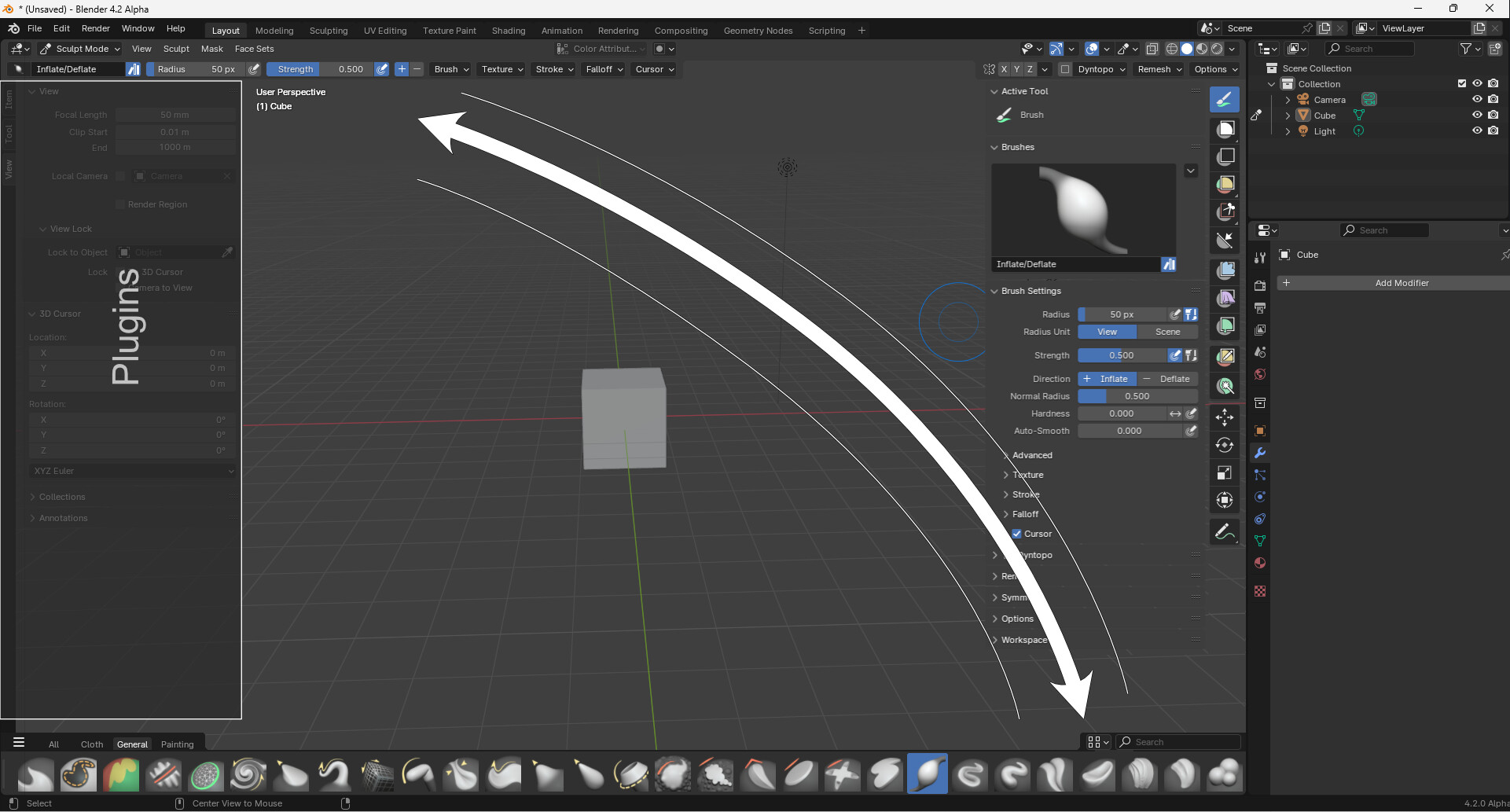
This would put the brush selection and brush settings close to each other, Reducing mouse/pen travel, and increasing intuitiveness (Communicated: These brush settings belong to the brush selected on this shelf).
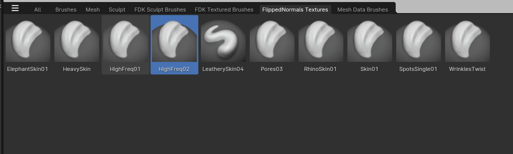
Some new feedback. I would like for there to be an easy way for brush icons to be replaced by the texture that it is using on the shelf. For instance, I am currently migrating a bunch of textures I bought from FlippedNormals into actual brushes that can be picked separately, but there is no actual texture preview to speak of, just the default icon thumbnails that were added with this new build.
Having the textures displayed instead as an option would make them far easier to distinguish.
Edit: Another thing I think would be useful is if the actual brush collections on the brushes shelf were actually sorted by folders named after the collections. Right now every single custom brush is being put in the same folder under Saved → Brushes.
Having them automatically sorted and synced when adding new folders and brushes in the asset folders through Windows Explorer would make it far easier to store and share brushes in the future by just compressing the individual folders into a .zip/.rar-file for others to use.
Edit 2: One additional benefit of this is that it becomes easier to separate brushes with licensed textures from the rest. I.e. the FlippedNormals texture brushes I don’t want to mix together with other free brushes. This is to make sure I never accidentally share any of them with other people.
Groups of brush tool types no-longer able to be accessed (removed brush tools). Typically we would have a tool “mode” and have a sub-set of brush settings for the tool mode. The brush asset could have been an expansion of the brush datablock, where it would store new brush settings for a brush tool mode. But now apparently there is no sectorization of brush types and sub-settings anymore - so the brush assets feels overwhelming and hard to pick what you need exactly.
When selecting a brush from the asset shelf, it is overriding edited or duplicated brush settings, loosing the user settings of the brush. This is destructive and unintended from a user standpoint. Ideally you would select a brush asset, it would add the setting to the scene and preserve any brush settings you had tuned on the selected brush you have in the scene. In general… seems the brush data block, something you can grab, modify, remove, save, and ship… is now ephmeral.
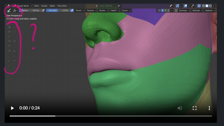
When using the asset browser, unless in categories, there is little or no way to know what brush is for what object mode or type, other than memorized thumbnails. Initial indicators for modes is not included (ei, Texture Paint mode = texture paint icon on thumbnail)
Not in the image, but there is a lot of realestate consumed from few brushes when using a full expanse toolshelf.
In general, we worked code to have the old datablocks brush system to work with the Brush Tool Mode > Brush Tool Sub-Setting datablock and exposed them to shelves (to the left in tabs and panels, customizable and pinnable). We were waiting to be able to mark the brush datablock as an asset to be able to link or append them from the asset browser.
We have had our users use this system for over a year, with heave testing. It was straight forward and similar to other software. (Tool first → Brush type second).
Right now the biggest UX hurdle with this build is… there is no user feedback or visual GUI indication that we are in a tool mode, only… random brush types that will become even less usable the more brushes we have, because there is not top-level hierarchy or “containers” of brushes with their brush setting “assets”
Also, final note, duplicating a brush asset does a hard crash…
Erasing that unnecessary step was, if I recall correctly, explicitly one of the goals of the brush assets project. In order to select any brush, you had to first select the relevant tool, then select the relevant brush. I think the issue with that is obvious? If you need more categorization, my understanding is asset catalogs are meant for that. You can separate your brushes by “type” or any other metric that suits you.
We solved top level access of brush types+tools that when you select the brush type in it’s designated panel in a shelf (that you can pin, collapse and reorder), it would also change the brush tool.
Example: Click erasor in the top level panel of erasers, then click a pen in the top level panel of pens it would change the tool and hit the type from the top level in one click. So brush is toplevel, but with default granular sectorizationn and user customizability for access.
"Tested system:*
You are not presented with a wall of mixed tool brushes with types ordered alphabetically, but by tool mode.
duplicating/adding a brush is already assigned to a built in tool top level “panel” or category
user visibility, pinning and reordering the tool groups of brushes is possible
has a brush tool indicator to show top level mode we are in in the toolshelf (traditional)
New system:
can only show one or lumped categories at a time, with every brush and tool mixed in by alphabetical order (a soup)
no way to toggle view, pin or reorder tool based brushes
no automatic assignment of a new brush of a tool group to the correct category, now toohlevel order is on the user
no GUI container for the brush types, it’s all on a messy desk. No bag for pencils, a bowl of erasors or a jar of brushes.
Right now the asset shelf has no indicator or sectorizationn of this. And if the asset shelf can only show mixed categories at a time, then top level access of all brush types in a usable way has been missed completely.
Right now brush asset shelf tools+type are ordered alphabetically regardless of tool or type. No muscle memory, no customizable view to pin or show multiple categories…
Top level access of brush tool+type is a good goal. But tool sectorizatión shouldn’t be on the user, especially if thumbnails and categories change.
It should be a GUI, a guided user interface with a clear UX, a user experience.
Right now there frankly is little GUI for brush tools+types.
My two cents… If this rolls out like this, we would probably develop this:
Atleast update default thumbnails to show the tool mode tool with iconography for a better visual queue.
Expose quick category selectors as a default for the asset shelf via tool shelf buttons or default category tabs to add in user sectorization while maintaining top level access, instead of user selection of categories at a deeper level.
Maintain our top level panel system as opt-in alternative so you can pin multiple categories to top level.
The feedback from artists that this is based on is indeed that brush tool types are not a good way to organize brushes. That often the tool type is not a good indication of what the brush is used for or how it should be grouped. Using a different texture or other settings can change the purpose of a brush entirely. And also that it doesn’t scale to having larger numbers of brushes.
For example you might have a set of brushes for an anime style, or watercolor, or for a particular project. If those are spread across tools, it can be tedious to select the relevant brushes for a particular thing you are working on.
There are of course trade-offs to that design choice. If the assumption is that grouping by tool is correct, then we’d be making quite different design choices. But I don’t really see a clear design where both tool and catalog based organization are emphasized.
I made sort of a related point, back when the icon/button design was being redone. At the technical level, one brush may be “destructive”, another “additive”, and another “modifier”. But artistically, when I’m painting in 2D I’m not choosing a brush based on such hardline technical parameters. I know what result a brush offers, so I choose it.
So I think being able to group by “toolbox” or “style set” would be something of value.
@brecht Why not just add auto-sorting features based on brush type in the brushes shelf as an alternative to having alphabetical sorting, including sub-labels inside the shelf itself to determine which brush type the brushes are based on? That would allow you to sort brushes similarly to how the old system does it without having multiple brush tools in the left toolbar where everything used to be. You could then find all brushes that were created from Scrape/Fill or Inflate/Deflate, just to name a few examples.
There are many ways you can build upon the new brush collections system to make things easier to find what you want. New sorting features, better search functionality, etc. Improvements that just weren’t practical with the old system. While still being a prototype, it is a good base to continue building on its foundations.
can the button be moved to the viewport (on top of the toolbar would be nice)
i mean, we should be able to access the brush palette even with the tool settings (topbar) hidden
This is exactly what I meant before, there is no indication/feedback about which brush is active, and the other tools as well are no longer easily accessible.
It would be nice if the arm motion of the artists could be taken into consideration.
A left handed person using a tablet has a different rotation of their arm and access to UI Elements than a right handed person.
To be fair for both left/right handed artists, some UI modularity needs to be added.
My takeaways on what is needed;
Active Tool(s) separated from the rest of the plugins.
The ability to easily reorder the brushes in the asset browser. (via click, drag and place) calling it manual sorting.
Locking/unlocking the movement of those Asset Brushes / UI Elements
Flip region for Active Tool and Plugins (it is an important feature which should be regularly exposed)
Modifiers/Geometry nodes are going to play a bigger role especially in Sculpting, lets address that with having them at the far right(left handed)
or far left (right handed) side.
A popup Favorites Pie where Assets/Brushes can be easily added and taken away from as well as its order changed.
Here it is also important to be able to change the size of the favorite assets, similar to changing other areas in Blender. (CTRL+ middle mouse + mouse up down)
BRUSH ASSET MODEL A
Asset shelves are important in UX, so forcing them to be horizontal could cause a lot of inconvenience. It would be nice if they could be placed in various positions, not just horizontally.
Docking to the right or left provides a more comfortable 3D view space on a 16:9 screen. This is because many users do not want the space above and below to become narrow. This applies to the pose library as well. If tools like the graph editor take up a large horizontal space, forcing the asset shelf to be horizontal can cause a lot of inconvenience.
Additionally, the arrangement of tabs and brushes should be editable by the user. Sorting by name or registration order alone can be quite inconvenient. It’s for the same reason that there are many requests to be able to edit the order of quick favorites.
Below is a simple model when docked to the left.
BRUSH ASSET MODEL B
The toolbar is important for quickly selecting brushes. It would be nice if there was a space in the toolbar where favorite brushes are displayed as below. As various types of brushes are removed, there is enough space so it would be nice if users could register more than 12 brushes as they wish.
As you know, the variety of basic brushes that most sculptors frequently use is not extensive, and they prefer to be able to select them quickly.
Users can be given the option to add favorites to the toolbar via the asset shelf, and conversely, to delete and organize them from the toolbar. The core idea is that the toolbar can be customized.
This is a rough model that only suggests ideas, and graphic completeness has not been considered.
This is an unpolished suggestion, but I hope it serves as inspiration. What I really want to emphasize is that if the UX does not satisfy the majority, then a degree of freedom should be functionally provided for UI editing. It’s important to enforce a UX that most users will be satisfied with over time, but it’s equally important to offer features that allow users to personalize their own experience. This way, users can adjust and optimize the UI to suit their needs.
I guess the prototype helps us to create our own collection of brushes for our needs.
If I set Asset Library to “Current File” or “User Library”, something odd happens. All categories I enabled from “Essential” are still visible. (Despite them being empty in the asset shelf).