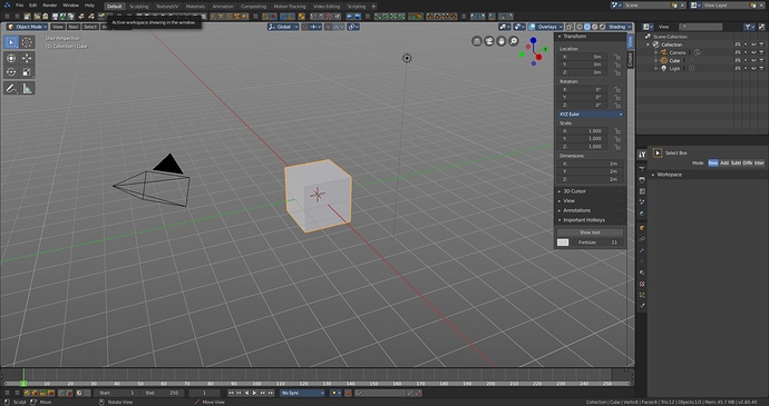
you can make it transparent in user prefs
UPD So with new user prefs we cant change it?
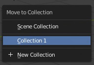
I think it would be correct if the transfer of objects to another layer / collection (using the number keys 1-9, 0) starts to correspond to the numbers that activate a particular collection.
Now the key sequence [M], [1] will transfer objects to the root collection. And the key [1] activates the first collection in the list (not the root).
I think in the list of transferring objects to another collection [M] we could use a tilde [~] for the root collection. Then the numbers will match.
may i ask about setting up “default project template”, is there plans to have it in the future? ,there isn’t much information about the Asset Manager and if it’ll have project template where folders are setup by default, the only quick way i could do it is create a template folder hierarchy and copy paste it whenever i need it then bookmark the project in blender’s file browser
I don’t know if this is the best place to ask for this, but here it goes.
It think it would be a great help if there was some kind of highlighting when you try to modify the look of an asset.
I mean, there are some times when I want to modify the color of something (i.e. the color of the font of the header of a panel) and I have to look for it by trial and error.
This could be solved with a dropper tool for example.
I have used and worked with a customizable toolbar in the fork Bforartists for some time. I can say it is indeed very useful. I like how you can position it, resize it, customize it and duplicate it. All it needs now are the active tool sliders and panel dropdown shortcuts from the new toolbar.
This is a great proposal. 
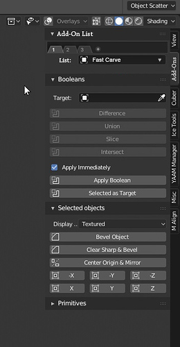
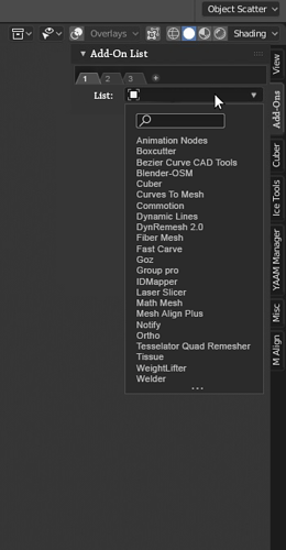
Another idea for the Add-On tabs!
- A Tab for the Add-Ons
- Add-On, when enabled → New tab (recently used Add-Ons, for example…)
Add-On, when disabled → This tab ( and in the list ) - The chosen add-on from list, gets activated and appears.
- Pin Add-on tabs for quick access.
- ( And maybe add a list for favorites… )
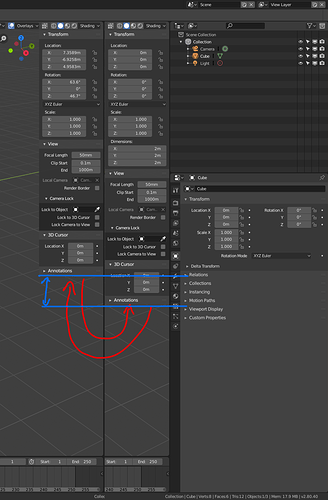
If the panel is transparent, it seems to be constantly jumping when switching between selected object types. On the other hand when moving an object the view3D header disappears leaving an empty space above the “n” panel that is fatal. Not to mention that it disappears the information from the axes of the browser in the upper right, while you are moving an object, you always need to have that information visible, otherwise you are forced to look first at that information and then proceed to move or perform the action you need, having to have looked before that information and remember it later.
The panel gives the sensation of being constantly bouncing, even when switching between addon tabs:
While performing an action you lose sight of vital visual information for some actions:
I think the “n” panel should be opaque to the bottom, independent of the active tool panel.
wrong thread sorry…
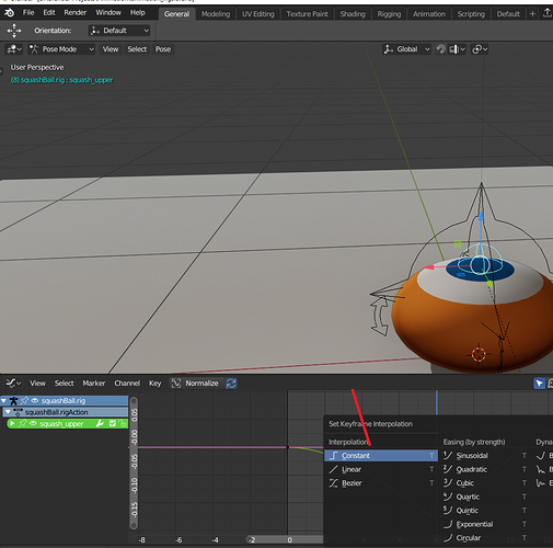
suggestion for adding keyframe interpolation and handle types buttons … there is space in the header at least for the most common used ones,keeping hitting hotkeys is a bit redundant and it’s twice slow than just few buttons at the top.
Hello Guys, After some time trying using Blender 2.8 in my daily workflow I found important to discuss with you some important things for the current Informational Architecture, UI - Density and overlapping between the zones, elements of the screen which are quit annoying for me. I have some suggestion, so please if you see it feasible, this will be great to have those change for the overall improvement.
This is the topic for discussion, tell me please what do you think:
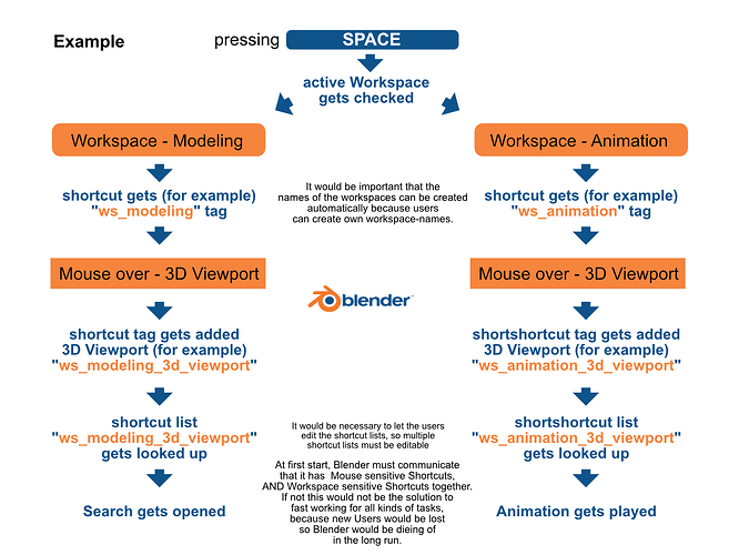
MAYBE an idea to fix Shortcuts for ever task.
(By using the already existing Mouse sensitive shortcut system combined with Workspace sensitivity)
I think 2.8 is on a good way with the UI. One thing I noticed however is, I am slower in modeling tasks because many basic functions have no shortcuts anymore and will not get one back, because Blender tries to don’t give one task (modeling) the whole keyboard and other task only some keys. However, what would be, if it actually can give modeling the whole keyboard, but also animation, and also shading?
This is my idea basically.
Would it be possible to combine the mouse sensitive shortcut system with added Workspace sensitivity to make use of the full keyboard easily in all kinds of different tasks with dedicated Shortcut sets? Maybe a call for content for all the Workspace+Editor would bring the best results. I’m no developer, but tried to bring this idea as far as i can, so others can bring it along further:
If something on thous lines is already on the way, sorry I did not find anything. But if not I would like to suggest looking in to this whole heatedly, so longtime users that only work with shortcuts can get up to speed with a great shortcut layout out of the box. I think a great shortcut system out of the box is important, because most tutorial maker would use them, and the step in using shortcuts would be smaller for newer users if a complete standard set as a good baseline would already be ready to use.
Is this really an adequate amount of options for a pop-up panel? It really seems to me it might be a bit too much. 45 seems to be a number of options that may be better somewhere where it does not disappear when the mouse is moved away. N panel maybe or maybe divided into separate panels. This seems to be a bit confusing and individual options are getting to be hard to spot. I think if previous versions of Blender’s UI got called messy and cluttered, this most definitely will be called that as well.
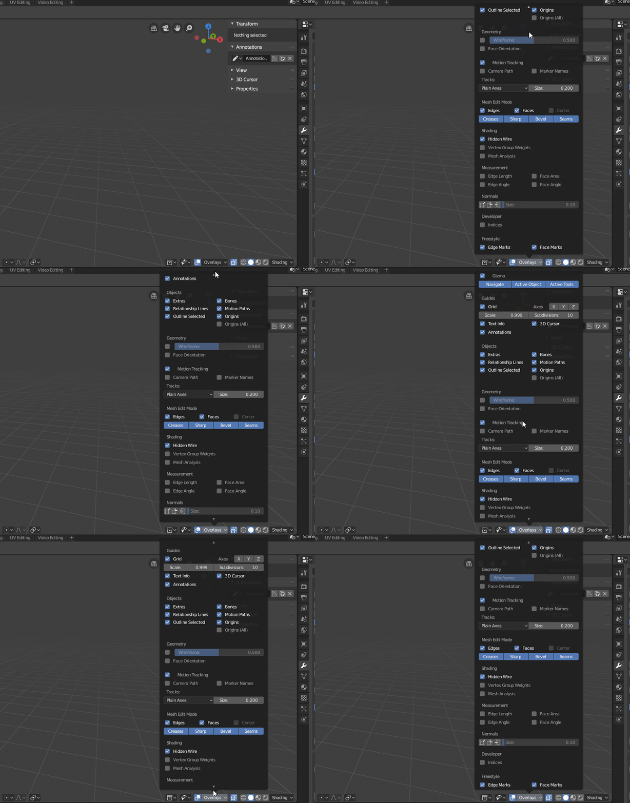
The idea here is that each section will be collapsible. Those sections are in fact already separate panels, you just can’t open or close them yet. But thanks for the reminder. Hopefully there will be time for a few more rounds of UI fixes before release.
I was thinking maybe it would make sense to split this into two similar panels something like Viewport Overlays and maybe Object Overlays or something similar. It seems most options are either more oriented to objects like Objects, Geometry, Mesh Edit Mode, Normals or more oriented to the viewport functions like Gizmo, Guides, Motion Tracking… Gizmo has more options hidden in the User Preferences as well. Maybe they could fit there if there were two panels instead of one. Just a thought. To be honest I don’t have an issue with this personally at all, I just think of all those people talking about Blender’s UI being uncluttered and cleaned in this brand new version and picture their faces when they stumble upon this bit of the new UI…
I thought of this a couple of weeks ago! yes!, a full set of hotkeys for animation yay!
I think it also would give Workspaces more weight, and no mater what task I do I can be quick doing so.
This is already technically possible, but we deliberately chose not to go down this road with the default keymap. Here’s why:
Currently we have already have it so the keymap is overridden in four layers. Now we have:
- Tool
- Mode
- Editor
- Window
Users have to keep track of all these things that can change the keymap. It’s already a lot - more than most apps, which just have:
- Tool
- Mode
(and that’s at most! Some pro apps have basically no layers - shortcuts just always work)
We considered adding shortcuts that also depend on the workspace, which would make it:
- Tool
- Mode
- Editor
- Workspace
- Window
I think this is too many layers for most users to keep track of. Users are likely to be confused if the keyboard changes when you are in a different workspace.
There’s a lot of theory behind this too. The amount of context the user has to pay attention to, adds to mental burden. Refer to UI theory by the likes of Jef Raskin.
Objectively the current Blender 2.8 GUI is less informative and needs more clicking.
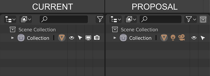
I propose changing the outliner bar from the current version where you have to scroll right to add a new collection. I’ve created a mock up where everything is automatically displayed according to screen size, for example on larger screens the search bar could be responsive and stretch out. This saves confusion for new users that don’t know they need to scroll right to add a new collection and saves time for existing users + an overall cleaner layout. Maybe also change the add collection icon to a plus button to make it more intuitive.
In the scene collection I think it would be good if we merge the functions of “hide collection/object in viewport” (eye icon) and “disable collection/object in viewport” (monitor icon) & “disable collection/object from renders” (camera icon) icons into one button while still using the eye icon. That way you can see all the icons in the collections tab visible and streamlines the ui / ux to be a lot more intuitive. Kind of like photoshop one to hide layers and one to lock layers. They basically all do the same thing so might as well combine all the functions together into one icon.
