Hello Blender Development Team,
Hello Pablo,
After I spent some time to analyze and try working with 2.8, I came up with some suggestion, which I want to share with you for any further discussion and hopefully for improvement.
All my comments are with respect to you and to the HUGE work you are doing guys, so this is not a critique but my personal and professional feedback on the current progress of 2.8.
-
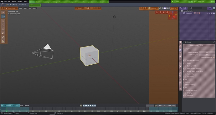
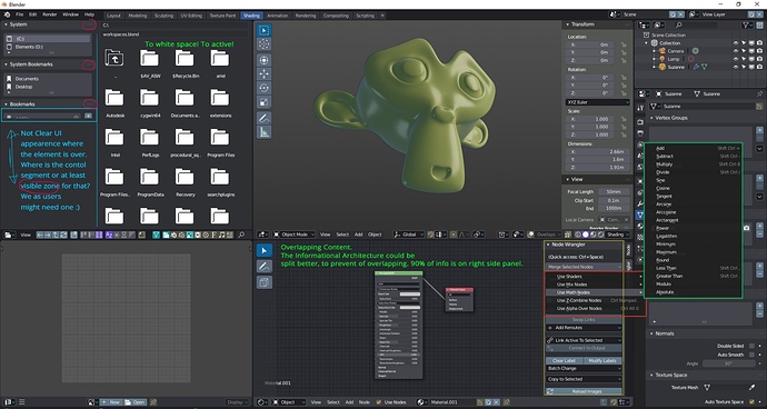
Dynamic UI Density of new 2.8 version. Including dynamic menus/panels/ list/icons with more of 1 option.
-
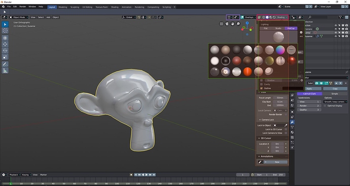
As you can see from here example, the overlapping content is not pleasant thing. Especially when you drive professionally with a software with focus of achieving great results.
-
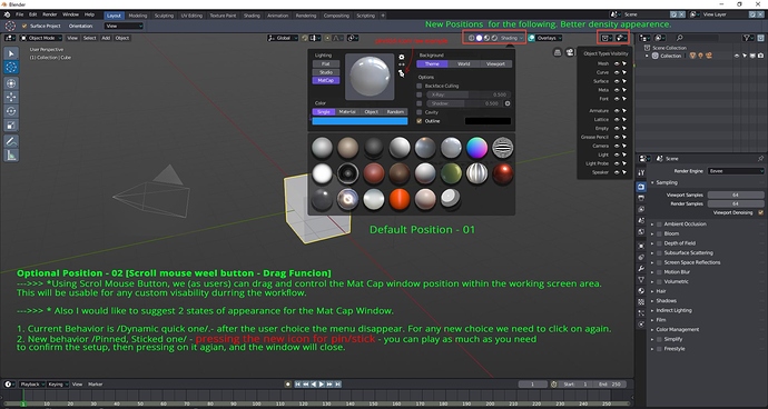
Basically to resolve the problem I create new IA proposal for 2 of the tabs - exchange places of [Shading Tab] with [View-port list appearing Tab]. With this scenario I put more focus on Shading Menus and sub menus. I design new proposal for the appearing because the current one is look not optimal.
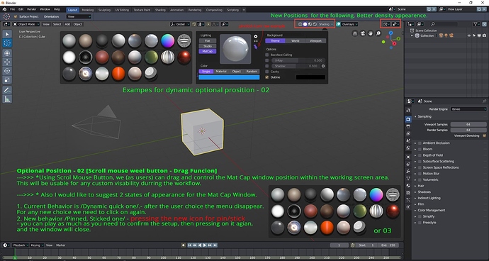
And also I’m presenting a proposal for better appearing on meta-cap menu + sub menus + functional improvements.
! -
Proposal for new functions applied to Main meta cap and any sub-menu with dynamic floating behavior
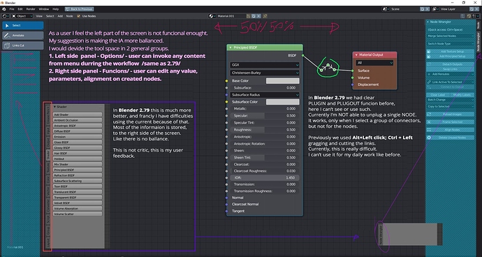
5.New Shading Tab appearance. Again the IA is not balanced and often I’m experiencing overlapping menus, not clear alignment, not readable UI. Therefore my proposals for improvement on the same for the Node Based Shading are /Equalized IA sides → Left - options; Right - values and functions like in Sculpting tab/mode:
6.Old functions which are quite handy but now are missing … or I can’t see them?
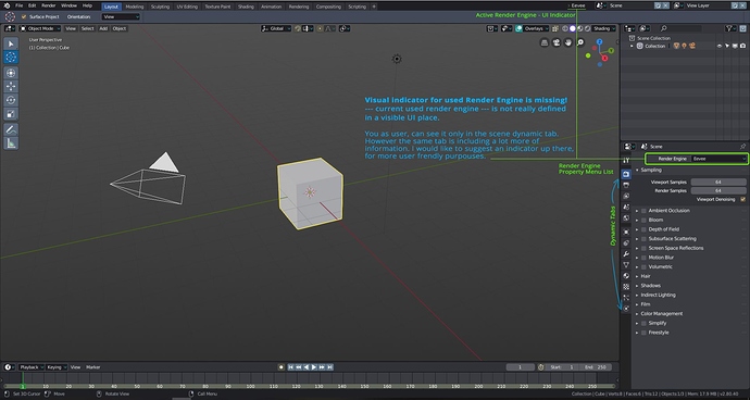
- Last but not least, something I think is super important, this is a visual indicator for the active Render Engine, not in a dynamic scene panel tab, but somewhere visible. Place for, quick eye recognition.
Thank you for you effort!
We are with you! ![]()
