Freeze can mean anything, freeze properties, materials, etc.
Fixed the icons being inverted, thanks for the heads up.
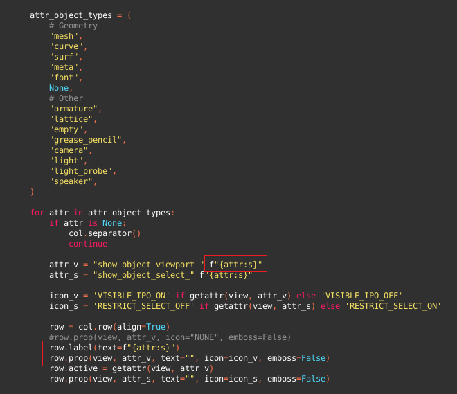
About using icons instead of checkboxes that’s more tricky. This is as far as I got:
Can’t seem to be able to fix the width issue (had to increase the popover size to 8), do you think you can help? You do crazy stuff in your add-on :] This is the simple diff, simply adding an icon to the row.prop.
For the freeze, I mean, freeze the selection, not be able to select the type of object.
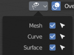
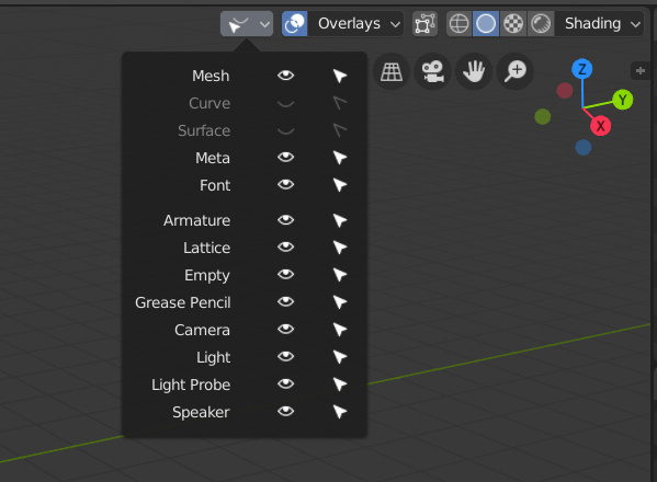
The current icon.
Replace the icon with a freeze icon and use the current icon for a selection button.
Like that we will be able to show/hide, select, freeze the objects by type.
I wanted to select all the visible lights to place them into a collection, but there is no button for that in Blender.
That’s why that could be really useful to have the option directly in this popover.
Yes. The Normals pane should be open by default and preferably moved to the top of the Data properties tab. These settings are touched with almost every object I create or import into Blender. I also feel like autosmooth and doublesided are going to be used before anything else in this editor by most ArchViz and new users.
Someone can throw a rock at me for a tangent and it is a can of worms in terms of conservationism, but there seems to be somewhat of a problem and I haven’t seen a more efficient solution anywhere as of yet. How about trying to improve drop-down lists (Modifier selection in particular) a little bit?
Namely - it is a common problem, that a list selection has more items than there are potential hotkeys, not mentioning first letters of list items repeating, resulting in need of individual keys to remember.
A solution I’ve seen proven fast and efficient is instead of instant hotkey execution, cycling the selection focus through items beginning with the letter pressed and using enter to execute.
At a glance it may seem like a complication - clicking drop down, pressing “S” four times to get focus to Subsurface for example, then pressing enter. But in practice it requires next to nothing of precious concentration and best of all - being a strong mnemonic, in just a couple of cycles gets into muscle memory without conscious effort, becoming almost as fast as unique hotkeys, while being much more universal, quicker to adapt and future maintenance free. If proven working, this might some day speed up other types of selection lists too.
Edit: existing keys can be preserved through +Ctrl, or vice versa.
Sorry if this is completely out of place, but it’s a too specific of a feature to post anywhere else. Thanks.
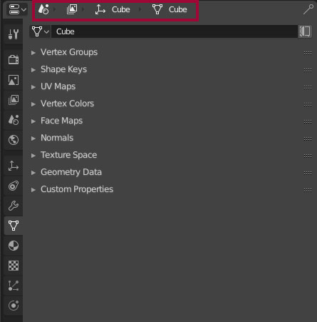
Hi - I’m not sure if this was proposed before (I know the tooltips part of this was in “Papercuts”) or is planned but my big problem with the Properties is that it can happen that I just have no idea where I’m at, what am I looking at.
I’m getting used to the new icons but even with the old ones I don’t want to rely on just an icon (far away now) or a tooltip hovering above said icon to know what tab I’m seeing.
For example where am I now? (Now imagine a first time user asking the same…)
The header does not make much sense for me. As a new user I would have absolutely no idea whats going on there.
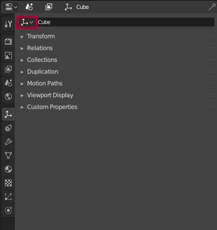
in the object panel is a dropdown menu where I can switch between the objects in my scene. but why? if I change the object in the dropdown, the selection in my scene does not change.
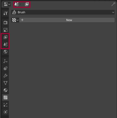
I know the icons are still WIP but the textures tab really confuses me
the naming of the different properties tabs are not consistent. I would always use plural terms instead of singular (materials instead of material…)
maybe the most important one. I know there is a margin between the “general/world settings” and the “object settings” but for me it is still not that obvious that I can change setiings per object and general settings in the same properties panel…
And here are my suggestions how to improve this…(maybe)
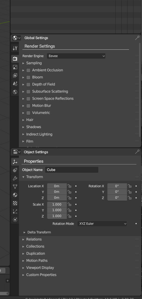
Instead of one properties panel I would split this to two different panels. For example “Global Settings” and “Object Settings”
Then you have two different panels which could look like this:
I would name the panel where I am in (world setting, object settings…) as well as the the current tab and discard this breadcrumb icon header.
Every tab should have its own header, so that I always know in which section I am currently in.
I would also discard this dropdown in the object tab and replace it with the label “object name” so that it is clear that I can rename my object there.
Maybe this does not only make sense for me but also for you.
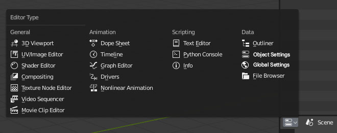
I proposed something similar, but in my idea the header would become the place where the user can switch bteween global/object (2 buttons) instead of opening the full list of editors
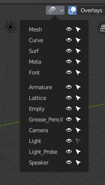
For consistency it would be better to have the eye icon here, instead of the checkbox one:
If you try to specify a different icon in row.prop() though everything gets spaced out a lot, if you go back through my answer you can find Pablo’s post that have a screenshot of what happens.
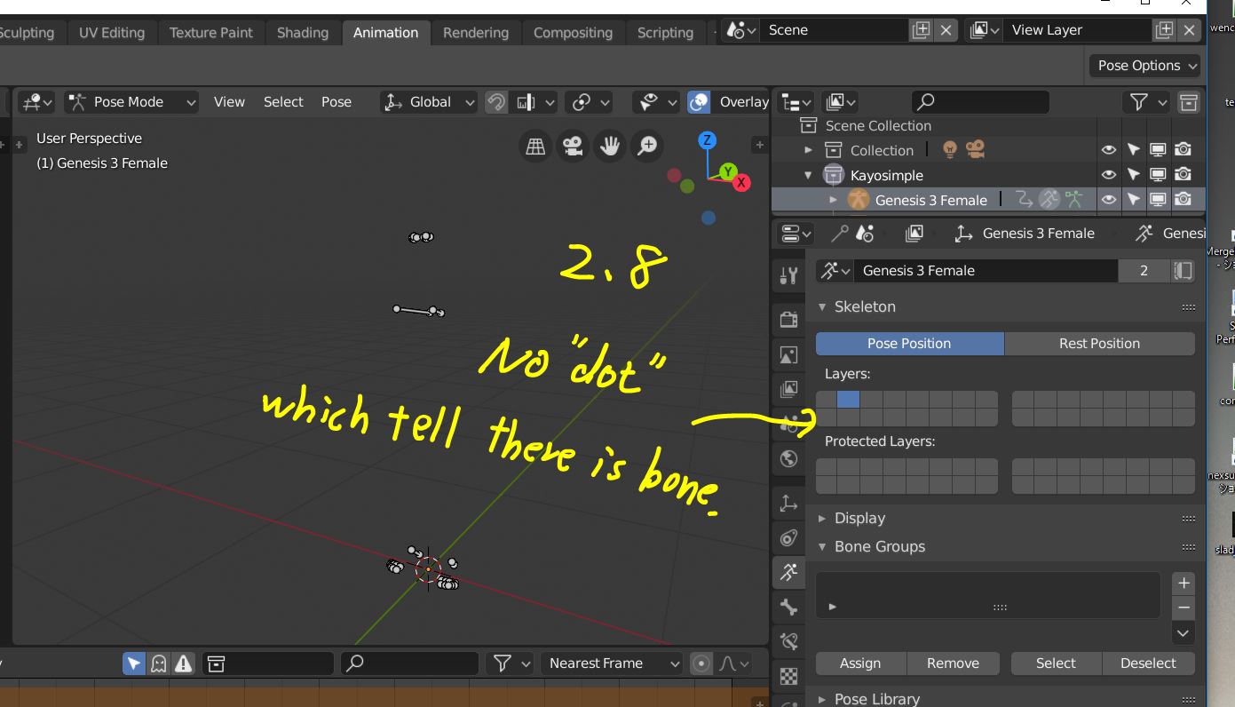
I happend to find problem about current ,property editor>bone layer for armature.
Though bone layer is still there as same as 2.7, but current 2.8 UI seems lost usability which can easy find
which layer include bone. (as same as 2.7 scene layer)
2.8 bone layer, I can not find any “dot” which tell me, which bone layer include bone.
though you may think, you only need to set all bone lyaer as visible (active) first, and check which layer
may include which boen, one by one.
but rig is usually more complex, then we often use bone layer to hide or show with grouping. the 2.7 small dot tell me, at least the layer include bone, or not. ,even though the layer is not active.
but 2.8 bone layer only tell me, which layer is active or not.
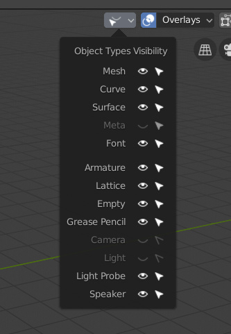
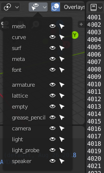
Because it’s not the real label of the object type but the one in attr_object_types (that is lowercase, and contains underscores). In your code by using .title() it solves the lowercase but unfortunately not the underscore.
To get rid of both lowercase and underscore we’d have to use something like: row.label(text=attr.title().replace('_', ' ')) but it’s ugly.
If there was some simple way to get the types of all objects in blender, no one would create by hand a structure like the one above right? . I don’t know where or how obtains the default text with “row.prop(view, attr_v)”
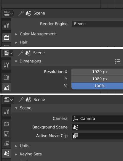
Wy render resolution located in Output Tab?
Render resolution is more important and used more often than Motion Blur or Freestyle or Symplify or several others settings frome Render Tab. Render resolution this is a very important setting for rendering.
sorry for my english


 Hopefully a Python guru can help out how to make this without looping another time or making the code complicated.