Why not just keep it like in 2.79? It worked great.
The only thing that should be added is a button in the editor toolbar for closing the editor, dragging the triangle back might confuse new users (but since it’s used so much, removing the option to drag it will be confusing for old users, keeping both options is better).
I have a few issues with the current design, I’ll try and break them down here.
Tool Shelf
While the new tool shelf fixes a few of the problems in 2.79, it doesn’t provide nearly as much function.
To start with, it completely throws away the secondary tools, keeping only the tools with the simplest hotkeys available. This can be fixed by allowing users to add or remove tools as they please. Another addition I’d like to see are the tabs from 2.79, but with the ability to add more tabs, to allow users to separate their tools rather than have them all in one place.
Secondly, icons with drop down menus should either be opened by clicking the arrow in the bottom-right corner, or have all tools available from the get go (or perhaps have a possibility for both, customisability is one of Blender’s strongest points).
Thirdly, and most importantly, the tool shelf was used for brush settings in the sculpt and painting modes. It now consists only of brushes, and the settings are placed in drop-down menus, slowing down the user. There’s no easy fix for this, which is why I believe the old tool shelf was superior to the new one.
New Horizontal bars
The new top toolbar and bottom project info bar are a huge waste of vertical space.
The top toolbar is left unused most of the time, its only use should be for extra settings that can’t be placed elsewhere, such as the Knife Tool’s “Occlude Geometry” and “Only Selected” settings.
The other tools present in this toolbar (interaction modes and transformation settings) are editor specific, and as a result, should be returned to the editor toolbar.
Nevertheless, the top toolbar has its use, it should just be collapsible like the N and T panels (not only when switching workplaces).
The project info bar takes up precious vertical space and should have a less wasteful way of displaying its information, perhaps it can be displayed in the window’s title bar.
Overlays
Having more control over overlays is great, I would like to suggest adding the option to use different overlays for different shading methods (e.g. removing overlays for rendered mode) and the option to limit the grid floor’s draw distance. The grid floor also seems to fade into objects, which is confusing when using it to measure scale.
A few more things I noticed whilst using 2.8:
The new interaction mode hotkeys take the place of the old hotkeys for switching sculpt brushes.
The T and N panels no longer push aside the 3D view when scaled, forcing the user to move around the scene every time they are scaled. They also fade in and out when activated/deactivated, this, in my opinion, looks worse (it also takes around half a second to appear, while the old method doesn’t).
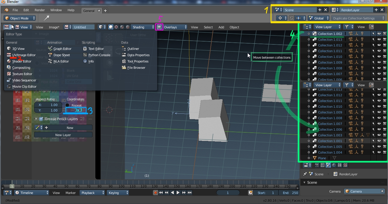
The Editor Toolbar is now moved to the top in most editors, while it is possible to easily move it down, it no longer flips the Editor Type menu, causing the 3D view to be farthest away from the cursor, rather than closest. I would also like to suggest having all Editor Toolbars at the same side by default, (right now some are at the top while others are at the bottom), as well as the ability to move the Toolbar around by dragging it (in a similar manner to Windows’ Taskbar).
The Stereoscopy tick box in the Render Properties Editor opens up options in the Output tab, confusing the user. It might be better to move these settings to the Stereoscopy tab.
The small triangles in the editor corners and the arrows in the sliders are gone, and it’s up to the user to find out where they are (or if they even exist).
Background Images, Matcap and the Render Active Scene buttons are missing from Cycles, I assume these are temporary changes, though.
The renderer now open the rendered image in a new window, which, in my opinion, is worse, perhaps you can allow users to select between both methods (I’m fairly certain this was done in an earlier build).
I also have a few personal problems with the new UI:
The object outlines are too thick, they look similar to a cartoon character’s outline. They also appear to have a gradient of some sort?
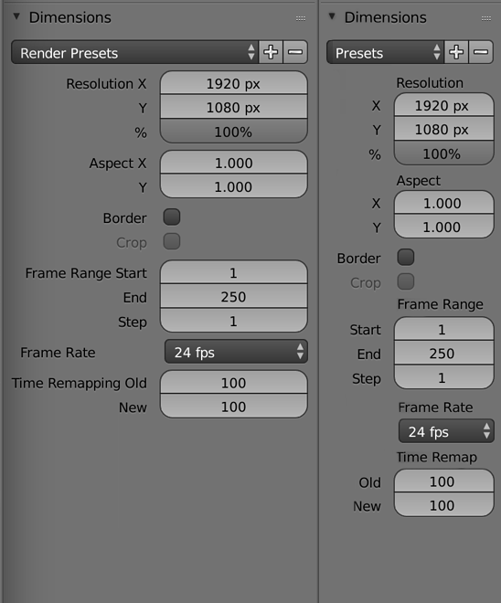
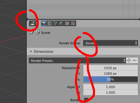
The resolution percentage slider in the Render Properties Editor should have the value written in the right side, not the middle.
Node Editor type is moved to a drop-down menu, which is slower than the buttons from earlier versions.
User Preferences are moved to the Edit menu, which, unlike the User Preferences, is used for project, not global, settings.
I don’t know who is deciding, but they are making very bad decisions by trying to completely change the way they work with blender. We are going to lose speed of work unjustifiably, changing things that nobody was asking for changed. Please listen to the professional sector that we use blender for our daily work.
Hi there, happy to join in. Great work and I hope I can throw in something as a user.
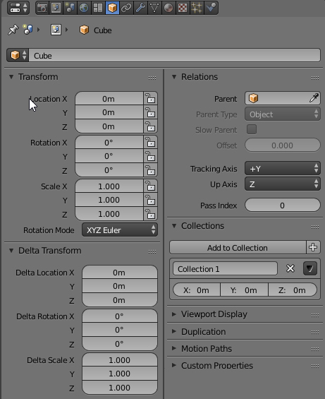
Single column layout: In <2.8 the field description is inside the field together with the value which saved lots of space. In 2.8 the description is in front of the field. Is there a reason for that?
Also: The single column layout is kind of irrelevant on a 4k screen
And: I do agree that as mentioned before that a lot of the interface and shortcut changes are not really helpful for experienced users. Manipulators in the work screen also doesn’t help. It gives a lot of clutter and hitting g to move something is so much easier then clicking on a manipulator on screen for example. I understand it is cool for new users.
The ability to set visibility, select ability per collection is great but we should also have the ability to set these properties per object. I hope this is planned as I was unable to find about it.
1 The new menu of the space bar seems to me frankly redundant and I don’t understand why we have to reinvent the wheel if we already have the Pie Menus.
2 I think it is very important that you can exit in rendering mode by pressing the “z” key to go directly to a wireframe mode and if you press the “z” key again you can go to a solid mode, as this is the expected behavior.
3 I think it’s also important to be able to have a wireframe with transparent, not translucent faces, at least to have that option as well. (as it happens with all the software in the industry).
4 On laptop keyboards, I don’t think numpad emulation is being considered when occupying the number keys in top. Instead I suggest using the F1 to F9 keys… Since this releases the numbers and they are more easily accessible as they are right on the edge of the keyboard without the danger of being able to press other nearby keys by mistake on certain keyboards.
5 The menu containing the popover of the F6 key I think is too hidden at the top right…
@Billrey altough Blender is WIP, we haven´t to stay with the silent blender community thinking that everything is going to take place out as expected dear friend. The opinion during all the code quest development, should not be optional or necessary to contrast opinions creating a GUI more funtional … the collective intelligence of people experienced in Blender who see the progress of our software from the outside, strengthens us all.
Great work! But, guys, please return back spacebar fot search. It’s really weird looking when you press spacebar and there huge list with icons of tools instead of minimalistic and speed search command.
i would like to give you my first feedback from my first impression of 2.8 UI and more.
What I like:
Wireframe (wireframe solid)
Outliners Collections
Better spacing in text (in properties for example)
What i don’t like:
(from the image)
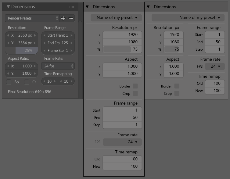
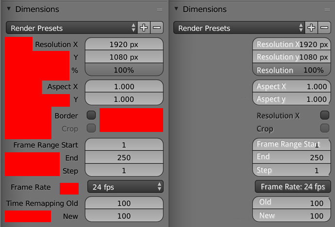
My main issue with the 2.8 UI changes is that, in my opinion, the single-column paradigm is mostly a lateral change from the previous multi column"design.
Yes, in theory there are minor space savings and organizational improvements within the single column design that allow users to work with a much more narrow properties panel than was comfortable in previous versions. However, these benefits very rapidly disappear as you widen your properties panel, leading to quite a lot of totally wasted space running down the left side of the panel.
Of course, this wouldn’t be an issue if we could be sure that users would always want their properties panel to be narrow - but that assumption is totally at odds with other aspects of Blender’s interface design.
Most obviously, the Outliner panel (which, by default, shares an area with the properties panel) is very demanding of horizontal space by nature, especially in light of the new collections systems. Not only is the Outliner a tree structure with many nested (indented) layers of nodes, but it also necessarily shows object names and a list of icons. All of this adds to the Outliner’s demand for horizontal space. In other words, the Outliner “wants to be wide” by design, while the properties panel now “wants to be narrow” because of the single column design. It probably goes without saying that there is some friction in these two designs, but what that really means is that as long as the Outliner and Properties panels share an area by default they’ll never feel quite comfortable and users may feel constantly inclined to adjust them.
In other words, a wide panel doesn’t work well with the single-column Properties but a narrow panel doesn’t work well with the horizontally-demanding Outliner.
At any rate, Blender’s UI is extremely flexible and it’s not really possible to assume that users will always want to view their Properties in a tall and narrow panel. So, ideally, the UI should be more adaptive to both tall-and-skinny and short-and-fat workspace layouts, possibly switching seamlessly between multi-column and single-column layouts depending on the aspect ratio of the panels at any given time.
Yeah not sure about single column for properties especially on ultrawide monitors where that extra horizontal space probably not even worth in exchange for more scrolling it adds.
Further if I keep outliner/collections on top of properties it still going to be wide enough for properties to use more space than single column.
+1 on the flexible column layout.
I came here after seeing Jacques’ video and I think he really nailed it.
Also minor detail, but worth mentioning. Maybe a roundness slider for the division in the UI between the panels?
Right now, turning down all the roundness on the UI elements clashes with the rounded edges of the dividers.
As Alberto said in his reply there are some situations where no space is saved. I know it’s wip though. But I thought of this way of saving blank space in panels. I guess it’s directly discarded because having two texts shown inside one property value box sounds difficult.
Hi, I’ve been reading some posts about improving the UI and I wanted to made one. If you like it give a heart and if you’ve any suggestion leave a comment. Thxs for all. (Made it with Photoshop)