I want to share this video about blender 2.8 feedback. I made a video in spanish but Pablo told it is long, so I go to redo the video impressions in short videos in english to share with community. It’s the first video about new viewport. I hope you like it.
8 Likes
really good video you bring up a lot of good points i hope one of the devs see this.
1 Like

That’s better than nothing, it’s important that something is there to warn you against clicking it. Window division was one thing that threw me off hard when learning Blender, it’s very easy to do it by accident and hard to recover from it without looking it up. Keep the huge arrow overlay on merge, of course.
Now here’s some of my own gripes with 2.8, in no particular order and based on latest:
-
If ctrl+alt+U is unused, why not keep user preferences on it?Something broke the first time I ran this. Disregard. - Spacebar search is one of the best things about Blender. Now the space bar is… “Baby’s first 3D application menu”, is what I’d call it. Big, big waste and fixing what isn’t broken. A hundred "yuck"s to that one.
- Main top menu is just a crippled Info window. Sorry, that’s how it is. I liked being able to turn it off and treat it as any other window. Now its functionality is spread across two different panels, only one optional. And now I can’t turn it off in the main window, or turn it on in a slave window. How does the current tabs thing even work with multiple windows?
Back in 2.7x each window had its own view, and that was it. Now it seems that you’ve added the slave window as a band-aid fix for the menu being duplicated in a “main” window, but that opens its own can of worms. (Which window does the slave “belong” to? What is its role in a workspace? How do I save its window layout?) I think this entire change was a fix for something that wasn’t broken; the Info window provided exactly the same functionality, and back in the day it took me some time to notice that it even was a window at all. Tabs are not an excuse here, you could’ve added tabs to Info as well. - Speaking of tabs, if you want to keep the tabs, consider for a moment that tabs tie the amount of workspaces available to a user to… the screen’s width. Anyway, if you really, really like the idea of tabs so much, then make them behave like tabs: let me reorder them manually instead of sorting them by name. Let me close and open them with the middle mouse button, a classic from tabbed web browsers that many of us are used to.
- Toolbar, oh the lamented toolbar. At the moment things are quite backwards; T-panel (where tool settings normally lived) acts as a toolbar while eating a disproportionate amount of space, meanwhile the horizontal toolbar acts as current tool settings, providing a laughably scant amount of space for it, which, just like the tabs, is woefully dependent on the screen width.
Do you like using several smaller displays instead of a big one? Well too bad, because Blender now officially hates your guts.
The T-panel’s space issue can be fixed by resizing it, which exposes the obvious blunder here; these happy, little user-friendly buttons could totally fit in the top toolbar, and it’s a much more fitting place for them. I’ll get back to this in a moment. - The stub for the new Redo could be even smaller. If I hide the Redo, that means I don’t need it at the moment, and I rarely do. Let me use my screen space as I please, and consider letting me hide it entirely with a hotkey. (which the old T-panel did, but I don’t miss the scrolling and folding. This would be the best of both worlds.)
- The ctrl+tab pie menu… actually, there’s nothing wrong with it, but I’d like some options here. 99 times out of 100 I want the weight paint mode anyway. Hopefully I can bring back the old behavior, and put the pie menu on some other key.
- Scrollbars are too subtle. Why hide them if there’s space reserved for them, and they’re always clickable? Don’t like the size either; you’re saving a few pixels but then all the new buttons and spacing in Properties negate that, by enforcing a minimum width, wasting all that space either way, especially with the new fancy menu layouts. In fact, the only property menus that use space wisely are the ones that haven’t been messed with. New ones just force you to do a whole lot more scrolling.
Blender has already undergone a UI overhaul once, and much of the old stuff had good reasons behind it. I see a lot of change for the sake of change. Slow down. Think about what’s actually broken before fixing it. We can always make a fork that cleans things up, but I’d rather not see it come to that.
And finally, my proposal for the tool-panel fiasco, which I bet is far from original. Return tool settings to the T-panel where they belong, and put the friendly little tool buttons in the top bar, where those belong. Finally, let me customize said top bar like Maya did (now there’s a legit use for a bar like that), and make sure I can kill it without crippling the application. (As it is, it’s almost as if you want to force me to keep it on.)
Next, stop horsing around with the menu/stats and put it back into Info, and add an option in prefs to turn the tab bar back into the old dropdown, where I could put dozens of views Workspaces™ without having to upgrade to a 4K screen. Finally, let me switch between those using Ctrl+arrows like before, as they seem to do nothing useful at all right now.
In short, find an actual use for the toolbar or axe it, and stop messing with the rest, it was never broken.
I’m pretty sure that changing the default navigation to alt+m1,m2,m3 and keeping hotkeys consistent would still do far more to retain new users than trying to imitate a certain someone’s pretty but poorly thought out mockup.
New video review about blender2.8 about the new column layout, the new problems that generate and how to solve it
6 Likes
About handles widgets in Editors corners (sorry if that is still WIP). Old users may know how to locate them. But for new users curved corners only seem eye candy, they will never imagine that there is a handle there at first sight.
2 Likes
Automatic scroll-up after collapsing roll-outs in properties panel:
Hi,
when enough roll-outs are opened, the properties panel becomes scrollable. If you scroll down to the bottom and then start to collapse the roll-outs again, blender automatically moves the UI so that the free space is filled.
I personally think this is a good idea in theory, but in practice the moving roll-outs confuse your view because everything changes position.
I liked it better how the panel in 2.79 stayed where it was until you manually scrolled up. Am I the only one who thinks like that? (Sorry for bad english and the in2.79everythingwasbetter style)
That looks great wevon.
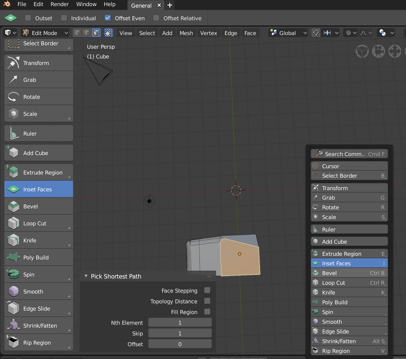
Is there any particular reason why the tools in the T menu don’t show their associated shortcuts but the version pulled up by the spacebar has them all listed? I think that if someone is new to Blender and trying to become less reliant on having to use those icons, they would find the shortcuts essential.
It also seems inconsistent that if you chose to assign a new shortcut it WILL show up but again none of the defaults do.
2 Likes
New videos about blender2.8 feedback this time about interface changes, the topbar and status bar fixed areas and the new t-shelf and spacebar toolbar
7 Likes
Because the shortcuts shown only work when the toolbar is up. Otherwise, the shortcuts don’t bring up the active tool versions. They activate oldschool blender style tools.
Great video Alberto. You convey very well the issues with the property panel in its current state. Nice job.
Admittedly I’m not sure I understand. For example, if I select bevel from the T menu vs. using the ctrl + B shortcut (with or without the menu closed), are you saying they’re not the same tool at that point?
Yes, it’s not the same.
haha I don’t understand the point of this at all. I will say I’m a new user so maybe I’m missing something, but to me the last thing I want is to be reliant on going back to the T menu to select things like rotate or bevel. I’d want to learn the shortcuts as I use them and only ever reference that menu when I need to select something less commonly used, such as the spin tool.
6 Likes
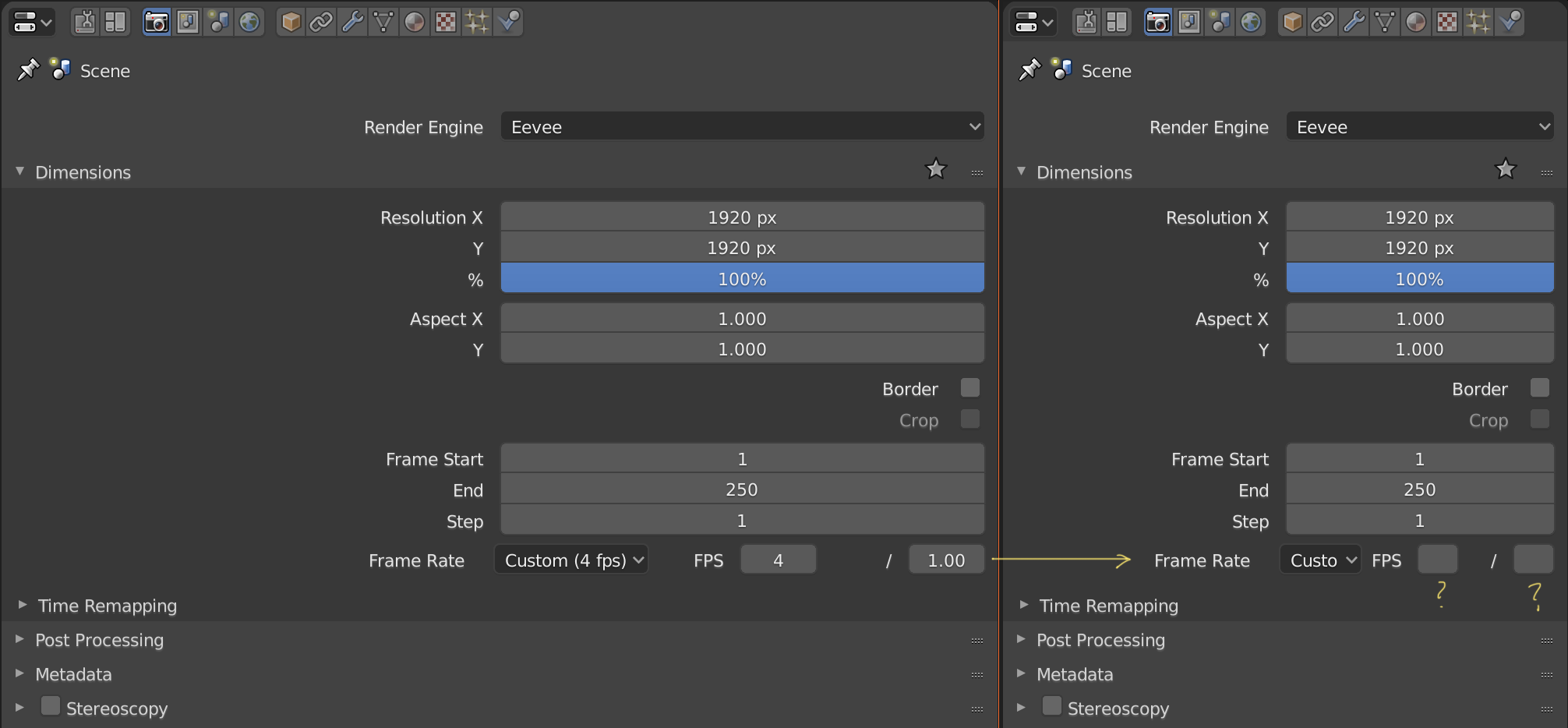
I think that the customizable frame rate is not displayed correctly if the attribute editor is not enlarged
I don’t understand your message perfectly, but yes, it’s the same that I’m telling in the video.
1 Like
Something related to this that I could never understand is why those editors ships by default with an insane narrow width, and hiding important stuff.
I even made a topic about this before.
Enlarging that area is literally what everyone is forced to do everytime they launch blender.
Why this is like that is beyond me…
Hit the b key. You will instantly start beveling selected edges. When you’re done with the bevel operation on those edges, the bevel tool goes away. Click the bevel button on the tool bar (or press space+B) you will have the bevel active tool on your left mouse button. You won’t instantly go into bevel mode on the currently selected edges, but anytime you left click+drag, you will bevel the edge you have selected. If you then select another edge and drag, you will be beveling it. The left button will forever have to bevel tool “attached to it” until you pick another active tool.
1 Like
Ah, I see. That makes sense now. Thanks! That being said, as a new user I found that differentiation completely incomprehensible - I wish the old tools were still on the tool shelf and there was simply a toggle to ‘make selected tool the Active Tool’ for when you want that behaviour over the previous tool system.