The default width of the editors on the right (Outliner and Properties) should be wide enough to reveal all the header options, or at least all the tabs available in the properties editor. Seems odd to have those options cropped and hidden by default.
When opening a new blend file using File → Open…, the option “Load UI” should be disabled by default imo. Most of the time we don’t want changes in the UI everytime we open a new blend file.
When using File → New…, to create a new fresh document, it would be great if it could create the blank document without resetting the current layout.
Since the Properties tabs will be on the side, this is really a problem. The single column layout makes the properties work in a narrower window, but the outliner will need some adjustments to also work with the same width.
Maybe the search bar could be placed on the bottom to fix this?
Imo left is better. Right might be fine when working with a single monitor, but when you have another monitor on the right, they become less accessible.
A solution could be to allow right click → Flip to other side for the Tabs (like the 3D View Header)
It doesn’t matter really. A wider width is a must, it shows everything, and in fact, Blender looks way better that way out of the box…
Have you noticed that increasing the width of those panels is the first thing everyone does when launching Blender?..
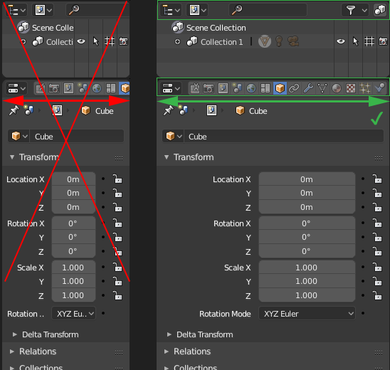
The way it is now, I can’t even see the full collection text in the outliner…
Something needs to be done, unless there’s some internal limitation we don’t know about…
It is in 2.7. In 2.8 there is no need for that because it looks perfectly fine with a single column and you gain 3D Space. The only reason you would still increase the width is because of the header tabs - that will be changed soon and because of the Outliner - that could be solved with some rearrangement of UI items.
That’s my main point, the header options (outliner) an the tabs (properties editor)…
Even with the single column (not a fan btw), it’s impossible to work with the default width… You will never be able to fully read the labels/outliner items etc… Just makes no sense.
While I prefer the tabs vertical like they are changing to (your screenshot), I wonder what about very very old users who prefer the properties on a wider horizontal panel. Preferably full customization is desired, so the option to flip the tabs from vertical to horizontal would be nice, even though I (as most of the userbase) will never flip the tabs to horizontal again. Blender has always regarded itself as a program that allows the interface to be fully customizable to the users content.
I preferred the 3D view and UV editors headers (as all others aside from properties and outliner) to be defaulted to the bottom. It’s always more confortable to move the eyes down than to move them up to look at the headers. But I can live with them being on the top. I certainly won’t be flipping them every time I open a new workspace.
im still for an option of multi-line header for the properties, i tried to hack it in but there seems to be some magic going on with the header that is beyond my scripting capabilities so i was not able to see how that feels. maybe i will do a mock up to see how it would look.
the multi-line (2 lines) could also be applied to the outliner and would solve the issue with different headers and not just tackle the properties and create an other issue in the outliner.