Blender user interface design

that its also happening with the “non-select” icon (the little arrow) in the collections, unselectable with right click but “A” select the objects any way, ¿may be a bug?

By the way : :+1::+1::+1::+1::+1::+1::+1::+1::+1: :fist_right: Groso!

:+1::+1::+1::+1::+1::+1::+1: Much less intrusive Thanks

2 Likes

Not a fan tbh. That gap next to items without checkboxes looks weird. I like it how it is.

It’s strange anyway. The only good/correct way is the same that iOS interface

image

3 Likes

New UI Changes

8-UI-Changes

Looks Awesome…:heart_eyes:

Added an option to Hide Origin also :kissing_heart:

with-origin

4 Likes

Has something like this already been proposed?
I think it has but I can’t find it anymore, so I don’t know if I’ve just dreamed of it…

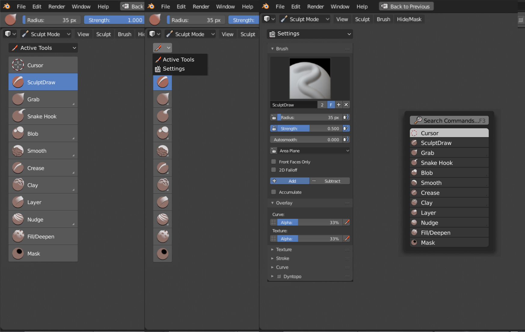
Anyway, I think this could be a compromise for toolbar and tool settings, that probably are still the most controversial things in 2.8.
While keeping everything quite simple, without tons of tabs in the toolbar, it would allow to access the tool settings tab in any situation, also when the 3d view editor is maximised or in full screen mode.

I know that there’s a logic fallacy in this for, if the topbar is hidden, you would theoretically need to first select a tool and then switch to the settings, but active tools are always available pressing space.

So, basically this would define two completely different workflows, a default one with active tools in the T panel + topbar, the other “more professional” so to say, with active tools if needed selected with space, and tool settings in the T panel.

10 Likes

what if Eyeview-objects-pop-over-ch

2 Likes

Indeed, I think that’s what they will do if we look at the top icon.

1 Like

This is a great idea and that will help working on full screen.

If you want to have settings next to the tool, just put it on the left… much less clicks…

Could we have an option change the roundness of the outline?

This is the only one we cannot change right now and if we use thick options, we have that full unwanted rounded corner.

8 Likes

Man I love you ! :heart::heart::heart:

1 Like

In fact I can imaging putting the outliner in it, like that we can work in full screen and call the outline with T and maybe with something like shift + Tab we could switch editor.

I really like this idea ! @pablovazquez what do you think about that?

1 Like

Really cool solution!

And I can think about another solution, which is to use the N-panel (Sidebar) to house the Tool properties. The sidebar has a lot of options that could easily be rearranged without hindering the workflow. Those options were rarely used anyways. Tools settings though are used all the time.

This is the rearrangement that I can think of:

And this would be the interface with the Tools Properties on the sidebar (and the rest rearranged):

If this idea is of anyone’s interest, please leave a :heart: so that the devs take into consideration :hugs:

8 Likes

Agree but not with the idea of turning the “propertie region” directly into the “tools shelf” as is, it has potencial to be more practical than that.
The idea of @a.monti (with the selection menu ) was also aligned with some ideas that where mentioned previously usable by add ons and had a lot of potencial.

Not sure about:

Green: That could easily be with view types on the header, at the beginning of the week where together and the eye icon or camera can represent both, camera view properties and view by type, saves an icon space and that would put also all view, filters, overlays, rendering and shading close together with navigation tools, really nice pack.
one thing missing from this idea its the quad view menu, ¿would that go in the same popover of the camera?
image

Red: always though that, but also its shown to be practical to have that data there or at least in a easy to view area. In practice works fine.

However this idea looks good from a user point of view, as long as some interesting is think about the Properties region.

1 Like

This is killing me too… Hit me if the solution arrives… :wink:

Hi Guys, Inspired by some unexpected insomnia, thought I’ll try work on a mock-up for the Shading Panel Pop-up menu. :slight_smile: Not sure if it’s a worthy effort but thought I’d give it a try. Let me know what you guys think. And if it’s good then I can try do the same for the Overlays Menu also.

Here’s a small sample. Original on Right, Mockup on Left. (Original: 240px Wide, Mockup: 203px)

Shading_Popover_Mockup

@pablovazquez Hope it’s worth you guy’s time. Please let me know what ya’ll think about it. And if you need a PSD for reference I can send it over. Sorry if this is a Big F’ing Mess to Look At. :slight_smile:

Gonna take a small nap and then hoping to tweak the width a little bit. About 15px more so buttons & sliders will scale a bit better with bigger screens. Thanks to @TheRedWaxPolice for the insight, :wink:

Since I’m a new user here it won’t allow me to post more than 1 image. Didn’t wanna spam this thread image posts. So here’s my discussion about same on BlenderArtist’s Forum. :sunglasses:

BA - Shading Popover Mockup

5 Likes

Hi to all, I want to show you a review of blender2.8 interface that I made. The video is in spanish, sorry, but I wanted to make a review in my native language. Anyway you can put captions in your language.

2 Likes

I’d also prefer this kind of layout, the new one seems quite chaotic to me, especially when Cavity is active.
There would be a loss in width for the sliders, but those are not properties for which you need that much precision (and one can always press shift to be more accurate).

It will be great if in datablock selector, blocks that are linked to a selected object would be allocated to a separate group, so that they can be quickly found. For example like this:

path945