Lot of characters & pictures. Sorry for that but I can’t speak briefly. Also sorry for all the pictures at links. Website say that it was too much images in post for such peasant like me, images is too big … bla bla.
At first time buttons was implemented - old Tool Shelf was absolutely replaced by " Button Shelf " and Top Stripe with settings. I find it uncomfortable from the beginning. But time is go. Then developers take back old Tool Shelf as part of Properties window… I look at all this, try to work with such UI configuration. I really don’t like feelings of working with current 2.8 UI scheme. In compare to 2.79 it feels not same efficient.
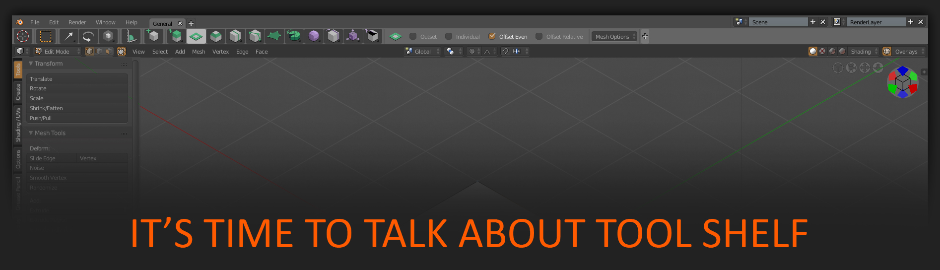
But let’s check what a difference.
2.79 Tool Shelf
- Quick to show hide by " T " key.
- If it need just to check some mode setting - just " T " to show, take a look, " T " to hide.
- Tabs save its expand state. When you press " T " you at one time see all u need.
- If talk about buttons - it has lot of space & hold tons of them. What i need, what I want as a professional.
- It was a part of viewport and it can be transparent so it don’t block view, don’t eat workspace.
- It has cool vertical tabs for addons and other stuff.
- All thisgs described above - maximum fast, handy, efficient. Work good, work fast & do my best with this Tollshelf.
2.8 New UI
- Quick to access by " T " Tol Shelf with all I need replaced by buttons I don’t need. Believe me - no one professional need… Never… We use hotkeys & PIEs. Am I wrong?
- And where is now our settings to set it, to check it? Their inside tiny stripe what most of time in Edit shown emptyness …
https://i.imgur.com/zuUAs7X.jpg In all other modes - contain settings. But !!! - But to just check this settings now it need to go up, point and click on button. And it show only one part of settings.
- When user have few brushes with different settings - to check is it all right he has to go and click to look inside when he switch brushes. Each time he switch. It sounds like downgrade, it feels like downgrade - it was downgrade.
- Also this stripe can’ be hide/shown by some key. When you go to Edit mode and it show " nothing you have to hold it on your workspace … this " nothing ". Or go and hide by mouse and than again show by mouse.
- Then guys understand that it’s all worse than before and bring back good old Tool Shelf ( I believe ). As part of Properties… But !!!
- But it’s no longer transparent part of viewport! No longer can be quick show/hide by hotkey! It was no longer same good, handy and efficient as in 2.79! It just eat my workspace… https://i.imgur.com/YiLeOdq.jpg
- Where now addons tabs???
And you known what? I feel absolutely f*** up with all this moves… I feell that it is not Blender I love, not Blender I want to work with. There are lot of amazing changes already implemented in 2.8 and I’m very excited of it all. I watch all the videos of new in 2.8. But this useless movement with Tool Shelf haunts me… I can’t eat. I can’t sleep ( of course a joke but… ).
But there is no point to criticize if there is nothing to offer?
So i spend some time by thinking how it can be done to make pleasure everyone. Also those who want all this buttons and etc… I propose for conception of two variation of same things in UI but represented in two ways.
Time to share it.
" Compact " Tool shelf ( stripe + buttons ) for all who want it. For all who just like it. Want to see his Blender this way looked. Maybe for some newcomers for easy learning. Maybe for some disabled for easier using, we must remember them too. Also I represent how current " Button " system can be improved in it’s functionality.
" Advanced ". For me. For other who want to see workspace free from extra stuff with same efficiency as in 2.7X. Who need to be fast and do his best. For those who need " quick to access hold all settings what needed transparent as part of viewport mighty old good " Tool Shelf. Not as a part of Properties. Not as a Stripe… And of course on " T " button. Just let me hide this stripe, this buttons and never occupy my workspace with all that stuff.
Also maybe it is reasonable to add hotkey to show/hide this stripe also - some Alt + T?
Here is " Compact " button system image. https://i.imgur.com/edcCONp.jpg
Here images of different Modes with " Compact " layout & 2.79 Toll Shelf together.
Edit https://i.imgur.com/YZLFBxB.jpg
Sculpt https://i.imgur.com/DaVJhDN.jpg
Texture paint https://i.imgur.com/kCg8ZhJ.jpg
Vertex paint https://i.imgur.com/KdciJ3O.jpg
Weight paint https://i.imgur.com/We6IFjI.jpg
If all this " proposals " is bullshit - say it straight!!! I want to see some feedback.
And of course I made a lot of mistakes in words … English is not my native language))) But I try to do my best.