I propose changing the outliner bar from the current version where you have to scroll right to add a new collection. I’ve created a mock up where everything is automatically displayed according to screen size, for example on larger screens the search bar could be responsive and stretch out. This saves confusion for new users that don’t know they need to scroll right to add a new collection and saves time for existing users + an overall cleaner layout. Maybe also change the add collection icon to a plus button to make it more intuitive.
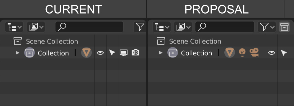
In the scene collection I think it would be good if we merge the functions of “hide collection/object in viewport” (eye icon) and “disable collection/object in viewport” (monitor icon) & “disable collection/object from renders” (camera icon) icons into one button while still using the eye icon. That way you can see all the icons in the collections tab visible and streamlines the ui / ux to be a lot more intuitive. Kind of like photoshop one to hide layers and one to lock layers. They basically all do the same thing so might as well combine all the functions together into one icon.