UV Editing workspace defaults to solid mode… like… what? 
2 Likes
Use case is anything you do in the outliner whilst filtering the view to ‘selected’.
I’m old-fashioned and I like minimal view, I’ve never used interactive navigation because I’m used to using shortcuts, so I just hid it ![]()
lol I did not notice that, it disappears because it is associated with the 3d view options strip, and it should not work like that.
Actually it is really hard to follow this tiny row on the left top corner with flickering numbers so I never look at it though. It is need a better approach.
1 Like
I visually I’m used to it, I’m used to the colors of the axes … so I find it useful, but yes, it should work without these little problems
There was a Gizmo Design proposal which might give better usability, but it archived.
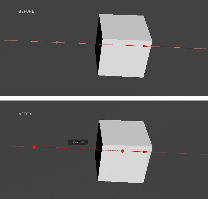
The visible arrow while moving (top image) was eventually added as I remember but was removed shortly. Any thoughts on this papercut @billrey? You are working on tool system right now as I can see through task updates.
15 Likes
no, maybe it was not archived, but subdivided into small tasks
It seems Move Tool Todo has similar task, but previous one looks better in terms of eye catching. May be make it also thicker.
“Currently, distances are not well communicated while dragging, only the axis. We can make it much clearer how far you’ve moved your item, like so:”
more generally, I’m a big fan of moi 3d, so I hope one day also blender has a lot more visual aids during modeling and measurements …
2 Likes
Been away for a bit and come back to this… D:
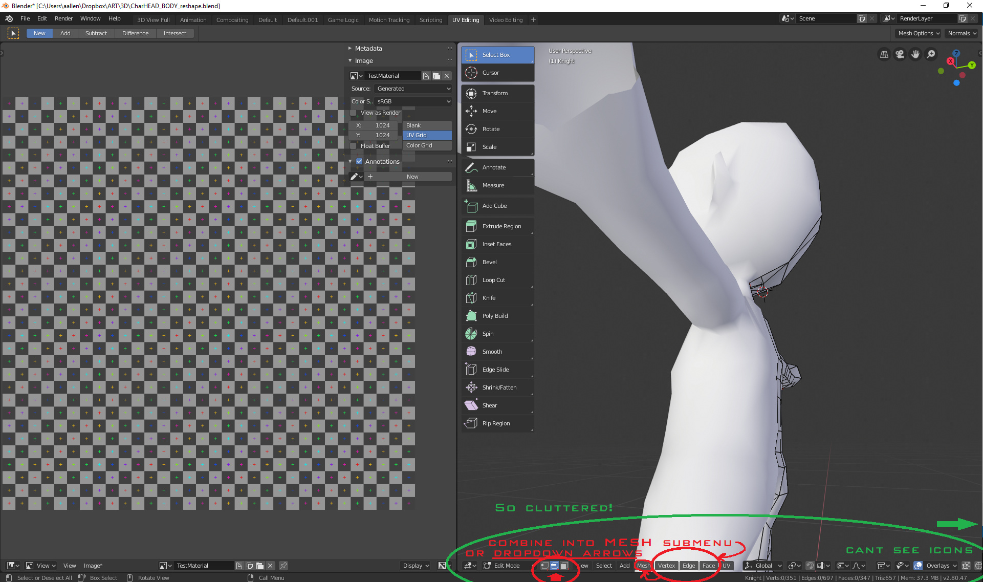
Two issues:
-
Bottom bar has SO MUCH VISUAL CLUTTER!! – it is impossible to use in a standard 1920 resolution across 2 panes (i.e. when UV editing), plus when combined with the default view and timeline area, it just creates giant bowls of “button-soup” that easily overwhelm the new-user.
-
There are tons of menus across the bottom that could be combined into one “Mesh” menu – BUT – if you want to retain the one-click popup for each vert/edge/face menu (I like that btw), give a dropdown arrow (or shortcut modifier key) beside each respective “mode” button that lets it popup each respective modeling menu. Those are highly-unused real-estate for highly-specialized features. Why not use them?
3 Likes
Did you try the “Collapse Menus” option in the header?
1 Like
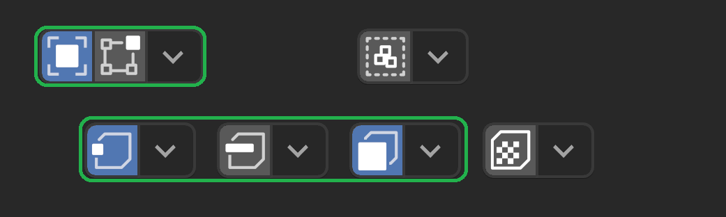
I was playing around with a very similar idea earlier but in the end thought it was a bit impracticable and non-obvious. But here was my mockups. Each of the following (obviously) includes a shortcut button or two, followed by an associated “more options” menu…
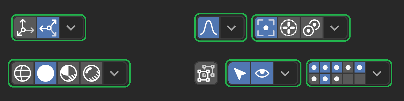
Interaction mode, view menu (button toggles sidebar), select menu (select all), add, mesh, vertex, edge, face, uv (button calls “unwrap”):
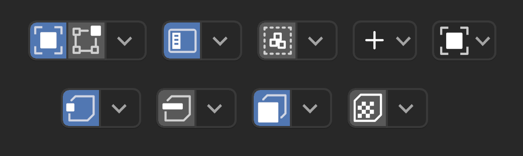
Similarly, transform orientation, snapping, proportional edit, pivot, shading, overlays, etc
3 Likes
Here is a term that defines the pre-2.80 era of Blender:
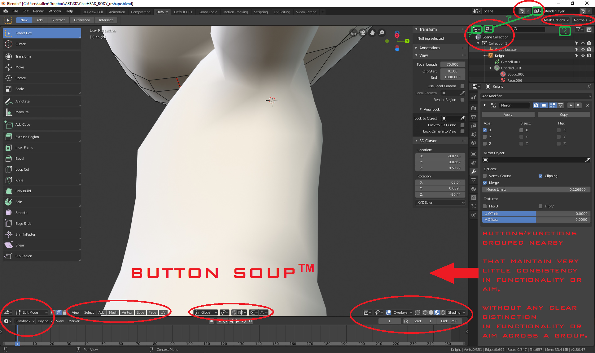
Button Soup™
Buttons/functions grouped (visually) nearby that maintain little to no consistency in functionality or aim,
without any clear distinction (in functionality or aim) across major portions of said group.
–
Why?
Blender’s UI is still teetering, threatening to fall back toward its original design… so I felt a PSA to clearly define the “papercut” phenomenon in a single term was in order to help define our UI issues more clearly, without having to carefully explain ourselves (and our reasoning) each time.
4 Likes
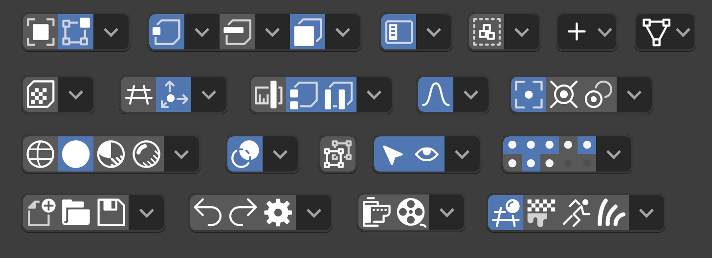
Those bottom buttons are as grouped as they could reasonably be though.
High level stuff, modes.
Menus.
Manipulators and edit effects.
Visibility and display.
man Button Soup™ is hilarious 
1 Like
It’s fair to think that – but remember – there are many ways to approach a problem – and just because you can’t see a solution, it doesn’t mean there is no solution.
_
UI has come a long way – it just needs creative thinking behind it – especially when (visual) grouping is an issue.
Basic tabs, dynamic groups, dynamic buttons/labels with dynamic grouping – Blender has them all – and all of these are great ideas – and all of these are related to different ways of grouping things together (visually) – in more consistent ways – while being visually-distinct and diverse across the interface.
By being more diverse (while also being more practical with where/how we represent our groups across the interface), we can eliminate the visual clutter while also adding better readability and practical application to the functionality – all at the same time.
You want to things behind tabs, menus, and other crap?
The stuff that isn’t behind menus is for the most part useful information to have at hand, or useful functions to have at-hand.
I don’t need to see a solution, because there isn’t a major problem. There is logical grouping to the buttons in the header.
“Visual clutter” is just another way of dumbing down an interface for no reason other than aesthetics, if you’re not paying attention to them, those buttons aren’t distracting, and if you want a less cluttered workspace, work in fullscreen mode or collapse the header and use shortcuts.
as I pointed out several times, I think the whole blender interface, because of the inevitable nature of adding functionality must become much more contextual and predictive depending on the work areas
1 Like
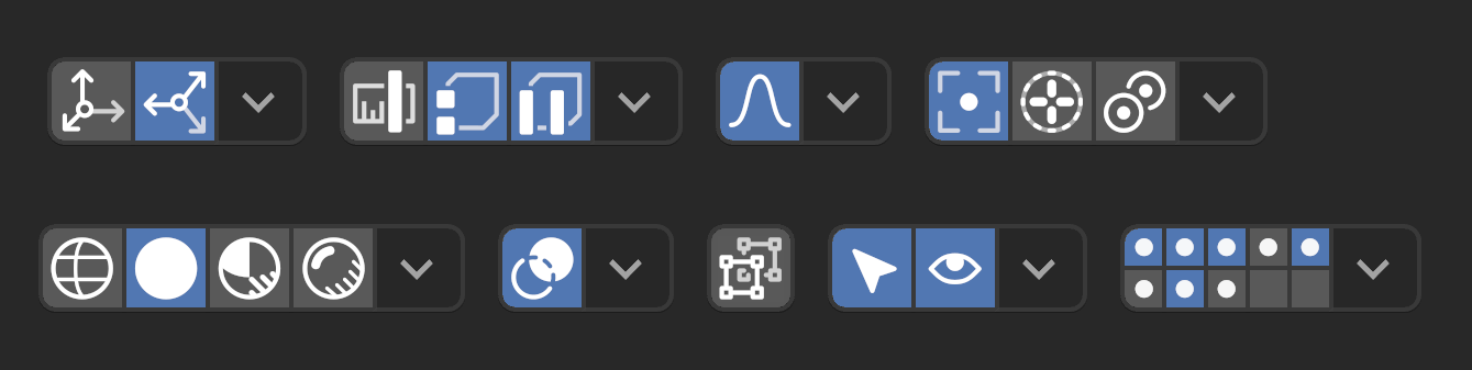
See below – I got rid of the ones that were very hard to understand, but left the ones that worked well (highlighted in green) and those I wasn’t sure about:
These major ones highlighted in green, though not as compact, are much more clear and practical. I think they work better if they had a border drawn around them, while lesser “grouped” functionality should be borderless:
Also, these look great too:
1 Like
Thanks!
Obviously the point of the (abandoned) exercise was to see if all the interface elements could be done in a minimal way that doesn’t use text but still allows less clicks to get to most-used functionality. In the end I don’t think it is clear enough. Just too obscure and non Blender-like. But still a fun exercise regardless…
3 Likes