Blender UI paper cuts

  1. When we have many layers and their order is constantly changing, it would be convenient to have a hint which layer has which number.
    Perhaps by hovering the mouse over the outliner or permanently (or optional). But it would be easier to enable and disable the visibility of the desired layers using the keyboard.

blenderoutliner

  1. Why removed the ability to disable the visibility of the layer from the keyboard? It is very uncomfortable.

  2. I think it still is necessary to synchronize the hotkeys when migrating objects on layers/collections and when you activate these collections. For example, now [M] > [1] moves objects to the root collection, but [1] activates the first collection from the list. It’s confusing.
    To transfer objects to the root collection, you can use [M] > [~]. This can be a solution.

3 Likes

Not at all antagonistic, are you?
But the answer to your question is a solid NO, I don’t want “to things behind tabs, menus, and other crap.”

But you agree that there is a problem – no matter how “major” it is.

How do you propose to know my reason is “aesthetics” – and how do you propose to know that is the only reason that anyone would want to eliminate visual clutter from an interface?

Apparently there is a misconception in your assumptions:

Most importantly – one does NOT have to “remove”, “hide”, or “obscure” an option from the interface in any way to eliminate “visual clutter” – other options exist.

There are plenty of examples of visual-clutter being removed from the interface without sacrificing usability for “aesthetics” only. But I won’t go into these because…

However – that’s a copout for me as much as it is for you.
__

Honestly, if you’ve ever cleaned your room, the same principle of eliminating visual-clutter applies – One doesn’t just go around throwing things into containers or hiding messy clothes in your drawers/closets just to make the room “appear” clean – You’ve got to use your room too. This method of “cleaning” does nothing but makes that process that much harder.
Even if you don’t clean it “properly”, and just fold up clothes and arrange things less haphazardly, a folded shirt on the foot of your bed is much less “visually cluttered” than an unfolded one – even if it is not put away in a drawer. More purposely-arranged things always look “cleaner” than haphazard arrangements.

Yes, things should still be in a place that makes sense – but the foot of the bed is a good (practical) place for a shirt to sit – if you are likely to wear it that day.

A drawer on the other hand is a common place to find clothes when you want them, but don’t need them handy. But having too many dressers or drawers can be just as big of a problem – What you really need is a closet or an armoire (with some hangers) so you can pop it open and just pluck a few shirts/pants to fit the occasion.

In contrast, a messy shirt on your bed indicates you could care less about aesthetics or practicality – you really just want to have your stuff wherever and whenever you want it, but you never realize that you end up struggling with both. This is because you’ve grown too comfortable (and blind) to the “visual clutter” and fail to see it is indeed still a problem and makes your life (and others’ lives when they have to see/deal with the clutter too) feel – and function – like crap.

Don’t believe the lies – It’s the little things in life. The little things. They matter. Even in UI.
__

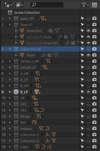
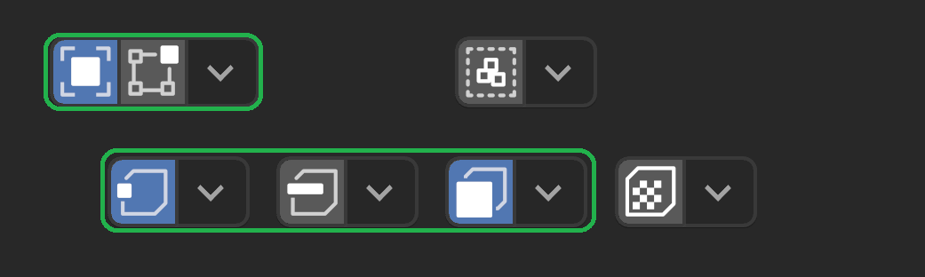
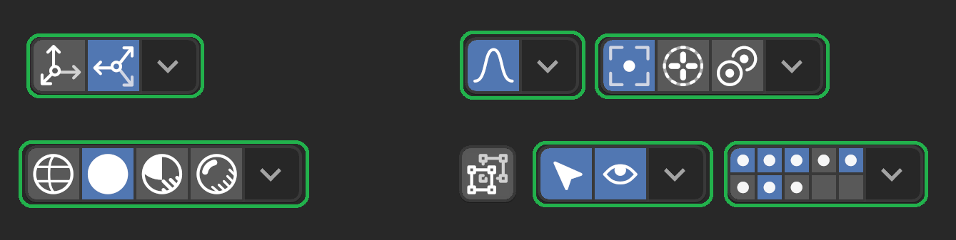
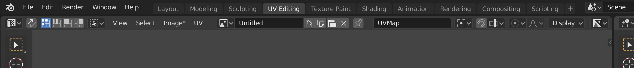
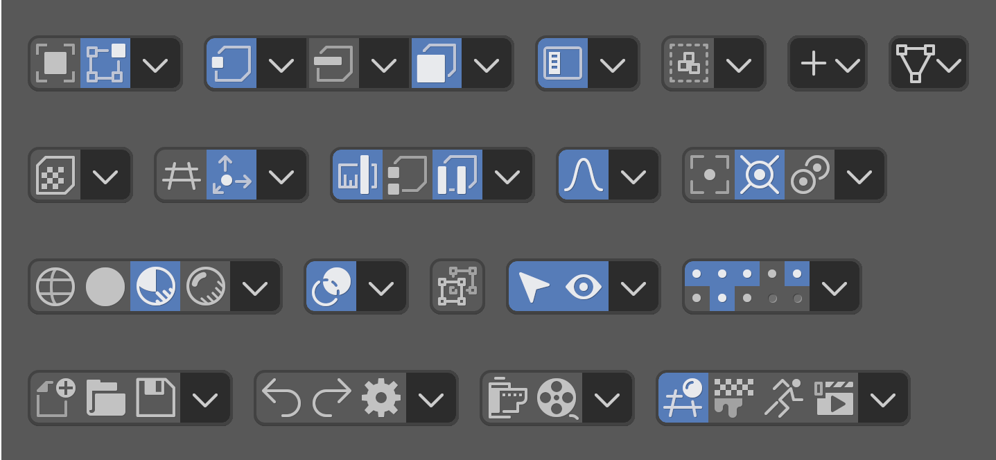
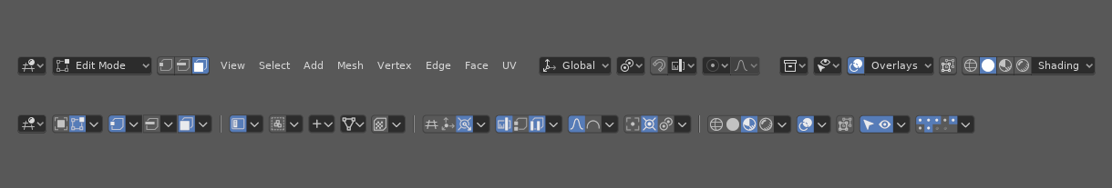
And while, yes, “Button Soup™” is a problem –

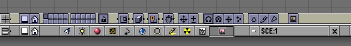
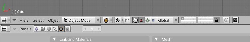
– it, as well as “Visual Clutter” can be fixed (practically) with creative approaches like @Harleya’s:
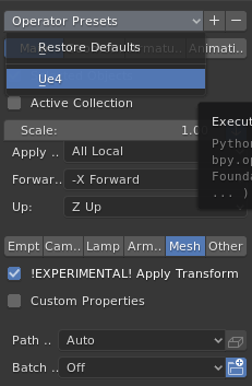

and here:

1 Like

What happened to automerge verts in 2.8? There used to be an icon in the header of 3dView

It’s in the mesh options popover now. I liked it better in the header but it’s true that it’s getting crowded.

1 Like

Thanks!

On a side note, I did an F3 search for merge, automerge, etc. but it doesn’t come up…

Stop trying to tell me what I think.

The buttons in the header are organised, accessible, and discoverable. @Harleya, the one who made the mockup himself admits it’s too obscure to be useful.

No matter what you do to ‘tidy up’ the header, you’re going to reduce discoverability. Turning the header into a list of random glyphs with no text for context, now that’s actually button soup.

Either way, it’s a header, it’s where buttons and menus go, it’s not clutter to fill the space that’s meant to have buttons with buttons, and it’s barely even filled anyway. You seem to be trying to organise something that’s already organised, by shrinking all of the buttons, that’s not organising, that’s shrinking and obscuring. Either way, over-organisation is a real problem, getting bogged down with making sure everything has a group that makes sense, when things just don’t group together that specifically.

As far as your metaphor of room cleaning goes… Places where work and things get done, are messy, because you need everything to remain at your fingertips. Go visit the workshop of someone who’s working, two minutes in all the benches are covered in tools.

1 Like

Maybe you’re just hungry? Please get yourself a snickers bar because at no point did I tell you what you think.

The messed-up thing here is that I agree with you in my previous reply, but you don’t see that yet because you’re still too busy trying to antagonize me to realize this.

Loads of icons can (not will) kill discoverability (see Button Soup™ post above).
– BUT my argument is that visually-separated groups of icons (with special eye-catching borders around some to “weight” them as more “immediate” icons, interesting spacing between other groups with less-visible borders, and no borders around others which are even less important) actually helps with discoverability. This is mainly true as long as the icons and functional aim of the grouping is clear and functional in the way the user expects based on its appearance, with decent tooltips, and most importantly, that each group actually maintains a visually distinct presence in its location (visual grouping), reinforcing both its form and function in its appearance simultaneously.

Nope. Not organizing – not even “tidying” – but making things clearer by grouping and weighting them (visually) in terms of consistent (or divergent) functionality, overall aim (or subject-matter) of the group, and immediacy of use versus “bread-and-butter” discoverability.

And yet he posted his mockups anyway. Makes me think he saw some merit some of the concepts.
I agree with him – some are not clear enough, but others work very well.
In my edit of his mockup, with the help of grouping the clearer ones based on visual weight discussed above (i.e. with the green borders in my own edits of his work), clarity and discoverability can definitely be improved.

That’s comparing apples and oranges – Blender has hotkeys for everything.

Everything is already at your fingertips.
If you still need to click to accomplish tasks, you’re still discovering your tools and workspace.
For that to work, you always start with your important tools laid out carefully so that you can know (at a glance) where your bread-and-butter tools are – only then do you start to discover in what drawers or on what shelves the more obscure bits and bobs reside.

In a haphazard (messy) workspace – the “discoverability” phase can feel near-impossible.
Without one’s bread-and-butter tools being in a clear and noticeable place at-a-glance, more obscure tools located in the many “general-purpose” areas can easily blend in, and work (and turnaround time) will increase proportional to the increase of visual clutter arising from further messiness as you continue working in such a space…

Ultimately, there is no argument that can reasonably advocate for (or justify) a messy, inconsistent, UI.

I am so happy William is in charge of 2.8 UI. He’s good at what he does and he has quite unified vision of simpler, easier to use Blender. I can’t imagine the horror of Blender 2.8 if no UI dedicated developer/designer was present and people like Antaioz were listened to…

Regarding papercuts, I have one:
I really wish that the last used preset/setup of the export dialog was remembered:
image
It’d save me in a lot of cases where I accidentally export a file with wrong settings, have to realize than and then make the export again. If not saving it with the Blender configuration, then at least save it within the file :slight_smile:

In general, when it comes to UI design, in some places it makes sense to save things globally within software configuration. Such things should be generally in some user preferences window. Blender already does that.

Then there’s another class of parameters, majority of them, which should be saved within the file. Again Blender does that.

Then lastly, in some cases, there are some things that should be always thrown away and reset to default next time they are accessed, but I feel like Blender does that a bit more often than it should :slight_smile:

So I think there are a few more places where it would make sense to remember last settings instead of always throwing them away requiring users to set up same configuration of knobs all over and over again :slight_smile: Save image dialog comes to mind for example.

7 Likes

F3 searches for operators, and this is not an operator (ie something you launch once) but a setting, that’s why. You wouldn’t see x-mirror either for instance.

1 Like

Re: Button Soup™

Let’s look at the Blender UI.

  • The first row contain: icon, menus, then immediately tabs (visually similar to the menu), on the right side there are two bulky complex widgets.
  • The next soup-row: dropdown, buttons, menus, bulky widget, other type dropdown (UVMap in the screenshot), dropdown with text only, dropdown with icon…

Look at Cinema, Maya, Modo, Houdini, any other.

  • all menus and tabs on their own row (this is what the user expects to see)
  • all buttons in the same row have the same type (in most cases), the same size, are lined up
  • there are only two types of items (buttons and dropdown) on the toolbar, this is not the place for widgets and fields
  • much more menu items (which is always easier to find for beginners than a button hidden somewhere in some panel)
4 Likes

Maybe it’s time to rethink and reorganize the 3dview UI taking advantage of a top and a bottom header

3 Likes


I agree that this is not really clear and optimized. there is lot of empty spaces that can be use to a better organization of the tools. Did you ever thought about having separators available in toolbars to separate things ?

Also there is too much dropdown menus (I don’t like them sometimes), their count could be reduced by “exploding” them to individual buttons (at least the most used ones). Having direct access to the eyes and the mouse to the most used ones can improve a lot the workflow imo. (Pivot Point Snapping, Transform Orientation,etc…)

Maybe also the transform location/rotation and the cursor position should be part of the 3D View.

1 Like

TopBar/Header from my pov

Yes, much too obscure. It was just a design exercise. But that can be a fun and useful thing to do. Without going through the motions sometimes it can be difficult to really see what works and what doesn’t. And examining why things don’t work can be very important.

For that particular mockup, I personally only liked two things. I think we are safe to show the current “shading” and “overlays” widgets without the text - the context around them make it clear what they do so the text is unnecessary.

But I also like the thought of promoting some of the most used/recent items to the top level, as shown with transform orientations, snapping, pivot point. It seems like a nice idea to make your last selected items available with a single click. But we don’t have a lot of available space to do this at the moment.

The show/hide collections widget looks cool, but mostly in a nostalgic way. I also like the look of the grouped icons when the separating lines are removed - it eliminates some of the visual clutter.

1 Like

translate

you do not imagine how much I would like to see this associated with the new collections …
in a new guise:

  • “the move” in a little buttons would move the list, also merge a collection if one already exist in the list …

  • simply by pressing on a empty small button, it creates a new empty collection/list (and displays only what will be created, as in logic with the old layer method) …

  • it is show simply the list of the first 10 collections and obviously the down arrow shows the list of collection as it is already now …

4 Likes

For anyone curious, following is a comparison between current 3D Editor in Edit mode, versus the earlier mockup. At 1X scale, so forgive the bluriness.

It takes up a bit less space, despite gaining one-click access to many often-used settings. But it is also a lot less clear - they definitely need those “instant help hint popups.” LOL. And I find that although the current mix of menu types is messy, the changes in type create waypoints that (accidentally) group the sections. When making everything more uniform it can make it harder to spot individuals. And the collection visibility thingy is probably too small to be usable to my eye, despite being about the size it was in 7.x

So overall I found it an interesting exercise, and fun to play around with, but not much of a usable thing.

1 Like

:joy:

sometimes you have to look at the past to redefine the future

1 Like

I believe that the transition between the various modes of working mode needs a bit of polish,
I find it annoying that the buttons between one passage and another change position … for example, I would prefer that the buttons vertices edges and faces appear in the center after the menus rather than distorted each time the position of buttons and menus

menus and buttons must not change position

2 Likes

@billrey Is it expected behavior that “Quick Favorites” are not saved?
I tried to use quick favorites several times but I noticed that they are not saved with the Blender configuration nor with the scene file. Basically they don’t survive Blender restart :confused:

1 Like

I believe you have to save preferences for them to be saved.