When collection selected, should allow user click Delete/Backspace to delete collection instead of right click.
3 Likes
Can we get back the CTRL + CLICK to select children of collections as it was with empties in 2.79?
2 Likes
Heyo,
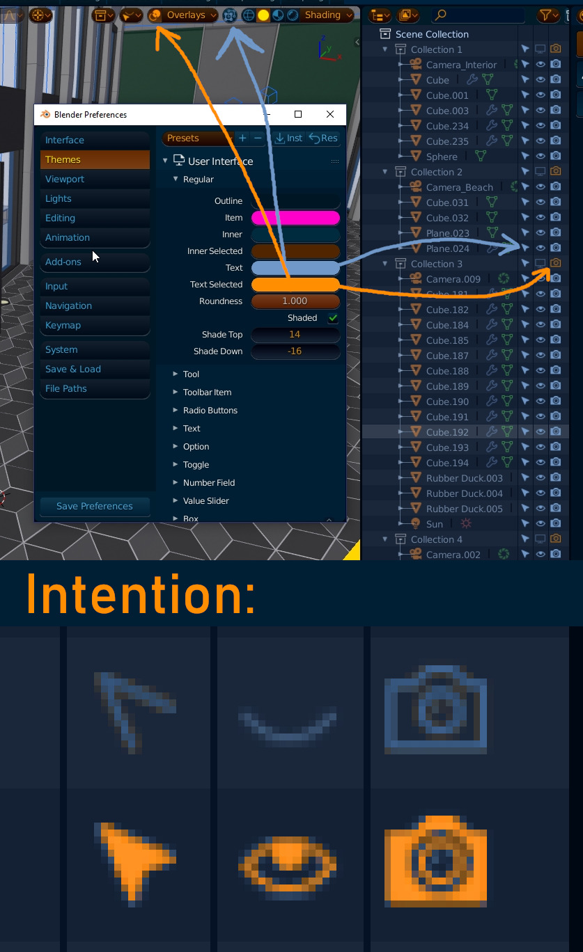
Tried theming Blender 2.8 and came upon a peculiar issue.
In the outliner the arrow, eye and camera icons colors are oddly colored from the theming options in User Preferences.
Basically when camera and arrow is turned off it uses the “Text Selected” color and when they are turned on it uses “Text” color.
This is an annoying inconsistency as it’s impossible to theme this correctly.
Shouldn’t it maybe be in the Outliner tab?
3 Likes
i didn’t know you could do that with empties in 2.79 
A post was split to a new topic: Unify Python Console & Text Editor?
Holy shit!
So I can drag the toolbar out sideways to get text descriptions, but I can’t drag the toolbar out vertically to expand it to see ALL tools… 
1 Like
I use box select to select a number of objects in the outliner.
But no, that’s not good enough for the outliner.
I must also right click these items and choose “select”.
3 Likes
nice possible solution…
I think the worst part is that many of those tool buttons have little arrows at the bottom-right, but nothing happens if you specifically click on them. They merely indicate that something might happen with a long press, which is about as unintuitive as it could be.
2 Likes
Outliner and viewport selection being different things has a number of useful applications (being able to keep your selection while operating on another batch of objects from the outliner), but in some cases you’d probably want to have them sync up, I agree.
1 Like
Yes, the added flexibility of the decoupled selection between the viewport and outliner is very marginal compared to the clarity, simplicity, speed and usefulness of making them sync.
By default, we should make the Outliner and viewport share the the selection state.
12 Likes
Hmmm, I guess I agree. Right now though we can do both from the outliner - clicking the name does an outliner selection and clicking the icon does an object selection (which never really made sense to me by the way), so what would happen in “synced mode” ? Maybe we could get rid of that distinction (clicking name or icon) entirely.
2 Likes
What is interesting observing about this adventure of “reordering of things” started from a very confused stage of functions that had accumulated over the years, functions that were randomly or not structured in favor of a coherent and logical efficiency that would make simple and more intuitive the use of blender, is that now, after the first layers of reordering, we see emerge a structure that recalls a reorder that begins to become exponential.
Neat things that call to rearrange other things, and the position of the compartments, work areas and how their tools should work at best, it becomes so obvious that the solutions emerge almost naturally … it was like seeing the resolution of a puzzle that eventually becomes easy to solve.
It is fascinating to see this process evolve during the course of these months of work of you devs.
I am convinced that this reordering of features will be the biggest of the winning cards of this version of blender.
And the confirmation of this, is that more and more professionals in the field and from the most varied origins, they begin to recognize the solidity of this work. And also because this level of reorganization had not been touched even with blender 2.5, and I remember that even then it had been done a similar long polishing job. Here there is not only blender, there is in some way the contribution of the whole history of Computer Graphics reached maturity, also through this forum and the contribution of the whole community with their advice and their perplexities when necessary. Here the history is being written.
2 Likes
Repeat last does too much, I just want to use the last tool on something again, I don’t want to do the exact same operation on it as well.
Hitting a single button, g for me, instead of whatever I had to do for the previous tool I used (toolbar click, go into a menu, open quick favorites, multikey shortcut, pie menu) is a huge deal.
Doing the same operation again is really powerful. One simple example is duplicating a whole pie from a 30 degree piece you have modelled. alt+d, r, 30, (axis), enter. shift+r, shift+r, shift+r, shift+r etc.
If you want tools quickly accessible, that’s what the favourites menu, or the hotkey for that tool, is for.
3 Likes
This would suck in ‘selected’ view, fyi.
Hold on, where did selected view go? Found it
No kidding, but so is using the previous tool. Like I said, a single button dedicated to the previous tool is extremely good.
Other things do this for a reason. I can’t have a bunch of shortcuts for everything I want to do. Not as quick and ergonomic as “g”. Sometimes you want to repeat a lesser used tool a bunch of times. There’s no reason to remap your shortcuts for a single session like this.
Repeat history and last are two different things, one opens last tool and the other does like blenders repeat last.
I’ll try to summarize what @lcas is saying.
Let’s say in edit mode you use the Knife tool to cut something.
Then you preform other actions - select, extrude, move, scale.
Now if you hit a button (for the last tool) it will enable the Knife tool.
It searches only for tools in the history of operations(ignores move/rotate/scale, select).
It’s something that might not make sense for a typical Blender user, but I find it very useful. In Maya you have different keys for repeat last operation and repeat last tool.
3 Likes
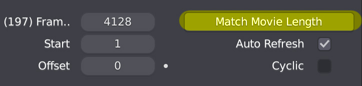
On my system, also noticed that the a video as texture do not refresh, (enabling auto refresh and setting manually more frames) you can confirm this?
instead by drag and drop a video on the 3d view, it work