Yet another source of constant frustration. Select button in material editor slot list does additive selection by default, so it adds to previous selection instead of overriding it.
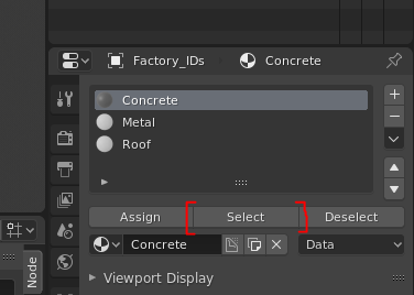
All this serves to do is to make users very confused about which faces is currently selected material slot assigned to >: ( And also becomes select/deselect cycle clickfest if you just want to quickly check your material slot assignments.
7 Likes
But the additive selection is also desirable sometimes.
Maybe the behavior you want could be added when Alt + Click on the Select button…
4 Likes
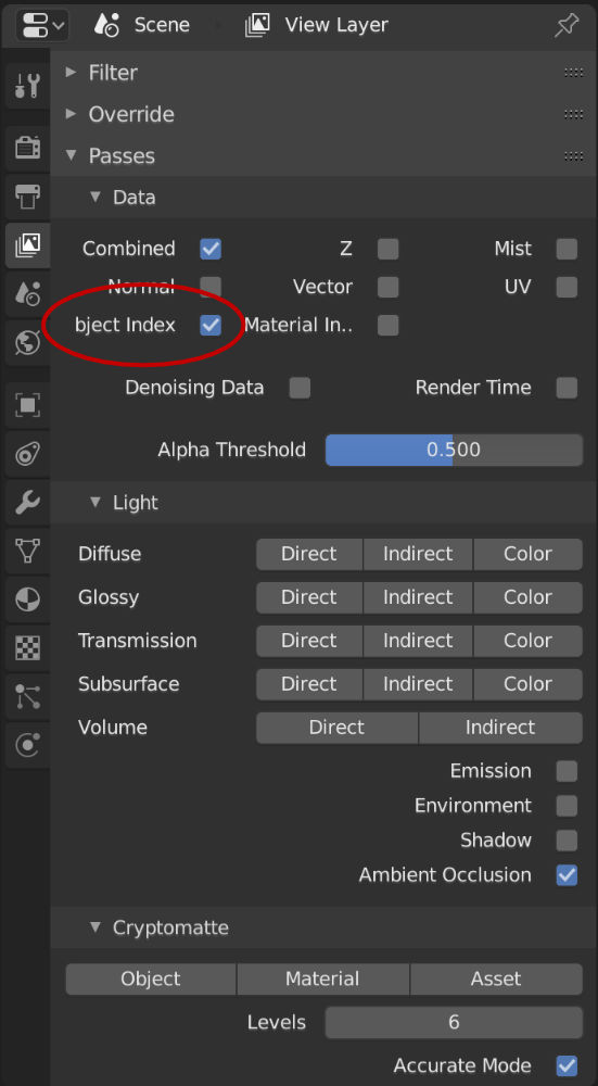
When resizing the width of the “Properties” panel there are a few pixels where the “O” in “Object Index” disappears when switching between the three and two colum layout.
1 Like
I also wish there was an agreed-upon procedure for items here that are now fixed, so nobody wastes time re-investigating something unnecessarily.
2 Likes
Shift actually, since in (almost) all other parts of Blender, Shift is used for adding to selection 
4 Likes
I actually suggested that before it was buried deep in the messages.
1 Like
@ideasman42 @Harleya Well, the idea was that we would add the suggestions we agree to do here: https://developer.blender.org/T56950
This thread can stay a bit chaotic, but the phabricator task can be made clear, showing what is done and what is missing.
I would like to go back through this thread and add more items to the list. But I also thought it might be a bit demoralising is we add, say 200 tasks? But if you are ok with that I don’t mind doing it.
2 Likes
Could be change some hotkeys like Proportional editing to make the hotkey cyclic between options
default value deactivate
hotkey: Proportional editing On
hotkey: Proportional editing connected On
hotkey: Proportional editing Off
hotkey: Proportional editing On
…
I like this idea – but keys like this need something extra.
I think as long as it flashed or displayed what mode we’re currently in somewhere on the screen (sort of like the keypresses appear in textual format on the bottom of the screen on youtube tutorial videos), we would be set.
We still want to show the icon displaying the current mode we’re in ofc (in addition to a flash of text that fades mentioning the current mode a user is in so that new users wouldn’t have to guess based on icon alone, and a flash of the text sitting at the bottom of the viewport would do this nicely – plus, old users wouldn’t have to decode icons at a glance – they can just read the text in a flash.)
I think the solution is to make proportional editing more consistent in the different modes. There’s already a task for it:
https://developer.blender.org/T58081
This will make the O-key behave in a more consistent way that makes it easier to enable and disable.
Fixed in these commits:
https://developer.blender.org/D4033
https://developer.blender.org/D4139
1 Like
make a pie menu, where you tap to turn on and of, and hold to change behaviours
I hate pie menus, can work for some people, not for me. I preffer classic menus.
I think that it’s better
O: cyclic Proportional editing
O+Drag: Select menu with all curves for proportional editing
This reminds me of another proportional editing paper cut: it would be great if you could press o in the middle of an operation such as (g)rab to turn on proportional editing, rather than having to cancel the grab to turn it on.
1 Like