The selection tool doesn’t show the W shortcut on its tooltip.
The thing here is, if for whatever reason you assign again the W key to the selection tool, it will only set W as the shortcut for that particular type of selection and you can’t cycle through the selection types anymore.
Please see the above post ^^, The W key should be set for the whole tool slot.
It would be helpful if the info bar displayed a poly/vert count for active & selected objects without having to go into edit mode, especially when working with high poly meshes.
It’s a bit hard to find whether or not an issue has been brought up, but I think I was about to report the same issue, and it’s been bugging me for some time. Basically this is the problem:
Which object is selected? I even pressed the . key to focus on the selected object in the outliner and couldn’t easily spot which was selected. Yes, I should have named my objects in the scene better, but I should also be able to easily to see which object is selected. I’m not even sure the outliner specific highlight is needed, is it? Selected objects should look more like the outliner highlight that makes the row blue in my opinion.
Maybe a more experienced user could answer this, but is there a good reason for outliner selection and scene selection to be different? Is it confusing for users?
I commented about the contextual menus not showing certain options before but I also wanted to point out some missing options in the Edit Mode menus as well. So here I go:
In 2.7x the W menu would always show the same contents as far as I remember. When Vertex, Edge or Face specific operations were needed there were menus for those too with Ctrl + V/E/F.
These are still there but now the W menu is showing options contextual to the selection type, whether it’s vertex, edge or face. But some options should always be visible and accessible (ignoring accessing them through shortcuts for now)
Options like Remove Doubles, Merge, New Edge/Face (Fill), Smooth and UV Unwrapping are weird to keep specific to only one selection type.
For example when UV unwrapping you are usually selecting edges or vertices to mark seems but now you would need to switch to face selection to get the unwrap options in the W menu?
This just adds unnecessary steps for getting the options you want and need.
There are also options that have been removed like Select Inverse, Inset Faces and Bevel. Even if these are not used from the menu it gives a helpful hint that the options exist and which shortcut is attached to them.
I’m hesitant to suggest adding more options though since the menu could grow pretty large.
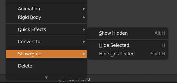
I also noticed a naming difference between the contextual menu and the 3d view header menus.
In one it’s called “Hide” and “Reveal” but in the other it’s “Hide Selected” and “Show Hidden”.
It would also be great to add the options 'Hide Unselected" to the W menu to make it clear that this exists. I personally did not know about it for a long time because of this.
I don’t know how much work is still planned to improve the usefulness of the W menu but these are some of my notes at least.
Don’t be.
Those menus they need to be customizable and populated with tools as much as possible otherwise they’ll be useless.
For example, those are the right click context menus of c4d for verts/edges/faces. Almost everything you need is in there, you don’t even need to touch any toolbar.
Definitely not roller only, keep Ctrl+Roller but what about the other proposals of Shift+Roller and Alt+Roller?
Shift would go by *0.1 increment (so 0.01 or 0.1 depending on what Ctrl+Roller does) which is consistent with it’s behaviour while using many operators in Blender when you require higher precision with movement etc… Could also be Ctrl+Shift+Roller.
Alt I am not sure about tbh, maybe not necessary to do anything as it’s already used for ALT+Click when changing the value for multiple objects at once.
No, wheel-only doesn’t work unfortunately for a lot of reasons.
I still like the idea of accelerating the CTRL+wheel effect through another modifier.
I haven’t found a case yet where you would actually want smaller changes per wheel increment. Most numbuts default to a change increment of one for integer values and for 0.01 for float values. In my opinion 0.01 is already smaller than what you want in most cases, so dropping to 0.001 say would be a waste of time. 0.01 is 100 steps to go from 0 to 1 which is pretty slow for most things, and even 0.1 feels slow for things like transformations, but it works pretty well in other cases to let you quickly rough-in values, and a factor of 10 works well for integer values so my vote would be for a single extra modifier that increases the scroll wheel increment effect by a 10x increase. SHIFT is generally the most accessible as it’s right next to CTRL but I’m not sure its use would be consistent with similar features already in existence.
In edit mode, there is a tab called “Mesh”, and then there is that upper right corner with “Mesh Options” and “Normals”. I can’t say anything about “Normals”, since it’s still a mistery to me what that might be useful for, but the settings inside “Mesh Options” could and should be cleaned up:
“X Mirror” and “Topology Mirror” should go to “Mesh”
“Live Unwrap” should go to “UV”
“AutoMerge Editing” with Threshold should be placed in the snapping dropdown
I hardly believe noone ever mentioned it before, but just in case:
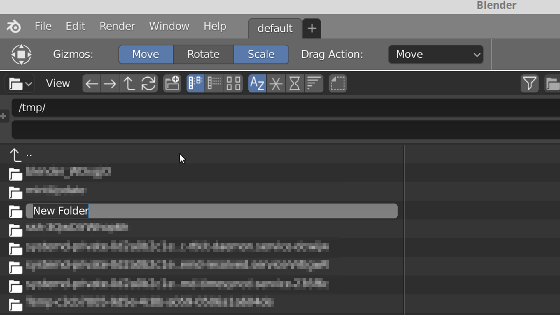
When i’m in the file browser and happened to create a new folder there, Blender might think that i do that from time to time for recreational purposes, but in fact most of the time i’d like Blender to open that new folder automatically for me so i dont have to scroll all the way to “n” as in “new folder” in order to click on that for it to open.
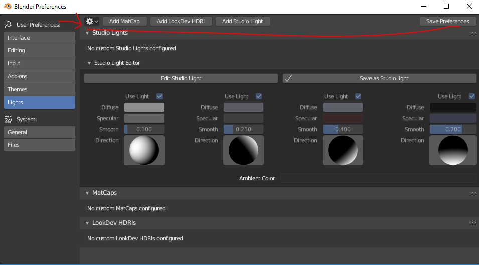
Not sure if this is on Windows, but on Mac (currently at least) the User Preferences window always opens centered on the cursor where most applications can remember where it was last positioned and at what size.
Maybe it’s because I find myself playing with preferences more as the 2.8 beta continues, but I have to reposition and expand the preferences window every time. And if you’re using the menu to open it, it’s always small and top-left because of the cursor placement. Not horrible, but kind of an annoying papercut to me. I’d like it if it remembered the last position and size as last time it was used.
The items in the Toolbar on the left in the 3D Editor are just too large, by default, compared to the rest of the UI. If most other buttons are of adequate size then there is no need for these to be four times larger.
The top bar (showing current tool settings) contains interface items that are the same size as the rest of the UI. Therefore there is no need for that bar to be higher than other areas that contain the same things, like headers.So there is unnecessary padding to remove there.
The icon for the currently-selected tool is drawn at the left of that top bar. But it is not an active element and is only there as a reminder of that the settings are related to. Therefore it can be smaller, dimmer, less saturated, less distracting.
And I do think we should consider removing the Blender logo since it is also shown on the OS window header containing it. Yes, it shows the splash screen if you click on it, but you can do that also by selecting “Splash Screen” from the “Help” menu.
I agree with what you say about removing the padding from the top bar, and I agree that the toolbars icons should be either the same size as the rest, or upon user override(through user preferences) at either 2, 4, 8, etc. times the size(of the other icons).
I am inclined to disagree with the removal of the blender logo at top left, but perhaps it should be optional.
On the subject of the icon for the currently selected tool I think it should be able to open up when clicked into a list of all the available tools, except unlike the 3D view-ports tool pallet it should be listing horizontally.
And on the topic of the tool pallet it should actually be a pallet that docs to any of the available view-port corners(so perhaps not the top right) and I’d even like to see it optionally floating around should the user choose to move it as such.
This in turn might open up the possibility to add back an action bar similar in nature to the “tool-less toolbar” as it essentially was in 2.79 and previous versions. Optional of course, as should be the tool pallet.