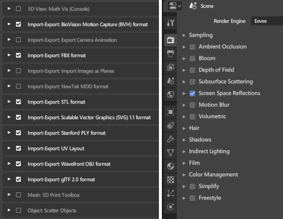
I just noticed overlapping here.

Prevents to see the items names.
This could be one of the simplest ones.
Can we have visual consistency of the checkbox options.
Idk if It has been mentioned but that space should be used to facilitate box selection, which should work without having to press any shortcut
Is this a paper cut?
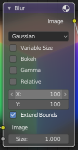
The tooltips are missing in the compositing Blur node for X and Y.
What am I doing here? Size X in pixels and Size Y in pixels I guess ![]()
It’s weird to have to come on the UI to edit eevee env.
Also, please add the selection on the top.
Same for render, with icons if you want.
We still have to go in the UI too many times IMO.
But the Shading popover in the viewport is only a viewport thing, the world tab of the properties editor is a material property basically, so I think it is better to distinguish the two, don’t you think ?
Nope since the goal is the same.
In this case, remove the env settings of the lookdev and place it in the UI.
We cannot box select with click and drag though, we can only use B at the moment, and the extra space is not needed. Is a new behaviour planned to be added?
But that is a scene/render setting, not a viewport propertie. I don’t see that the shading popover is a good place.
For me this is the same since it’s will change the result in the viewport.
Yeah, but you change the result in the viewport with bloom, ambient occlusion,… and all that are render settings.
I don’t think the goal is really the same, at least I find different use for the two, for me Lookdev mode is more of a temporary thing, and having an easy way of changing the env is usefull, and I don’t find the same use when I do rendering where I work more with node editor and so I can change it from there, as it doesn’t change only the viewport but also the final render. But this is all a personal opinion 
But I agree more on the rest, I miss the rendering buttons, and next to the Wokspace tabs is a pretty good place for it I think
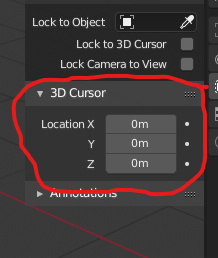
Hi! My papercut #1, please expose 3d cursor rotation. It has rotation now, but it is hidden yet and I can’t see any way to manipulate it manually. Thanks.
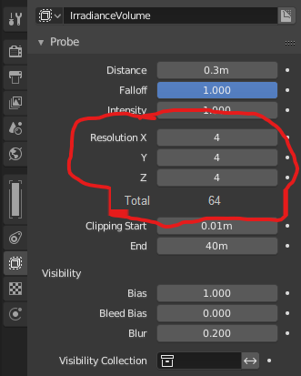
The second one, it would be awesome to see total amount of probes in irradiance volume, so user does not have to calculate it manually, while adjusting resolution to get a tradeoff between baking speed and quality.
I don’t know but if not planned, I think it should be added, just mentioning before so developers don’t have to work twice before changing it back. I think that space should be useful for box selection, while in the list default behaviour should be moving what is selected (as it is now) which is nice for moving one object quickly
I’ve noticed you can scale individual ui elements by hovering over them with your cursor and pressing +/- which is pretty handy by itself but i accidentally pressed it a few times and couldn’t tell what the standard size was. Is there a shortcut to reset their size? If not I’d propose one.
It’s always been Home key to do that.
I am still learning. Thanks a bunch!
In Rendering/Performance Tab it would be neat to have indication that “Tiles” mean pixel number instead of number of tiles in a direction, e.g. “Tile Size” or “123 pixel”. A guide what size to choose in the hover help would be nice too.


