Use Units Scale for this in Scene Properties > Units, if you work in vary small or very large scales. Higher floating point precision or more advanced scene scaling are not trivial changes, and I don’t think this is really related to UI paper cuts.
3 Likes
Yeah. That’s why I said in my first post, that I’m not sure if this issue belongs here. I also discovered it just by accident when I tried to scroll a website but Blender was still in focus. Sorry for the inconvenience.
I understand the reasoning behind what you’re asking for, but in actuality no modern computer can handle this without faking it in some way. Games like Minecraft, or really any game with a large map use trickery to move the world around YOU instead of moving you farther and farther away from the origin of the scene. The rendering engines can’t correctly draw things that are a whole planet’s distance away. Most games use a skybox as a way of faking these details (There is camera trickery that will even let you do 3D objects in the skybox.)
So as nice as it would be, it’s not possible to do it for real, and building a better way to fake it is way bigger than a paper cut. You can always do what billrey suggested about setting the Scene Properties > Units differently, this is one of those “fake” ways that will allow it to work. Hope this helps! 
Like I said: Most likely I’m expecting too much from Blender… and perhaps any other computer technology of the 21st century. 
1 Like
Perhaps, but I think you will be equally as satisfied with the results if you learn how to fake it the way the pros do in the industry. Check this out, here is one example in Unity: https://www.youtube.com/watch?v=9PJ6zJIHbqY
https://www.reddit.com/r/Unity3D/comments/3on8bn/solar_system_to_scale/
2 Likes
I’ll give it a shot. Thank you.
When exporting, the file is automatically named after the blend file, rather than the name of the object you’re trying to export.
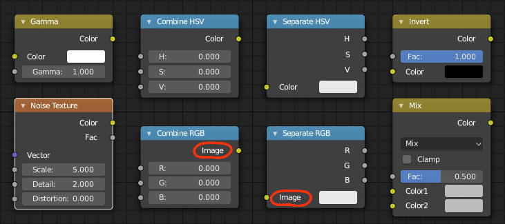
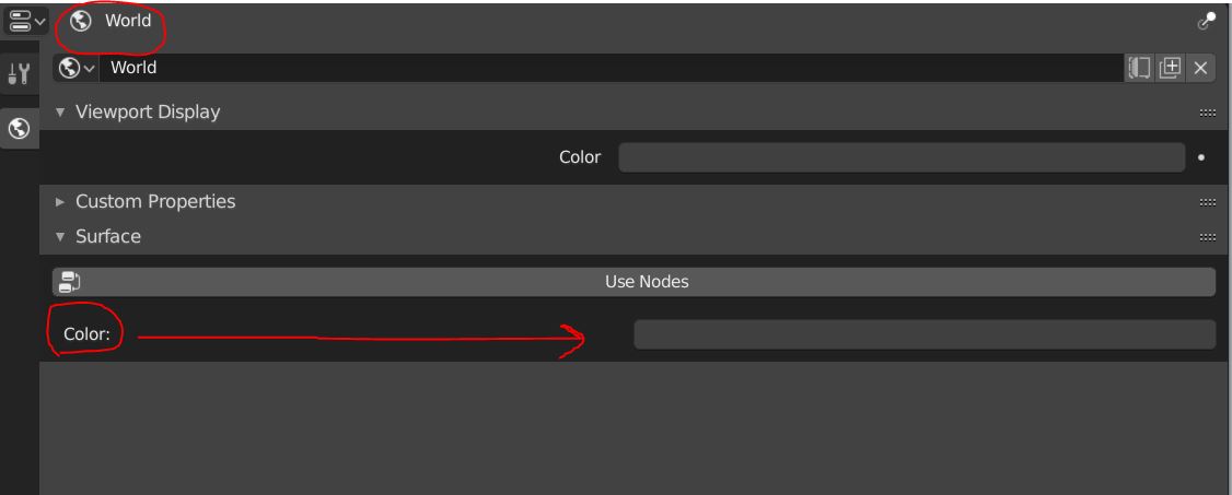
The name of the color node of Combine RGB and Separate RGB is called Image while it is called Color for pretty much every other node.
21 Likes
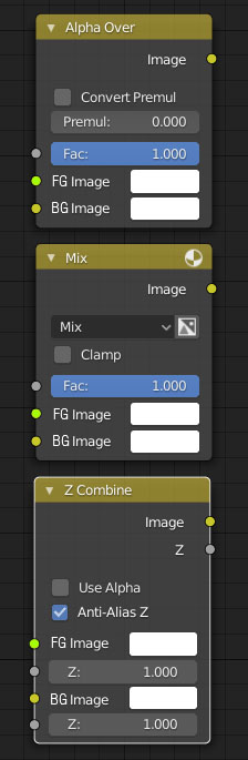
I’m new to Blender, and when I try to use the composer, I always find it annoying that the composite nodes are not well labeled, as in other compositing programs.
I think it should be clearly indicated which entry corresponds to the foreground and which to the background, with a different color or with the name, or both. I also think that the foreground input should go above by logica.
Also the composites nodes should in a new own rank, composite, not in color.

10 Likes
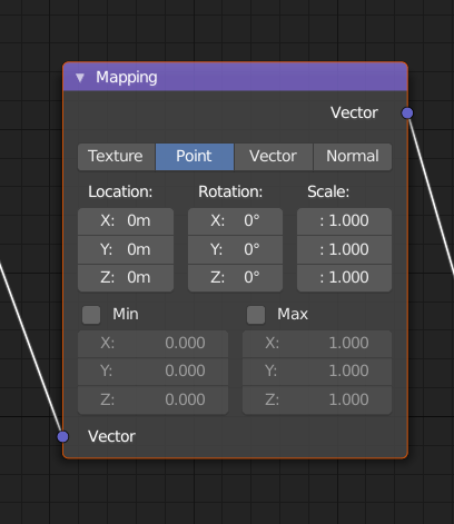
Might have been posted already, as I think it is rather obvious. After all these years, could we please have the Location, Rotation and Scale properties of the Mapping Node exposed as node sockets? It’s kinda old-fashioned to have to produce something home-baked just to achieve that. See Bartek Skorupas presentation at BCon 2014 on why this would be awesome to have: https://www.blender.org/conference/2014/presentations/110
16 Likes
Hi @pablovazquez,
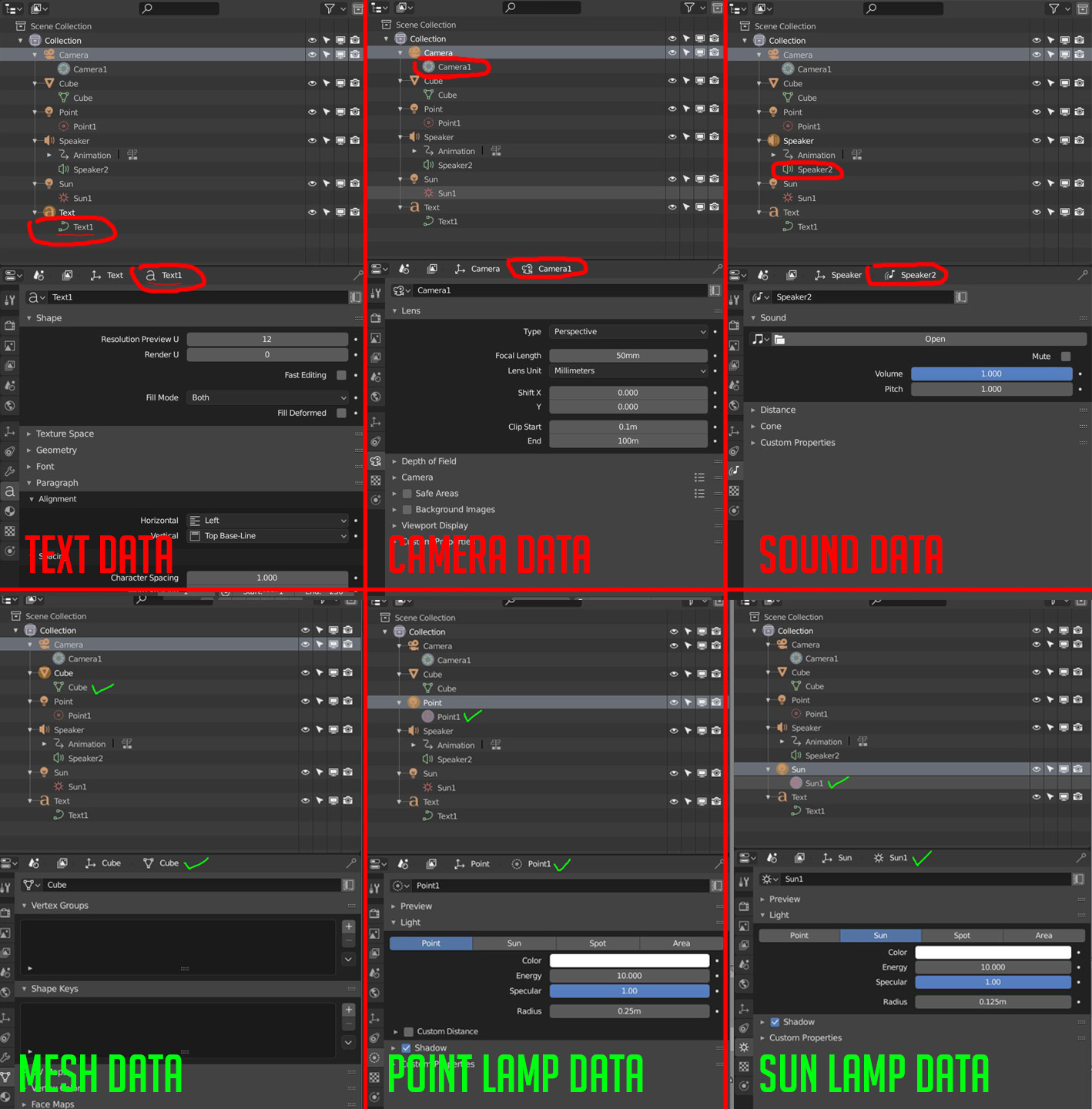
I found some inconsistency in some Objects Data icon between Outliner and Properties Editor, please see below.
My Sugestions are :
- Camera Data using Camera Icon with green color
- Text Data using “A” icon with green color
- Sound Data using Speaker icon for Properties icon
6 Likes
3 Likes
@jendrzych: Can you elaborate on which icons you intended to be where? I can update to fix this inconsistency if you describe what should go where.
We cannot use different colors for the sockets, because the colors are meant to communicate the data type. But the name change probably could be done I think.
1 Like
My personal (a bit biased) opinion on the matter:
1.Text ObData - icon used in Properties Editor is the one that should be used in Outliner
2. Camera ObData - the one from the Outliner should be used in the Properties Editor
3 Speaker ObData - as in the case of the Camera ObData.
2 Likes
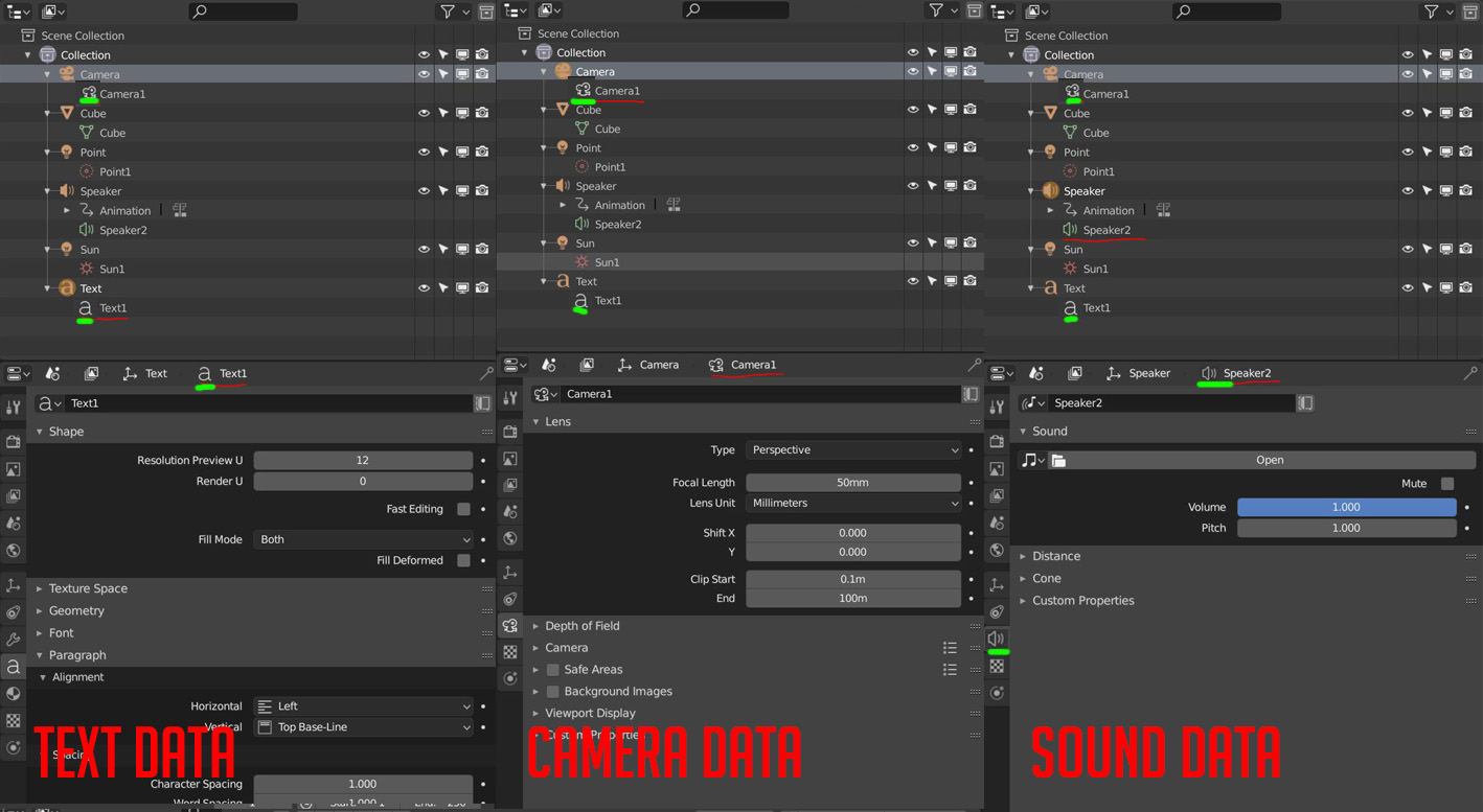
Camera ObData was designed as an Iris. So it should be the other way around.But the very Iris icon is similar to the Sun pictogram. Let William decide.
1 Like
Hm, I was going to let you decide… 
I already change the icon on the image (the last image which using the Green mark) to be the proper icons in my opinion.
The iris icon for camera I think not so useful, instead we can use the same icon but using another color just like Mesh data color. Also please note that this is for the sake of consistency between icon on the Outliner and Properties Editor
The Iris then - the hollow camera icon isn’t the best one.