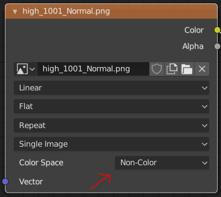
probably somebody else pointed it out already, but loading a new texture resets the color space to the default sRGB.
This is pretty annoying since it requires always a double check.
thank you
probably somebody else pointed it out already, but loading a new texture resets the color space to the default sRGB.
This is pretty annoying since it requires always a double check.
thank you
I prefer a minimalistic interface, spared from the fact that it is never used due to uselessness. Most of the tools I use as operators (via hot keys). And something tells me that I’m not the only one.
People want to be able to change the color of any button in a blender, any inscription to customize themes (for example, to create pink themes, so popular among modernists), but is it not logical to be able to customize the tool bar?
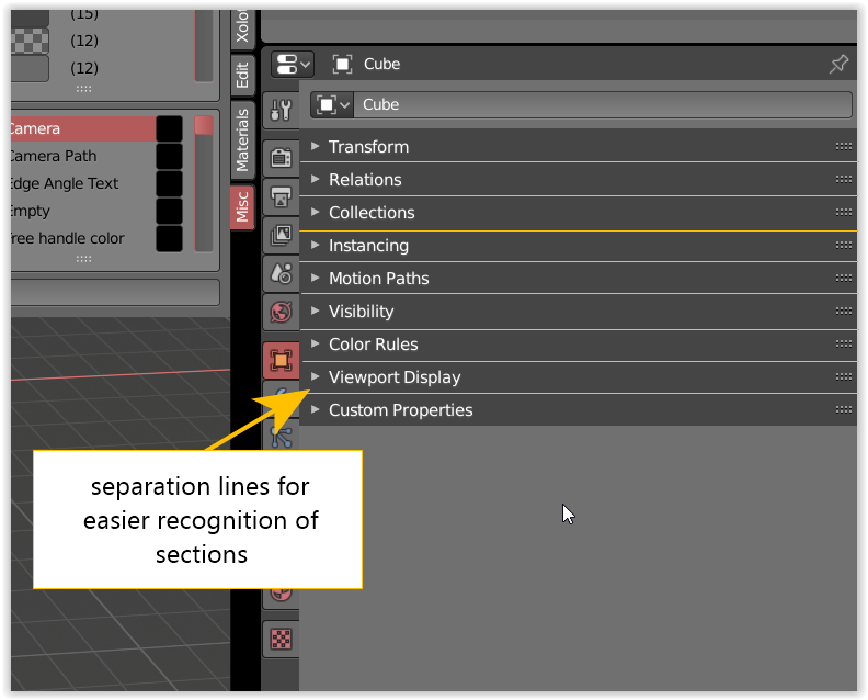
It would be nice if the panel headers had outlines or separation lines or a offset to each other which would make the separation of section easier to find for the brain, i think it would help a lot with the default themes that do not have a lot of contrast.
Well, I mean you can already hide the toolbar, and there’s the Quick Favourites Menu, too.
I mean disable them completely. This is more like disabling addons.
It turned out that I have two hands from birth, and this allows me to use the mouse and keyboard quite successfully, which makes most of the tools on this panel redundant for me (I sincerely hope that there are still people like me among users).
Undoubtedly the tools are very useful, but if a person is used to working quickly using hot keys and operators, it would be nice to give him the opportunity to turn off those tools that only interfere with him, clogging up screen space. The same applies to sculpting brushes, and in general everything that can be located in the toolbar.
Im not in favour of this adjustment. the left icon is way more clear for what the function does. An icon need to clearly show what it does or explain it somehow. Currently i see it as everythin in the box gets selected. Thus being this a mask. that means all will be masked.
Another issue is that using that mask tint/color in the icon makes it less clear when background of the UI isnt as dark or perhaps when tint is different.
You can ctrl LMB in the outliner to isolate Collections. You can do this hovering over the EYE icon, if you keep hovering it will show other hotkeys as well.
Can you elaborate more on what you need or looking for?
Sorry man, but that icon representation is wrong, no matter how people are used to it. You can check out zbrush etc, to see how it is properly done.
Sorry, but unisolating shows everything, so goodbye setup from hunders of collections.
Also - the point of this tool is to manipulate collections visibility through objects selection.
That’s a big difference.
Current isolation realization works for active object only.
I dont have Zbrus, so i cant check it out.
Okay, and what does your unisolating do?
I just found your scripts and was checking what they actually do. The isolate seems handy indeed.
Dont think it would be much work to convert it. Though with collections it does work a bit different i believe.
Well, it’s tactical problem.
For example, if you make table editor like excel, you provide toolset that gives full workflow cycle - for example, setting rows height, columns width etc (not like in revit, where they made one then next year - another)
If somewhere is ability to split in a parts something, there should be ability to join it.
So, that issue concerns collections in 2.8)
It is common layer system with ability to set an infinite amount of collections, released without proper management toolset providen.
I described most of such problems in Layer Maniphest some time ago, based on my experience, so there is need in subset of common tools that provide comfortable work with thousands collections.
Some of tools there can be pretty much simple, but this entire subset yet have to be designed.
Otherwise it will be yet another set of addons that again provides abilities that have to be basic, I want to avoid it this time.
Basically, we need
First one is available in 2.79 by default, layers isolation is in 1D_Scripts, switching prototype is here
https://developer.blender.org/T61578#669517 with GIFs
I haven’t figured out completely how collections work. But isn’t it possible to check to which object a collection belong? If so than you can loop over all objects, if there are active than add the collections to a list. Than you can loop over the collections and hide all which aren’t in that prior list. This was just a quick thought I had, I don’t know if actually works.
I didn’t know it was a toggle button as well. Yet trust button one isn’t very clear, I’m looking at it with my phone. I can’t seem to understand what the concert actually does, i see it jumping between render or not, but not sure where it gets that info from.
When you switch the renderbility is also see the visibility switching??
Explanation: visibility and renderability lists swaps their values.
That makes possible to view renderability state of scene as visibility.
if there are active than add the collections to a list. Than you can loop over the collections and hide all which aren’t in that prior list.
Do you mean to make an addon?
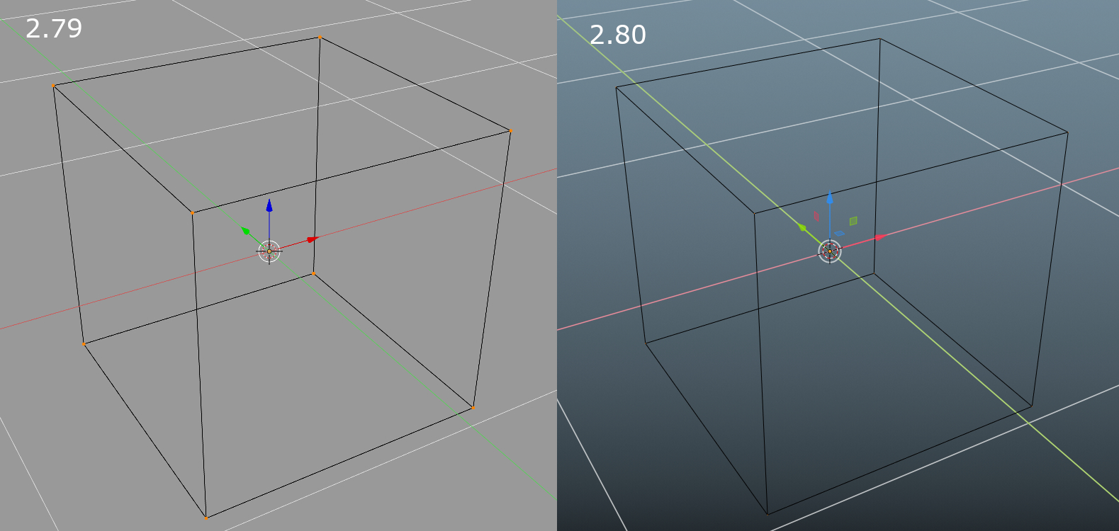
Selected vertices in the edit mode of the Lattice object are barely visible in 2.80. Their size is linked to the vertex size of the mesh’s edit mode, through theme settings. I find the default setting 3 px for the size of vertices perfect in the edit mode of meshes… but in Lattice’s edit mode they’re barely visible when selected, and basically invisible when unselected. It looks like as if I was in the “edge” edit mode.
In Blender 2.79 the size of them looked fine.
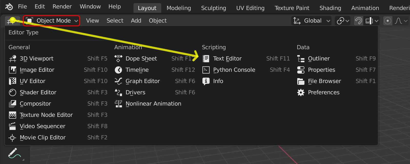
Back to talking about the design of the Editor Type menu.
When I try to switch editor type, for example, to the Text Editor, the mouse trajectory goes through the Mode select menu, and the Editor Type menu closes.
It’s really annoying.
Has anyone else had a problem like this?
Every menu works like that. Just make sure you don’t accidentally hover on other menus when making the move. lol
Yes, of course, each menu works in this way. But only “Editor Type” menu has four columns, which makes it very wide and causes this problem. The only problem is with this particular menu.
And, of course, everybody always moves the cursor along the shortest path, i.e. in a straight line.