But when I switch to workbench, the lookdev icon disappears from the viewport, so to me, it does seem that you have to be in that render view to tweak those settings.
Either way, it’s a complete mess right now.
But when I switch to workbench, the lookdev icon disappears from the viewport, so to me, it does seem that you have to be in that render view to tweak those settings.
Either way, it’s a complete mess right now.
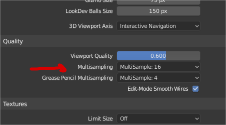
Viewport AA parameters must be in the shading panel. Because that antialiasing not only affect to render shading when using workbench. It affects to solid view when you use eevee or cycles.
Or duplicate options in boths sites, or separate both AA parameters
And this parameters must be named (overlays multisampling)

and maybe viewport multisampling must be here
I think in this case the paper cut is that know people don’t know about Workbench engine since in any other software it is appear to be just a Viewport (2.79 have it this way too).
So, right now it is not obvious that Viewport and Workbench is the same, because it also changes the render engine for camera.
While using Cycles engine, the lookdev mode has ugly shadows. Switching to eevee and enabling contact shadows for each light solves this issue. But then when you switch back to cycles you don’t have those shadow setting anymore.
In Texture Paint the Fill tool has default settings of strength 0.5 with pressure sensitivity turned on. So rather than filling it does semi-transparent glazes. Probably should be default strength 1 with pressure sensitivity off.
Edit: also maybe unified color.
Edit: Aaaaand Harley to the rescue.
New one.
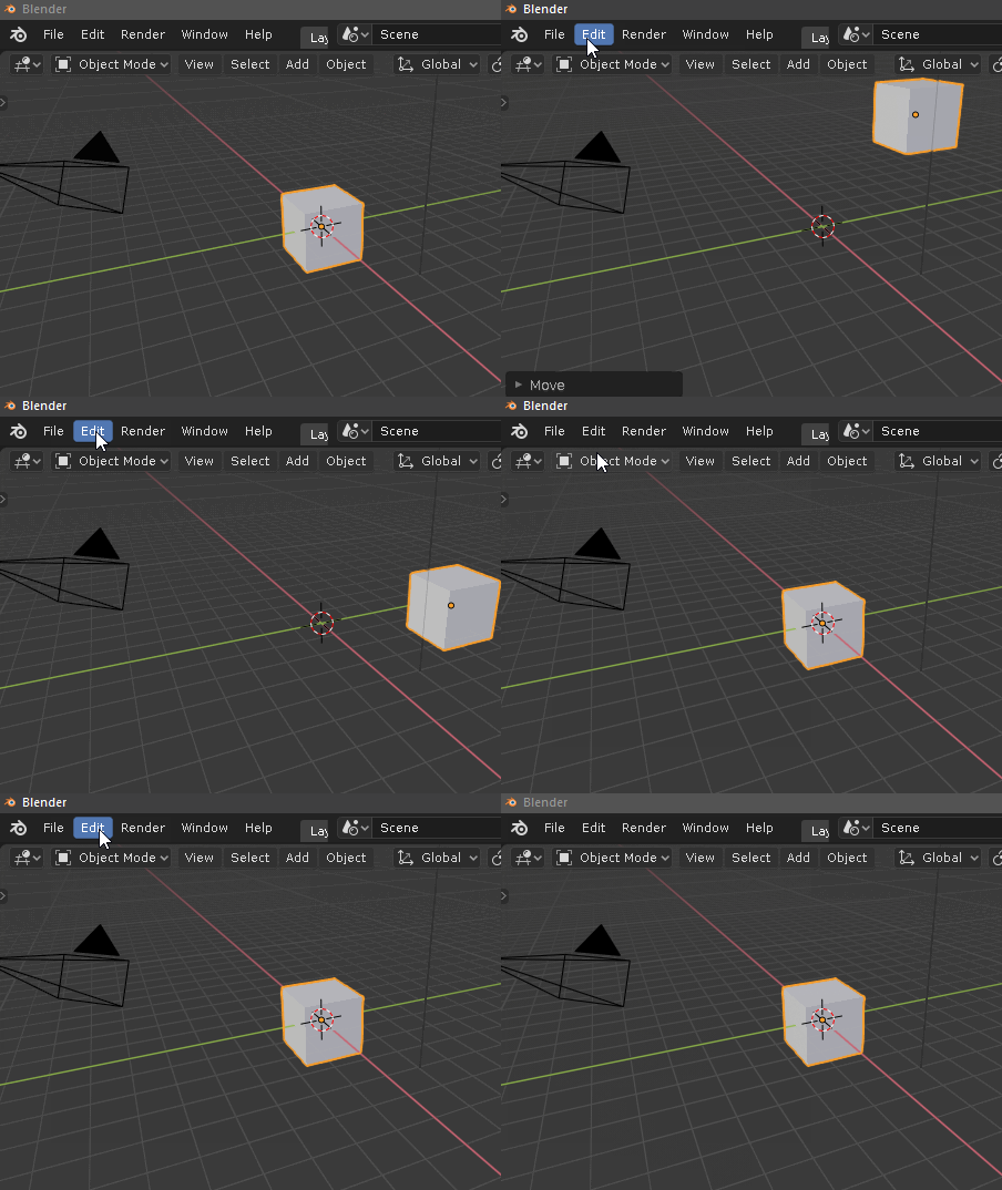
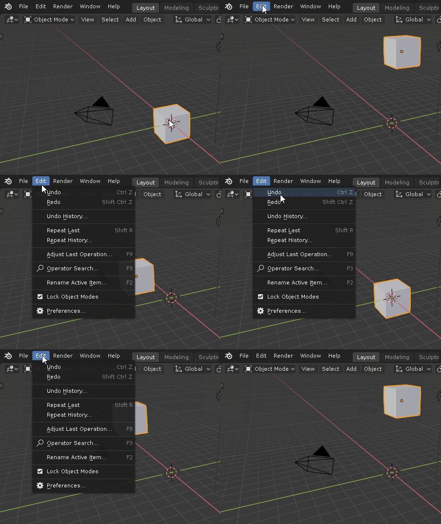
Undo / Redo entries in Edit should be grayed out if there are no more steps to undo/redo.
Right now you can click Edit > Undo/Redo until end times.


honestly I don’t know how to consider this, if it’s a mistake or a wanted thing.
Used to blender 2.79 way, it makes me a little confused …
I noticed that now I can clone the individual chisels and make different versions … for each category …
but the fact of having this empty box at the moment makes me perplexed …
it’s probably not even a paper cut … but I’m too confused how to consider it
perhaps it would be better to access this box-list, just in case you clone the brushes … if there is only one brush, it makes no sense for an empty list to appear when you click on the image …
and the space should be dynamic, which widens as the number of brushes increases, increasing …
I noticed the theme settings for the axis colors are only used in the navigate gizmo in the 3dview.
I couldn´t find any settings for the axis colors in the Graph Editor. So I was wondering if those two should be linked but then I noticed that the Dope Sheet and the Timeline do not even show the axis colors and also look a lot cleaner because of that.
Now I am not a fulltime animator but I would go with the cleaner look and just remove the axis color display.
This thing:

is super annoying. Can we PLEASE make it into a standard center-of-the-window modal confirmation dialog, basically a variant of the exiting with changes one?
I want to start a new document so I reach up into the corner where the File menu is, select New → General, and then I want to move the mouse back towards the middle of the screen, and the extra-subtle at-mouse “OK?” dialog vanishes as soon as the mouse moves away and now I’m sitting there wondering why the “New” operation is taking so long.
And speaking of dialogs, are we still going to get the new Windows exit-with-changes dialog for 2.80? I had the volume turned way up again.
Yes, please…
There’s a task for it here: https://developer.blender.org/D4829
It’s not a UI design issue but a technical issue that makes it a bit tricky in Blender
in the top panel of the brush-sculpt having two icons that represent the same brush seems a bit superfluous to me, why not unify the two?
at the click of the icon the list of brushes appears …
(same thing as I’ve already pointed out in the other comment here too, an empty compartment doesn’t make sense when there’s only one brush)
edit:
maybe you are aware of these inconsistencies, ergo the brush gui should be evolved … well in this case take these paper cuts as a reminder ![]()
Merge View, Element and Tool tabs into one (View tab) in the sidebar as previously
Like title says, would it be possible to merge this 3 tabs in one only?
I have a lot of addons, this supposes many tabs in the sidebar, with this 2 new tabs (Tool & Element) introduced in the last Blender 2.80 version there isn’t many space in the sidebar also I think these options are already available in the Header (Tool) and in the Properties Panel (Element), it is reiterative to have the same options in different areas of the UI and more thinking that we need all the possible space in the UI.
This is the View tab in the previous version 2.80.58
If you don’t want to use the N-shelf controls that hundreds of users want… It’s not necesary ask to remove them, you can always not use them.
At least not say they should disappear because you want to save two tabs space because they are the ones that bother, not the other 14 extras you have and you still having free space…
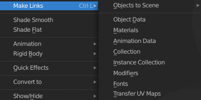
Most of the items in the Object / Make Links menu have to do with copying instead of linking. Link should always mean that editing one will also change the other.

A more minor one, but it would be really helpful to be able to set the viewport texture manually.

Otherwise, after working with materials, I go back to my layout workspace and find all my objects are now a mixture of AO, normal, specular, etc. maps, so I need to go back to the node editor and re-select the diffuse texture for every object.
You can Show/Hide the Tool Settings > mouse over Header and right-click (in my case). I say only to have the posiblity of Activate/Deactive the Tool tab, like other tabs (addons), I prefer to use the Header for Tool Settings, for me it’s a more quick access.
In the case of Item tab, merge with View tab, in all previous versions, included 2.79 this was the default.
This is a section for User Feedback, and I’m just making suggestions.