The modifier tools UI panel is so incredibly overcrowded on one row that at the factory defaults UI width, the name box of even such a short text as “Displace” won’t fit in:
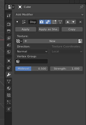
These UI controls require at least two rows.
The modifier tools UI panel is so incredibly overcrowded on one row that at the factory defaults UI width, the name box of even such a short text as “Displace” won’t fit in:
Are we in Centimeters yet?
I might me completely missing things (again), but:
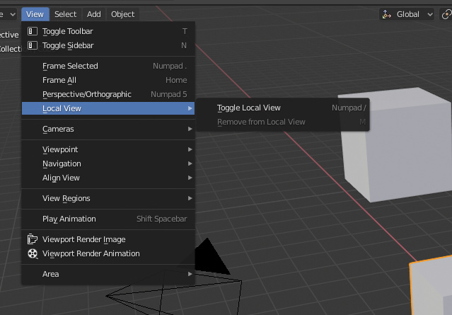
EDIT: Ok, apparently, the text (local) appears in a tiny corner of the screen… not enough, imo. I’d like to color the entire frame of the viewport differently, like an outline… and also, similarly, do the same when in auto key mode. These are important things you easily forget you’re in (at least I do).
Is this not a menu shortcut? or do you mean something else?
Ok, why do I keep missing these things? Even better, I now know that “zoom to selected” is called Frame! Thanks! 
I still want my colored borders idea for local view & auto key, though.
The problem with language in the UI is that for every translation the problem arises again.
What about icons that look like the messages with a plus at the bottom? That is instantly recognisable.
We should have icons for such actions in the toolbar instead of settings, it would be easy to test such a solution with students, I think we’d see direct improvement.
What about icon toggles like for the overlays and other buttons in the 3d view? You get instant access to the option and visual feedback where you expect it.
Well, as you may have noticed from my reply, I require an overly obvious UI in order to notice it, so for these quite important things that affect a large part of the view, ideally I’d like them to be very obvious:
Local view - Here I used the same color as a selection, because you require a selection of at least one object in order to enter local view mode.
Auto key - Here I used the color red, which is often used for record, and auto key is one of those really dangerous things as well (I’m actually very glad the button is gone from the default workspace in 2.8, but I did not like that it’s no longer red).
Here is it, the biggest UI Paper Cut of them all.
The search bar of the Keymap Preference Editor.
I can’t even search with 2 keywords while such feature is so so so easy to achieve with Python language.
Most of the time, the hotkeys we want to edit uses the same operator name in different contexts. Why can’t we just search for “View3D Select” and get to where we want?
The entire Keymap Editor were hard to use because of this. Not to mention the open/close of the details of each keymap. They sometimes automatically opens and closes as soon as some changes are made.
We are getting new “Industry Standard” hotkeys all over the place, and yet this brutally underdeveloped keymap editor don’t seem to improve at all.
Please point me to the correct place and I WILL MAKE THIS KEY MAP EDITOR 100 TIMES BETTER.
Please…
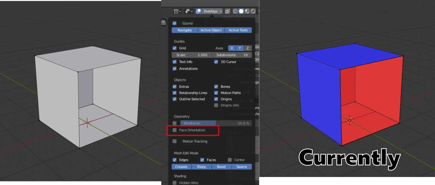
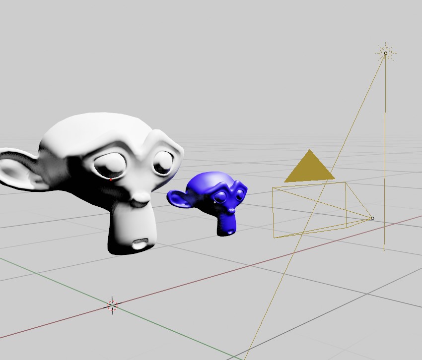
Currently the “face orientation” mode renders forward faces blue and backward faces red:
My proposal: If correct faces are not highlighted, and render NORMALLY according to the mode (i.e. shaded, or matcap, or textured, or lookdev, or whatever), and backfaces in a highlight color (RED) it’ll just be a normal way of working, modeling. If a face normal accidentally gets flipped, or a hole accidentally gets cut in a mesh, it’ll immediately show up in red. Instead of only seeing the red backfaces we should toggles this other blue/red mode which is not suitable for working in.
Here are some ways this could happen:
ALSO: Some from rightclickselect sad, that red color is too bright, and it will be cool to have option to change color
I played around with active tools and interface in 2.8 (i’m not a new blender user) and want to share some ideas, fixes and some better/ new user friendly defaults. There will be a lot of them, so i will number them but they’re not huge changes.
1) Adjust last operation menu should be open by default.
I noticed new users don’t know about it. It’s kind of hidden so it will help them.
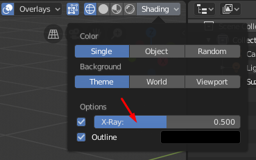
2) In wireframe shading X-ray slider should be set to 0 by default.
Same as above, new users are confused why their wireframes looks like this. And even blender users often don’t like it and ask how to change it to “normal”. People who need it can tweak it manually.
3) Scale and move arrows in gizmos sometimes overlap the circle and you click them instead,
they should be moved away from the center. And “handle size” option like pre 2.8 would be nice.
4) Some tools exist only in the context menu (edit mode - right mouse button).
loop cut and edge offset doesn’t exist in edge menu. (only in edge context menu). Knife topology tool should probably be somewhere else too, right now it’s only in edge context menu.
make face (F - hotkey) tool - should be moved to ctrl+F menu and/or face context menu. Right now it exist in ctrl+v and edge context menu. (confusing)
Screw and spin operators don’t exist in any menu. They can only be found through search operator (f3). But i don’t think they’re needed anymore. They were always clunky and view dependent, new spin tool don’t and amazing. And we have screw modifier with more options than screw tool.
5) Just small inconsistency. Shift+S (cursor snap menu) now is a pie menu by default everywhere except in edit mode for grease pencil objects.
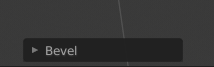
6) Tool tips (hotkeys for tools /status bar) appear in different places.
Bevel and knife tools hotkey list at the bottom.
7) Old “circle select” tool (C- hotkey) is not consistent with the rest of selecting tools.
Now every active tool has “new” selection method by default, shift to add to current selection and ctrl to subtract. Old circle tool adds by default with left click and using shift to subtract. Suggestion - rework old circle select to work like a new select circle active tool. (so we can navigate and orbit around, shift to add and subtract (ctrl) + add new hotkey to tweak radius of the circle, similar to paint/sculpting radius change (F hotkey) but F is already used in edit mode, so it have to be some other hotkey. Select circle active tool needs this hotkey too (to change radius). Right now we can change radius only here but it’s slow and inefficient.
Old box select (B) has the same problems but i don’t think anyone would use it anymore.
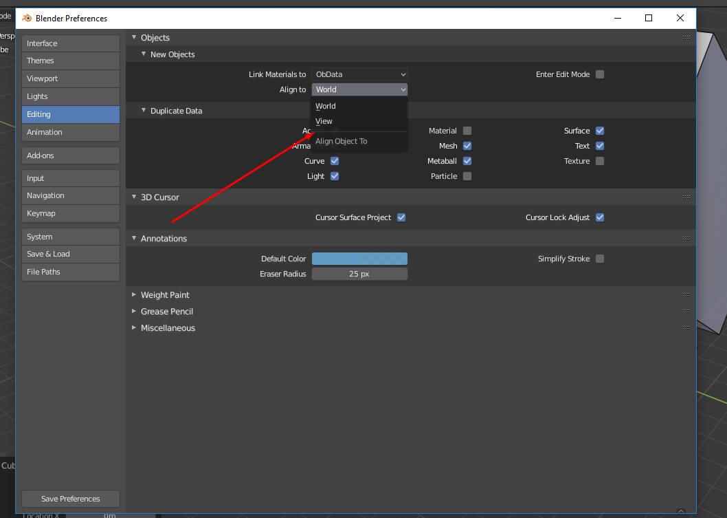
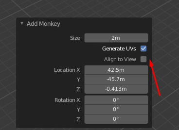
8) 3d cursor now has rotation and by default it rotates to “view” when you place it. It creates problems
active tool “add cube” creates cubes based on the 3d cursor orientation (i.e based on the user view, because that’s where 3d cursor gets its rotation from). It feels awful and never desired. And “add cube” active tool seems to be ignoring any settings and always gets it’s orientation from 3d cursor.
Suggestion :
Change default 3d cursor orientation from “view” to “geometry”. I think it will be desired behavior in 99% of times. Fix “add cube” active tool so it will respect “align to” settings. Add option align to 3d cursor here (it should not be default but having this option would be nice)
9) “Loop cut” active tool doesn’t show you preview of multiple loops. I don’t know if it’s a bug or meant to be like this.
10) “Offset edge loop cut” active tool doesn’t allow you to select anything when it’s active. (only hotkeys C and B allow you to select)
11)
“Poly build” active tool needs option “only quads” or something like this. We can hold Ctrl to split and Alt to dissolve but interface doesn’t tell it to user, there is no hints. And holding Ctrl creates conflicts with the snap tool, blender is trying to do both at the same time.
12) “Spin” and “Spin duplicates” active tools should be merged into 1 tool.
They are identical. The only difference is “dupli” checkbox should be on by default for
spin dupli tool but it’s not right now, at least for me. And they don’t seem to store their settings independently so if you change “dupli” checkbox on or off, it changes for both tools and the other way around. And it doesn’t make much sense to have them as separate tools anyway. So just merge them and expose “dupli” checkbox to the active tool settings.
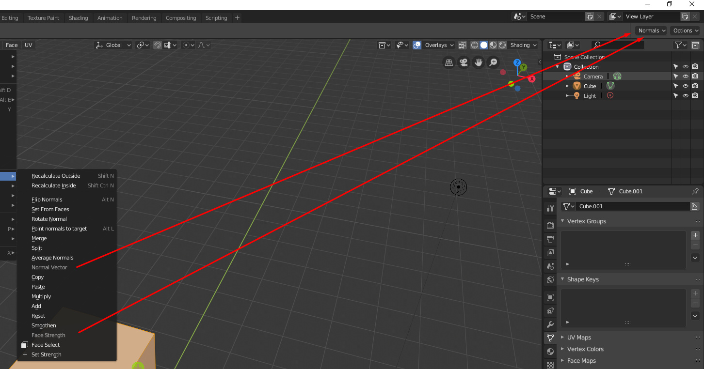
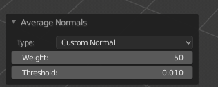
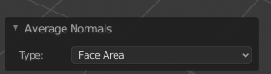
13) Edit mode > mesh > normals.
Normals menu is splitted into 2 parts and these 2 greyed out options in reality located on top bar.
I hope one of the devs will read this wall of text.
Just to point out, the modal selection tools are supposed to work like that, it’s what makes them fast to work with. There’s no point turning them into a glorified hotkey for the active tools. Also MMB is the mouse button for deselecting, so you need no modifiers.
Yes, i know that. But we can’t navigate in the viewport when circle select is active. And now we got active tool, we can navigate but can’t control radius of the circle with a scroll wheel, we need some new hotkey for this. So they both have cons right now. And both work different. I don’t mind adding to selection by default, but i really want to control my camera. And i’ve seen people were complaining about it too, so i suggested to make circle select great again.
Ii agree with @Way. Why deselecting with box is Ctrl and with circle select it is middle click? It is natural to rotate around while being able to select.
I have addapted to it, but still rotating without getting out of the tool would feel much more natural.
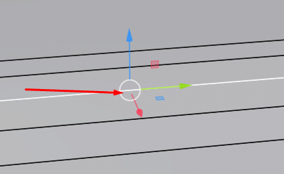
the outline of the selected empty/camera should follow the same outline width option than objects.
when a camera, light, or empty is selected its not distinguishable enough
its exactly the same width, no distinction between selected or not appart from a slight color change of the thin wireframe, hard to see !
It’s middle mouse button for both.
It sounds like what you want, is to just assign the circle select active tool to the C hotkey. Which is pretty easy to do.
Something about grab and proportionnal editing mode.
Why can’t we enter in proportional editig while grabbing ?
Currently, we have to activate it before grabbing/scaling or rotating. should we be able to activate it whenever we want.
or mabe i missed something ?
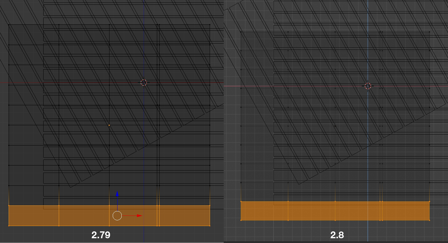
In the wireframe mode, there is a semi-transparency of the rear edges. In 2.79 there is no such thing.
You can change the opacity of the XRay in the shading popover
Look at my post above, point 2. That’s why i suggest to set it to 0 by default. I’ve seen dozen of confused people thinking it’s a bug.
X-ray does not affect this. I always put it in wireframe mode to 0. X-ray affects only the quality of the edges.