I do hate to argue about defaults. No wait… I mean I do like to argue about defaults…
There is a reason why default cm is empirically “better”. Human bodies and brains are optimized to manipulate objects within arms reach. So an ideal situation is for us to be still while picking up hand-size objects and moving them about on something the size of a tabletop.
Even for out of scale things. Imagine physically building a model of a building or car or human or bug. That physical model probably fits in a breadbox.
Right now, with the 2 meter cube, we are imagining a working area the size of a parking garage. The default should be a tabletop-sized. The cube should be about 10cm on a side. The monkey should fit nicely in your hands.
And this is the same scale that should apply to the material previews as well. Preview area the size of a breadbox with sample items that can fit nicely in your hands.
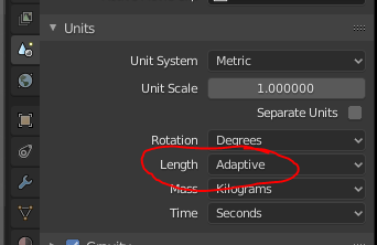
In the metric system, meters is the base unit. If the base unit was cm, I think it would make sense for thet to be the default. It’s built in to the metric system that km (kilo) means 1,000. So typing in 1,000 gives you 1 km. There’s a one-to-one simple mapping then. If we used cm as the default, you would have to type in 100,000 to create something that is 1km. The word ‘kilo’ (a thousand) in km then can’t be used to deduce how many zeros to add.
Meters allows you to specify very large objects and also very small objects.
Blender is not only for making things that fit in a bread box, you can make large things too.
Earlier, someone said that Blender is the only 3D app that uses meters, but that is not the case.
That is not at all related to what I said. Yes, the metric system is wonderful. And we can easily change from the default. And that should be metric system with working area the size of a tabletop and primitives that fit in a breadbox. Faced with things of this size you would probably use cm. The size of the base measure of the metric system is irrelevant.
It’s not irrelevant, because the metric system is based around multipliers like ‘kilo’, ‘centi’, ‘milli’ which only make sense if you start from 1=1meter.
Until you look at the numbers and try and rationalise them in your head, or measure something. centimetres are not really a common unit of measure. Things are typically expressed in meters or millimetres.
It is perfectly irrelevant. I am arguing scale while you are arguing measure. Like saying we should put grams on a human scale because that is the base measurement. Or to base cooking liquid measure in litres.
Yes, I am saying you should use any measure you like, meters, cm, inches. But regardless, when the monkey head is added in the default way in the default scene it should be of a size that fits in your hands. Right now you’d need a piano moving company to help you move one damn monkey head.
Ah, I thought we were talking about the default unit of measurement, but that is about the default size of objects. Those are two different discussions.
Yes, the default size of the monkey head would fill out the size of a room, which is indeed odd.
Both. I am just saying the starting point is of a working area the size of a tabletop with objects that fit in your hand. And preview area the size of a breadbox. Start there and select scale and measure that is most comfortable for most people.
We can talk about what people want all day but the writing is on the wall, blender is all grown up now. I see you saying pretty much the same thing a lot and I gave you the benefit of not quite understanding that there are other priorities outside of your own. I regret going off topic because I’m not here to argue.
Those priorities aren’t mine, they’re a large portion of the blender community’s, likely numerous developer’s, and Ton’s. They underline core concepts that have pushed blender development for at least 5-6 years, realistically longer.
And implying that blender has only just ‘grown up’ now that it’s gifted users of other software with some compatibility is horrendously insulting to any past blender users. Especially the numerous people who use it in professional work.
This however does not eliminate the fact that there are 2 (3) pairs of repeated words, with different meanings, in the upper right part of the interface.
This is not a teaching problem.
This is a problem to face, the only solution to which is not to rename terms: I am writing this here so that someone can think about it and eventually come up with a solution.
No, product design(such as furniture for an example), engineering, machining of parts for manufacturing and architecture is always done working in millimeters exclusively, no need to convert anything, minimizing the amount of material waste and more importantly mistakes. Outside of the US anyways.
It might also be causality of the flat UI design. In flat design everything kind of blends (merges) together and many UI elements look identical. In addition to that flat designs are often monochromatic which reinforces the problem.
It used to be that a button looked like a button, menus were clearly recognizable as well as input fields, drop down menus etc. Colors, shades and gradients also helped users to orient better; certain UI elements had 3D depth so they nicely popped up above their surroundings.
I also think non-flat UI looked more stylish and professional. But right now almost everyone and his dog implements flat UI.
Anyway enough of my rant, maybe changing the UI theme would be worth the shot and your students would be able to tell what is what right away. One could even try designing or remixing a theme with emphasis on differentiating certain problematic UI elements.