Blender UI paper cuts

I also think that the transforms tool should be separately toggled from the rest of the tools

Talking about the C select.

It is currently not possible, invoked from the keyboard “C”, to switch from add -left button- to subtract -wheel pushed-.

This is in contrast with:

  • the B box selection where the action is over as soon as the mouse is released (you need to press again to restart but you don’t need to press esc to stop the action).
  • the proposal to make this a tool to paint the selection ( https://developer.blender.org/T57209 ): if you need to paint you can’t press esc and again C every time you want to add or remove… is a very slow process.

I propose to:

  • keep the “classical” shortcut and the naming, being so easy to grasp the behaviour and remember: it has only one shape possible
  • re-implement the ability to switch from add to subtract and again back to add during the action, as a real selection painter with left/center mouse button (but, again with just a Circular shape…)

I consider those shorcut as one of the clever thing of blender:
easy to teach and easy to use (literally starting from ABC and quickly available for the left hand).

Thank you,
Rickyx

2 Likes

A similar question: Inaccuracy of values in Transform

1 Like

Not annoying but noticeable.

I think the Normal Map node should be connected to the Principled BSDF Normal Input (maybe also to the clearcoat normal input) by default since it is not obvious that one has to connect a image texture using this, but applying an image texture there is probably the most frequent use case for this input.
node

1 Like

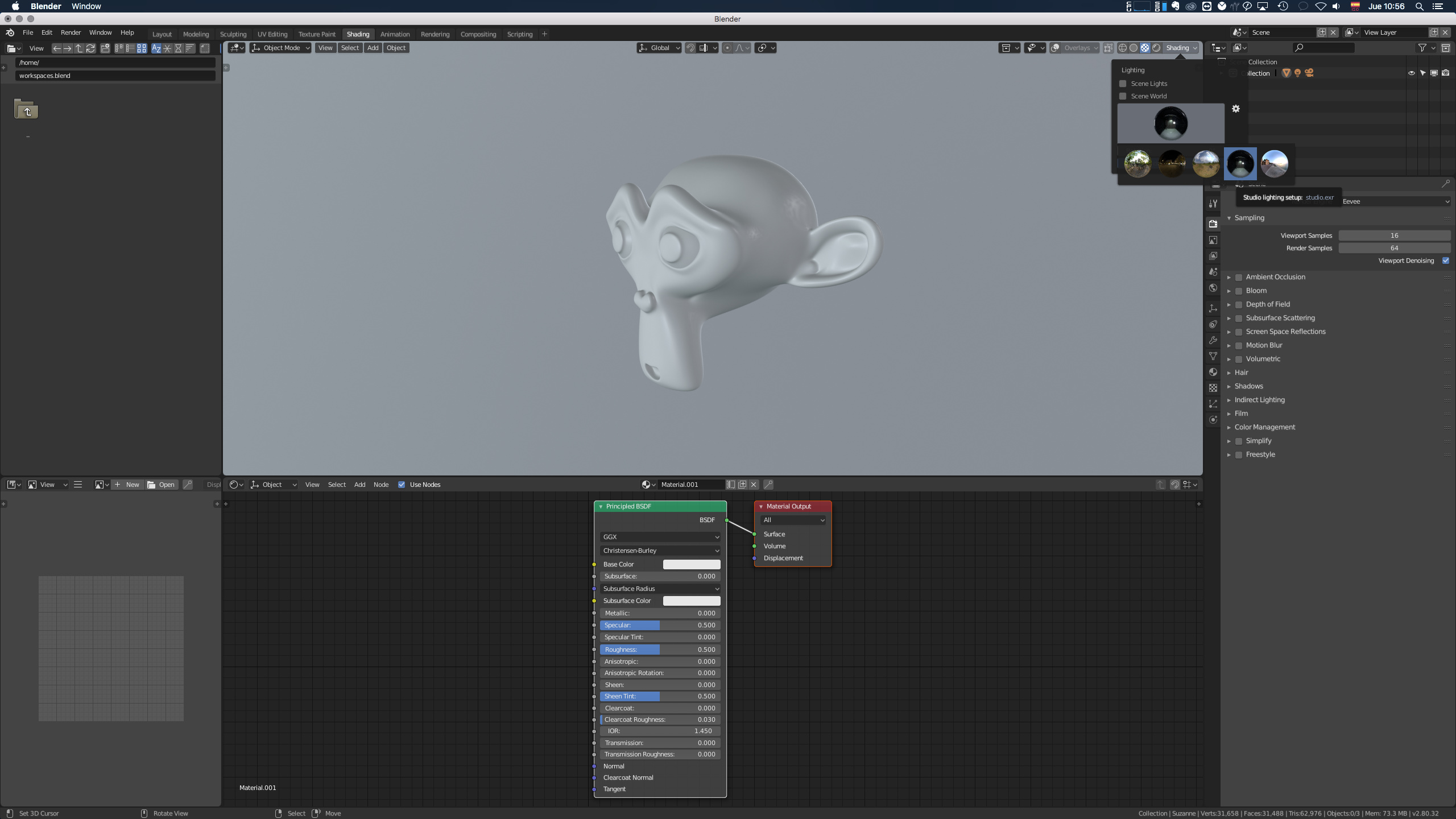
By default the hdr of the background of the shading layaout, should be the one of study, since it has a more neutral illumination and it is in the way that habitually it is going to work the materials not to have contamination of color in your models. Then the user will switch between several different backgrounds to check how their material is visualized, but the main one to work with is the studio one.

5 Likes

It doesn’t seem to be possible to scroll the materials menu using the Mous3(middle mouse) button, making going through the materials with a tablet a pain.
Screenshot%20from%202018-11-22%2012-39-39

4 Likes

The mouse needs to be very still when clicking the new tabs at the top. It invalidates the click if you move the mouse, making it difficult to switch to a tab using a tablet. If the only requirement was to have Mouse1(left mouse) pressed down and then moving the mouse over a tab, I think it would be better, and I don’t think this would have a negative effect on normal mouse use.
Screenshot%20from%202018-11-22%2012-53-13

2 Likes

This should work, and works here. Are you sure? What OS are you on, and which input device to you use?

I’m on Linux, Ubuntu 18.10. My tablet is a Veikk S640, which doesn’t have proper tablet support yet on Ubuntu, but the Linux kernel seems to now have some sort of universal tablet support which makes it work without pressure sensitivity or options on the mouse mode (the full tablet space is used for the entire screen, not mouse emulation). I have however been installing the newest Blender build through Thomas Schiex’s PPA, so perhaps I have an older build.

I can confirm this as well. I’m on Linux and using mouse. The tab switches on release and if you move the cursor a few pixels after the click the tab won’t switch. It’s the same story with the properties tabs.

Is switching on release an intended behavior?

In 2.7 if move object to hiden layer, then this object also becomes invisible together with layer.
In 2.8 if move object to hiden collection, then this object does not become invisible together with collection, is still visible.
Maybe I need to write a bug report?
sorry for my english

1 Like

That does not happen actually. If you set the Collection to be hidden in the viewport (Screen icon), if you then drop an object in there, it will also become hidden.

I’m assuming you are using the eye icon, which is only per object, not per collection. This is more of a demonstration of the confusing UI is in the Outliner, and another example of why we should improve this area, probably by removing the eye icons from Outliner altogether - it’s simply so confusing that users think it’s a bug.

4 Likes

Yes you are right
I use not only the outliner, but also the popup menu Collections Visibility.

Right, well you are not wrong to bring this up. If we don’t make this area easier to understand or simply inherently simpler, many users are likely to be confused about this. I spent a lot of time with 2.8, and even I get confused about this still.

2 Likes

Fixed now:
https://developer.blender.org/rBa7f9b57983aa8ac5a52a611634aeaf6c8191d226

6 Likes

Papercut: Adding a new material slot should automatically create the base material.

Papercut: Creating material slots and assigning them an already existing material, should automatically make it an individual material.

Right off the bat, I don’t see any use for have duplicated materials, that update each other.

It used to do this at one point, but was removed because it creates an unused material whenever you want to assign an existing material instead.

6 Likes

But the existing material eventually goes away after restarting the file. I prefer to know that when I click the plus button, I immediately get a material, instead of having to click once again to get it.

1 Like