Blender UI paper cuts

You want this?

But still, blender doesn’t have true edge selection, there will be always issues.

4 Likes

I want to propose small improvement to File Browser. In most OSs in file borwser user can switch between different thumbnail sizes, list, and detailed list view with Ctrl+Scroll. It would be reasonable to mimick this behaviour in Blender File Browser, since keybinding for it is free.

In general I’m strong proponent for capitalising on existing user habbits to improve Blender usability when it is not colliding with specific function, tool or workflow.

2 Likes

Huh. Well look at that! :stuck_out_tongue_closed_eyes:

Thanks, btw. :slightly_smiling_face:

Fix me plzzz. :disappointed:

The default blender search defaults to wildcard pattern matching:

bild

But the data api search does not:

bild

Also, the default view has a nice (but limited) filtering options for types of objects:

bild

(Missing mostly every type of object, but still… also, modifiers would be nice to have.)

But the data api view does not have anything at all:

bild

(Oh, and similar to this, I think it would be nice if view filtering options were separate from search filtering options… but perhaps that ups the complexity too much.)

5 Likes

I would like to see the selected objects automatically gathered (grouped) in the newly created Collection as soon as the user clicks on the New Collection icon. In fact, just the same behaviour than layers and groups in Photoshop.

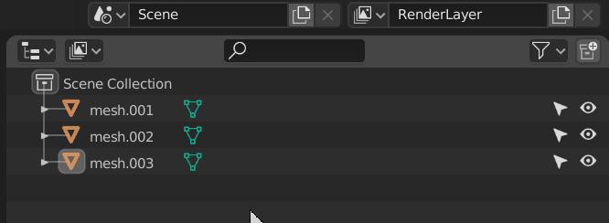
  • Current behaviour (when the new collection is created, the user has to manually move the objects into the collection):
    current

  • Proposal (once the new collection is created, Blender would automatically move the previously selected objects into the collection):
    proposal

EDIT :
Maybe a modifier key (ALT/CTRL/SHIFT + LMB) could be used to select objects prior to click on the New Collection icon.

Also posted at GSoC 2020: Outliner Discussion and Suggestions and https://blender.community/c/rightclickselect/V9fbbc/

17 Likes

This is useful, but I’d put it under a modifier key, like Alt + click… :wink:

7 Likes

This!
Otherwise the mistakes would be very annoying.

1 Like

I’ll third that. It would be annoying if you had to deselect everything first if you wanted to make a new collection

3 Likes

Totally agree. Why not a different icon though ? There’s so much space in the outliner header, we should use it.

To avoid confusion maybe: why two icons to make a new collection? How could you picture the feature in a tiny icon?
I’d vote for a rightclick menu option: “Put selection into a new Collection” and “Link selection into a new Collection”

Yeah it’s not obvious. Maya has a button for that, which is where I took the inspiration from. Clearly there should be a way though, I mean you can from the ‘M’ menu but a more straightforward way from the header would be nice.

Ha! indeed you are right… that would do snapping the CTRL modifyer.

Sad that its not documented would of saved my (and you) some time - hopefully its something that gets mentioned in the snapping tool notes… I might port that question into the Documentation section.

thanks for clarifying this @lsscpp

I’ve always had the feeling in blender 2.8 that the splash screen is not aligned. I think it’s because of the viewport and the properties panel, it gives you the feeling that it’s displaced. My simple solution proposal would be to put a black dye around it as I show in my mockup to focus the attention on the splash screen and hide the off-center feeling.


Proposal:

9 Likes

Why not…

Maybe if the “New Collection” icon opens a dropdown menu…
something like this quick mockup

should be just a UIpython job

1 Like

Outliner suggestions

1/4) Show selected items deeper in hiearchy.
Root -> Spine -> Spine_01 (Selected) -> spine_02 …

2/4) Optionally allow “Sync Selection” roll out hiearchy to the selected item. (Like in unity)

5 Likes

3/4) Filter for searching that shows only matched items.
OnlyMatch

4/4) Shift + click select based on what i see in searching.

Sorry for spam but i cant upload more than one image for post.

Ps.: Ok i can use Imgur, but i must go back to work so i leave it as it is.

3 Likes

No more buttons or dropdowns plz, it’s too slow. Blender already went too far in hiding things like this.
As suggested above, alt+click is the best clutter free and fast choice. IMHO!

That’s a good idea and a great mockup. Creating a collection is not something you do very very frequently (except maybe at the very start of a project), so I’d say two clicks is worth it. Plus we get to cram anything we want inside that menu.

1 Like