Blender UI paper cuts

I have noticed that the floating window when you open a new file is really slow if you drag it around, in comparison with the Preferences windows which doesn’t have any lag while dragging.

Hope it makes sense.

1 Like

I guess that’s the same issue as this: https://developer.blender.org/T69530

Actually I don’t think we can apply materials to specific vertex groups, unless I am mistaken ? We can apply materials to a selection of faces, but that isn’t kept track of anywhere as far as I know, except from the material panel, from which you can select faces onto which a specific material is applied. I’d love being able to use vertex groups from Cycles nodes, too.

Can we have a second option for Delete Keyframes? where it just deletes without the confirmation box just like the one for the Objects.
Del

5 Likes

Yes, you can apply materials specific to Vertex groups. But you have to do it in edit mode, as there’s no way to select the vertex groups otherwise. And you have to keep track of them with the regular material listing.

Another one is this, which was something I never noticed before until another user got confused by it.

These tabs have the same name on top:


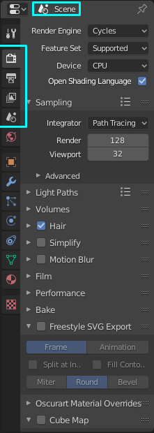
When they should have their names changed based on what they are, with only the Scene tab having that name on top.

10 Likes

I mentioned this a few thousand comments above : )
So I agree. It is very confusing.

3 Likes

That’s not the tabs name. It’s the context the settings belong to. You get the tabs name by hovering over the icon at the vertical left list of that panel.

1 Like

It still is confusing, especially when someone asks you where the Units setting is, you tell them is in scene and they respond “Ah, it’s in Scene-Scene, not Render-Scene”

2 Likes

Those “breadcrumbs” are useless, it should just be removed.

3 Likes

:joy: Ok that’s hard. I thought you meant it would be the name, but if it’s more about that there should be the name, that’s ok.

But if you replace it, the last information if a tab is coupled to an object( or something different) or not would be removed.For some tabs it’s clear enough without that info, but especially for tabs like “texture properties” it would be even worse than it is now. There would then be nothing left that tells that it doesn’t belong to the selected object.

1 Like

Those breadcrumbs communicate the context like @Debuk said but I find that’s not very useful in practice - users can learn all they need by hovering over any property (provided they have python tooltips enabled), and it would probably be more useful to have a user-targeted name at the top of the properties editor, such as “render settings” or “scene settings” - even though technically they are found in the same place API-wise. Maybe the two could even coexist, something like “Render settings (scene data)”.

1 Like

Yes a combined topbar might be a solution along with some updated tooltips. Generally I don’t think that the python tooltips are the right thing to use for that.
But I agree it’s not that useful, especially not there, as it could be useful for orientation but in the moment when you are switching tabs you are looking at the icons to the left. Anyhow a good gui should mininize the need to read the manual. So I’m against removing that information completely and let people guess about the context until they know everything well.

Maybe change it to something like this:
I changed the layout of the vertical list, the topbar and the icon order

The image is larger than the preview. So you have to click it to see it as a whole!

DeepinScreenshot_select-area_20191022122810

if you see here, if you scale the toolbar too much the icon collide each other
it would be much nicer if the “excess” icon would just be hidden and be scrollable just like in 2.79 instead of mushing it together. not a big issue but would be a nice thing for small screen user like me

5 Likes

Icons could be nice, but that is probably a no go for the “Newbies Path” blender taking. They seem to be evolving the UI around newbies and destroying workflow for “hardcore” users.

2 Likes

Well there is one downside to that. Never automatically do that, the autosave can be older than you manual saved version. So you will loose work if that time gap is quite big.

I always check my manual saved file time and than check “Auto Save”. Than i can see the time stamp on that auto save file.

Im seeing tons of crashes with bl2.81 on OSX. so i use this method a lot! It seems to be crashes couple times in an hour. If i dont check it using this method i loose quite a lot of time really fast

Same as with that PIN option, why use that? Basically makes the UI useless

1 Like

the problem of newbies can easily fixed with tooltips … :wink:
or even with the text name of the tools that appears on the mouse cursor when you roll over the icons …

like this…

9 Likes

TBF we can take care of ourselves, and when we don’t have the options to, we complain about it anyways.

Yep thats 100% true, there is already a proper working tooltip :slight_smile:

Whos gonna make it happen :wink: