Blender UI paper cuts

Yes indeed, the breakpoints just seem to be too far apart, meaning the Toolbar has to be extremely wide if you want to see the text.

Was no better remove the hability to resize the T-shelf and make only avalaible by menu or area controls?

In the example above, that would allow to get to about here before it changes to two columns of Icons:

ToolbarBreakpoints

1 Like

This would actually be rather great to fix if you can :slight_smile:

  1. Wrong icon for the Light Probe ObData icon on the Properties Editor’s tab (orange U15 instead of green T12):

  2. Proportional Edit mode toggle button uses one pictogram for both its states (I21) - enabled and disabled. I20 should be displayed when the mode’s Off and I21 when it’s On, for better state indication.

@billrey - two low hanging fruits to pick by the way of icons update.

1 Like
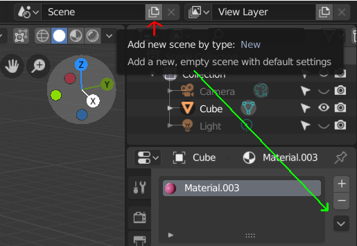
  1. Shouldn’t this become a drop down button without a tooltip reading “add new scene by type: new”, since the button triggers regular menu?
    scene%20-%20tooltip
    scene%20-%20menu

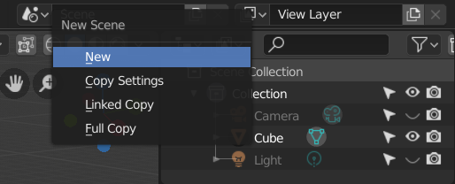
BTW, material, texture etc., could get the drop down button instead too.

@billrey The world in cycles is not limited to being a simple material, there are many more things so the icon should not be red color .

2 Likes

I meant to say that the toolbar snaps at the break-point from the two-column icon layout to the name layout (right now it only snaps at the two-column-layout ‘side’ of the break-point but not at the name-layout side), not that it would snap wherever all the names can be fully written without ellipsis.:slightly_smiling_face:

1 Like

Option to set animation duration for the Tools and Properties pane animation and other UI animations in general

(EDIT: typos)

Similarly to to the Smooth View preferences setting that controls the duration of the view animation and completely disables it when it’s set to zero, there should be a similar setting for the Tools and Properties pane fade-in/fade-out animations (pressing T and N shortcuts when Region Overlap is turned on), and another one for the rest of the UI animations (e.g. when expanding/collapsing a pane with the little triangle next to its header).

Explanation

These UI animations are problematic because:

a) The animations take time which can be annoying to power users. The UI definitely feels snappier with the Smooth View set to 0 or to a very low value, for example.

b) These animations can be slightly, or in some cases even severely, nausea inducing to some people (they mildly annoy me, for example). It would be very handy for such people to be able to disable all UI animations.

Also note that if Region Overlap is turned off, the panes can be toggled instantaneously. It is unfortunate that currently that’s the only way to turn off at least these animations.

Potential duplicates

The below two posts did also bring up the issue, although they only proposed to introduce a toggle to turn the pane animations on or off. This proposal of introducing two Smooth View like preference settings for the pane animations and the rest of the UI animations is more flexible and pretty straightforward to implement (internally, there must a hardcoded time constant used for these animations; these just need to be made configurable by the user).

1 Like

I don’t think this needs an explanation:

I mean, you can probably extract a more sane name from the string you use to open that specific menu, right?

9 Likes

Unless I’m missing it somewhere, there doesn’t seem to be a way to change a workspace name.

image

I suggest you should be able to do this in the workspace panel:

image

3 Likes

Double click on the tab…

3 Likes

Keep position, rotation of vertices on a curve while editing other vertex.


array should generate parts by length of segments in curve.

You edit only selected part
like this: https://youtu.be/aq40xnFU7aI?t=59

1 Like

How about simplifying the look of the outliner by removing the horizontal stripes, aka make it so that every-other row is not a different color? Or give us ability to change the amount of color difference via the theme (unless there is already and I cannot find it). Without the stripes, it would look something like this:
simlpeoutliner
I think it looks simpler and easier to use. :slight_smile:

3 Likes

whooop … i like that, looks sexy!
the grey visibility icons could use more brightness though because right now the look disabled.

it looks nice, but when you have a ton of objects in your scene, having the stripes does help you look at what’s enabled/disabled without having to hover over the object.

4 Likes

I believe the Outliner alternating rows are hardcoded. It could be themable, so you could set the strength and color value in the theme.

3 Likes

I don’t know the correct word, but in the UV editor I see two options for stitching vertices together, but no option for pulling them apart:

I have unrwapped an island and aligned it. Now I want to separate it into two islands without unwrapping again (because that would ruin my previous align work). I don’t even know if it is possible?

It’s there… redownload…

Anti-aliasing settings are now hidden under a tab AND a drop down setting in the latest 2.8 build:

WTF!?

There’s 2000 papercuts in this thread. Why did the developers have to go and create a new one?