For anyone curious, following is a comparison between current 3D Editor in Edit mode, versus the earlier mockup. At 1X scale, so forgive the bluriness.
It takes up a bit less space, despite gaining one-click access to many often-used settings. But it is also a lot less clear - they definitely need those “instant help hint popups.” LOL. And I find that although the current mix of menu types is messy, the changes in type create waypoints that (accidentally) group the sections. When making everything more uniform it can make it harder to spot individuals. And the collection visibility thingy is probably too small to be usable to my eye, despite being about the size it was in 7.x
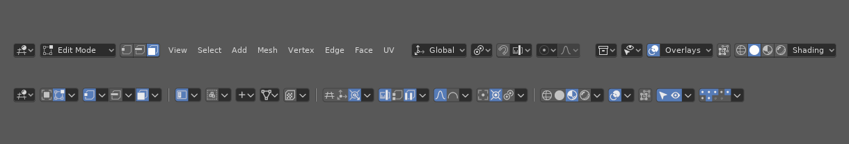
So overall I found it an interesting exercise, and fun to play around with, but not much of a usable thing.