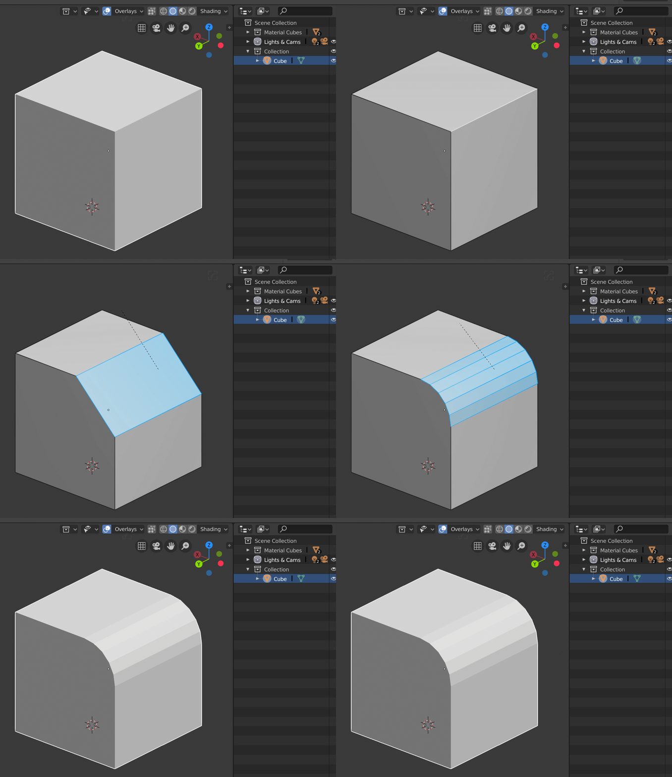
Hey guys, hope I’m posting in the right place.
A small UI Paper Cut would increase consistency in the UX. Everything related to selection in the UI and menus highlights in Blue. But the default themes selections in the viewport are Orange. The default theme should build on it’s consistency by having the Blue selections reflected even in the viewport and while modeling.
