OMG this is what I wanted in blender , please do it for Edit Mode too…
The placement of the Adjust Last Operator feels awkward, since it’s in the corner but never sits flush with anything and just sort of hangs out off center. IMO it would be much cleaner to stick it in the sidebar. That way it can be easily hidden or expanded and there are less things to manage.
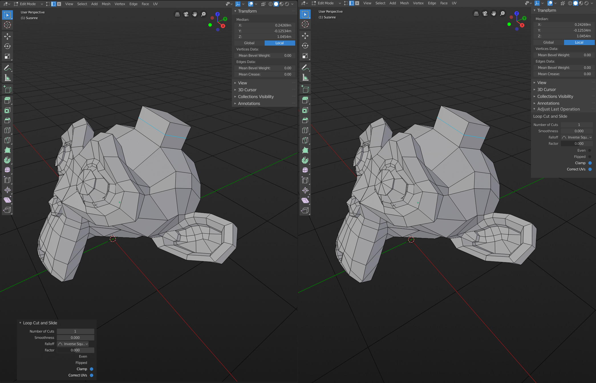
I get that we don’t want to crowd the sidebar, but it’s better than crowding the main part of the viewport.
8 Likes
