https://www.dropbox.com/sh/jatljnpbgxb3sox/AABswvTEa_5U8FC1W0PKQeE3a?dl=0
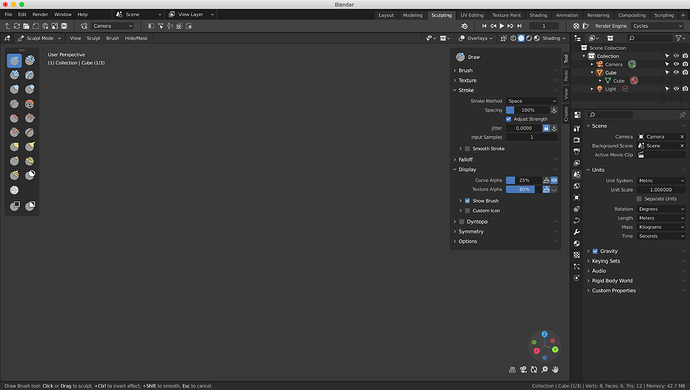
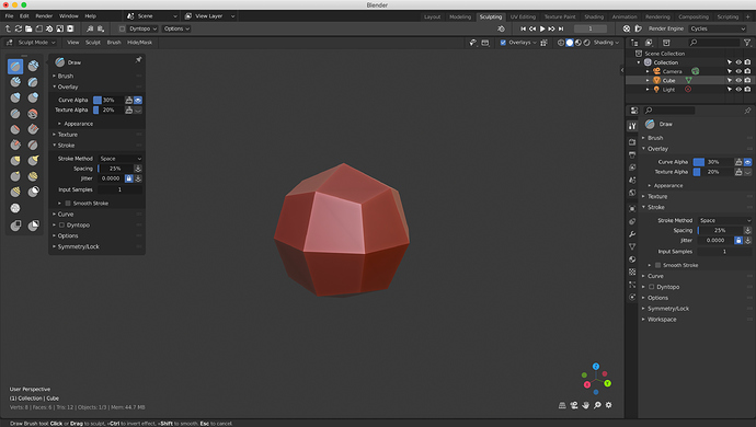
Sculpt mode, tool settings panel.
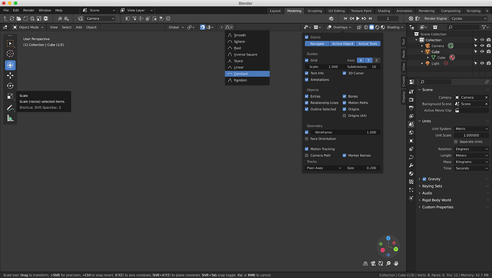
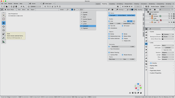
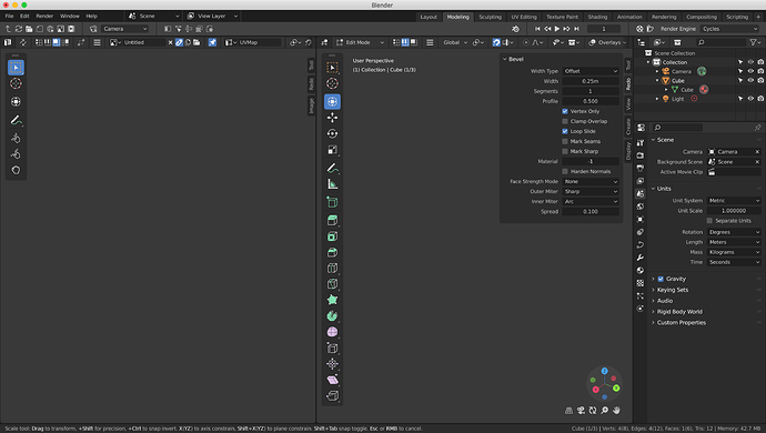
in particular, this mockup makes sense for all active tools …
having the tools close to the buttons simplifies the interaction
I still thinking that sculpt must have a big improvement. Beginning by the icons, change of brush actually is harder.
I like how you are adding icon button to the top toolbar. I have kinda been using a fork do that (bforartists) - they have merged in 2.8 alright.
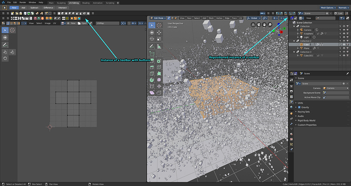
Out of personal preference, the toolbar being customizable is a must to me, and that is what I like of BFA. Also, it’s positionable anywhere, like at the bottom the toolbar is the animation toolbar.
If the top toolbar with sliders, toggles, dropdowns AND customizable, positionable, and with customizable button rows would be beautifully amazing and versatile. Right now the fork is sorta hacking it. I like your initiative - you know how to dev this?
Yes, of course, it’s the same for all tools. When this panel is pinned it is similar to the previous T-panel. When it is not pinned, it behaves like popover and automatically closes when losing focus.
I think the top-bar or editor header may have something like pages with previous/next buttons to access more options.
Editor header default “page”.
Next optional “page”.
Topbar with the pages.
Unfolding double topbar.
I think there are a lot of good ideas here, and many that I’m surprised don’t exists yet. It might be best allowing the tool doc to have separate and more relevant doc bars for each themed tab, and also allow customization similar to Maya’s ctrl+shift click on an icon to doc it (you can even doc action scripts which would be awesome in Blender). For example, the render tab NEEDS those render buttons! I think some kind of loading bar (like Zbrush and others) to show when it auto saves would also be extremely helpful since no one ever seems to know that feature exists until it is too late.
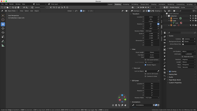
I posted this in papercuts but think it is more fitting here. I should also mention that the add shapes option is pending with the developers, though they seem to be adding it to the toolbar which I think could be the smarter move because the icons are relative to where you use them. Maya also has a very cluttered set of redundant tools, that can waste time learning and search through (some times up to five tools for a task Blender can solve with one). So I am hoping Blender can continue in keeping their UI in as smart and clean of a layout as possible. For example, the shapes could start as the three simple primary shapes, (Cube, sphere, and pyramid), and those three icons could be long clicked on for drop down for there 2D or other variants. Personally, I think the smartest way to handle this has objects UI replace the transform UI when nothing is selected because it gives a starting place for the transform. 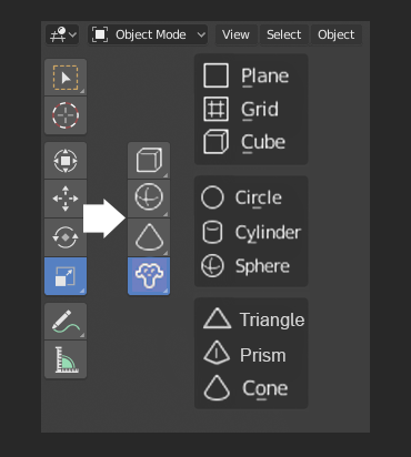
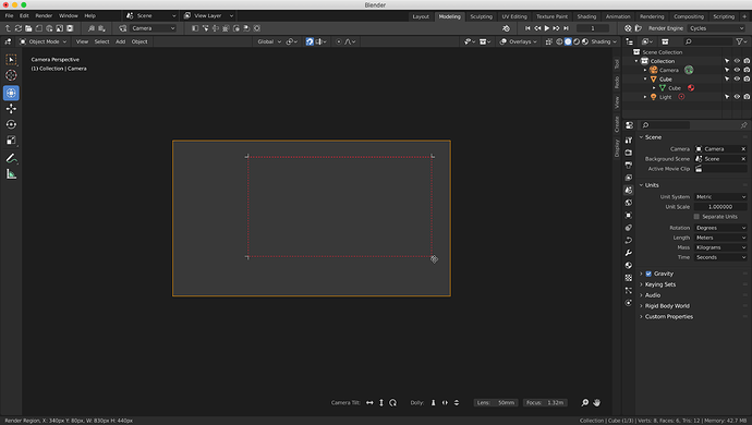
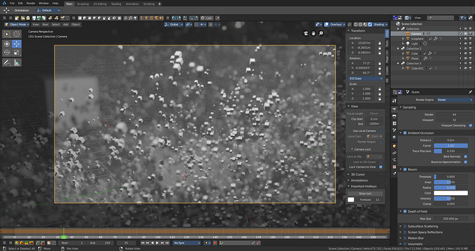
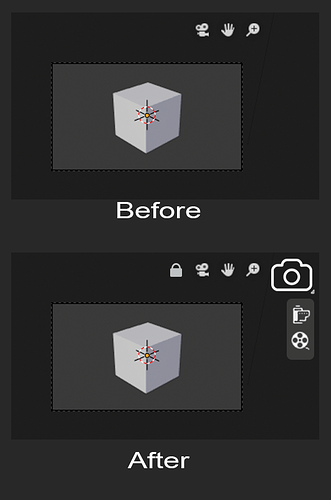
I also think it would be more intuitive and fluent for the render button to be in the Viewport because taking a photo in real life is simple as clicking a button when looking at something you like. In Blender, there are a lot of confusing tricks that come into play, dealing with angling camera without knowing the hotkeys, learning about the outliners and modifier camera visibility options, useful options like lock to view are hidden in one area when settings and the render buttons are in another, not to mention for some reason it brings up a new cluttering pop window instead of just switching the themed tabs. Most of the camera’s features really don’t become useful until you introduce animation, so I think it is something worth simplifying and streamlining. Whenever I am in the viewport I press the camera button half expecting for it to take a viewport rendering like in 2.79, I’m not sure how to do that anymore but instead, it goes to camera view, it would be crazy in real life to be looking through a camera with the button and yet its no where to be seen. Fortunately, the gizmo and perspective UI disappear, making room lock to view (the same way people in real life can look around through a camera lense), and a snapshot button, along with a drop down for the more advanced rendering options.
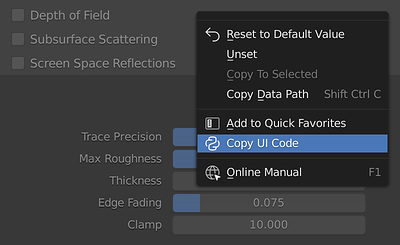
I imagine that the content of the topbar is a script/addon that can be easily edited, with the ability to copy the buttons code. Of course there may be some kind of editor but that’s another story.
It’s a good idea to show some information about auto-saving, for example it can be the default state of the notification block.
The “Back to Previous” button in more correct place.
The Transform tool have options - move, scale, rotate on the top bar. I don’t see any differences from the separate Move, Scale, Rotate tools. So maybe these tools are overkill, but to replace the tools when nothing is selected it’s inconvenient, it will need to deselect objects every time in order to use these tools.
If the render button will be on the tor bar, it will not be needed in viewport. Although additional gizmos to control the camera can be added to the camera view, like in the mockup in the (updated) first post.
Make the switch between lasso, rectrangle and circle select more unified.
Currently to switch from one of these tools to another, you must first disable one active and then you can press the shortcut to switch to another …
Please make the switch more immediate simply by making it possible to press the shortcut needed to select the next tool while one of the select tools is already in use.
I know it is already possible to do this in some way for the left click select mode by pressing “w” several times
@billrey
To be honest guys…
who agrees with me that that empty space on the sidebar recalls a nice "Texure Slots / image Layers" panel?
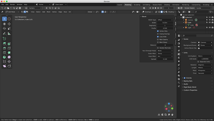
I think either I am miss understanding you or vice versa about there options. However that brings up a great point, I think those bottom left options that pop up when using a tool could have an extremely relevant placement in the top toolbar. That should be a great proposal!
How is it inconvenient? In the same way, there is no use to transforming when nothing is selected, the same way there is no use to having a selection when adding an object. They are perfectly interchangeable, It is screen real estate friendly, and as for as clicks go, you will already have to click once, either the tiny add menu or the entire viewport, think of the viewport as a larger button that you are already more likely to click on to clear the selected outlines when viewing the scene.
I still like the idea of making more use of the top toolbar, however, I am leaning towards expanding the already existing right options (that show up in Edit), and relocating the bottom left options because they are both 100% tool related options which naturally fit on a toolbar. The second bar could be cool, like an omnipresent quick favorites section.
I understood you this way, when some object(s) is selected then there are “transform” tools, and “add object” tools hidden. In this case, if I want to add an object I need to “deselect all” first, this is an unnecessary extra action.
In any case, “add object” tools should first of all be in Object Mode and there is plenty of empty space on the toolbar.
Same amount of clicks as I stated above so nothing is extra. Mainly my goal is to keep a clean as possible layout, the placement biased off the version the developers already have pending https://developer.blender.org/T57210.
I get why you would want to add objects on the top toolbar, there is a lot of empty space and for convenience sake, I agree but disagree for consistency sake as I mentioned more relative options could be a better fit. There is still a lot of potentials if the right half was sectioned off to go along with the theme tabs, especially with your right-aligned themes. Right now a lot of the options seem a little cluttered, but still a great starting place.
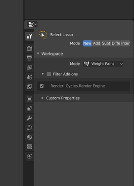
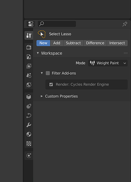
A before and after comparison of the Properties editor.
- swap the Modifiers and Object Data tabs, this will separate visually similar icons of the modifiers and constraints; also this is more logical, the mesh and then the modifier of the mesh
- separate tabs of the Particles and Physics in a separate group
- less separators between individual tabs - less noise
- less contrast between the background of tabs and panels will make the icons more visible
- separate the editor header and the its panels
- sub panels without additional background
- sub panel contents with a indent
Next to the search field, I can imagine < prev & next > buttons to quickly switch back and forth between two or more panels instead of scanning the vertical icons each time; and maybe also a Favorites button to show a set of (previously picked) panels
Seems like a whole bunch of extra buttons to band-aid the design fault in the icons, instead of addressing the problem itself. If the tabs were easier to distinguish, there would be no need for any of that.
@Antaioz, @lsscpp, one does not contradict the other.
Here the problem is more than just distinguishing icons. You need to first think about where the option you need is located, then find the tab/icon, scroll down, expand the panel, expand the sub-panel, expand the sub-sub-panel, and it’s all in order to click one checkbox.
So a kind of Quick Favorites menu might be useful.
I like some style decisions.
Anyway, I think that we won’t see any change for 2.8 or other versions.
