Blender is moving in the wrong direction

i’ll leave this here so maybe people will understand better , cheers :wink:
https://youtu.be/LxQ-uqJq3dA

1 Like

I have been doing that.
The day I read left-click was default now I did this in that order:

  • Stopped working
  • Took a deep breath
  • Opened a good bottle of wine
  • Lit up a candle
  • Silently shed a tear of joy
  • With shivering voice whispered to the silent room:

Thank you. Thank you people who finally, after all those years of pain and confusion, finally you have done what is right. You have made a brave decision to finally do what would always have been rigth. You have decided to withstand the shitstorm.

I can say that I owe everyone involved in that decision a beer. Or 10. :beers:

To your points: Change is hard. And this one is a brave, big change. It will take some time smooth out rough edges. It’s a good change.

7 Likes

What seems to be missing from the current 2.80’s design paradigm is the concept of a passive tool. I mean we have actions, and we have active tools, and then amongst active tools we also have things that should be designed to be passive, such as the selections.

Passive Active Action
Select *
tweak *
Move *
Extrude Region *
Extrude Faces *

Passive tools and actions should be usable at all times. An active tool should only be usable while it’s active and the only way to use it should be to interact with it’s gizmo/widget, the selected passive tool is what’s triggered if you interact with anything that is not the gizmo/widget. Actions are immediate and operate on current selection.

2-80_Toolbar

Or am i horribly wrong here?

15 Likes

Hey Man! I feel you, and I am struggling like a mofo and having proper anxiety about losing the two most important elements of professional work: speed and efficiency, they could also be equated speed=efficiency. I’m also an owner of 3Dcoat, really thinking about grabbing a substance subscrption, but I’m not giving up on good old blender, also my goto tool for making a living 5+ years at least. I think I’ll let go of the pressure of switching to left click select since, in maya I know I’m in maya because of selectig with the left, and same for blender (with the right click). I takes 2 minutes to adjust to each software. I think I’ll HAVE to use 2.79b for at least another year as a backup plan, cause it’s hard to beat. I just hope right click select will not be a second class citizen down the stretch. There WAS logic and serious thought behind that concept. Period. Stay strong bro, we have to wait for 2.8 to catch up to 2.79 efficiency and then switch.

6 Likes

Totally agreed period.

3 Likes

Unless I’m misunderstanding you it would seem you are wrong(build from 29th last month):

The layout adjusts responsively to the space/panel size. Sure it could be optimized to be more conservative of space, but that is a different discussion and has been discussed before I seem to recall.

Theming/colorization of icons is planned as far as I know. Blender 2.80 is not finished.

I can agree with you on point 2 in as far as the top bar needs a lot of improvement and optimization. I have little in views of how though, at least for now. But it does feel off to me as of right now.

For the first, I think a change to being a tool pallet was the right choice, however it might be interesting indeed to also see an optional “Action Bar”(which is what the previous one really was).
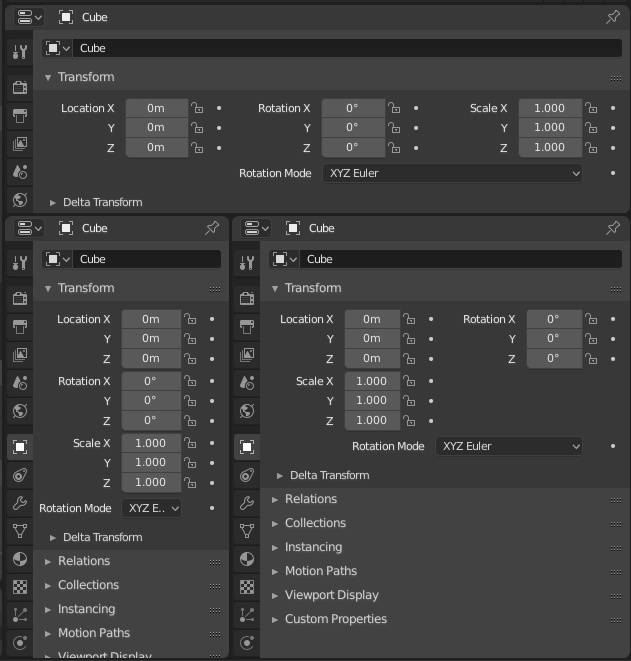
Yeah, they have made little improvements to the properties panel layout but the “auto adjust” still isn’t working in all tabs. Particle system tab for example.
This hopefully is a thing that will be fixed in the final build.

And about the top bar. Earlier in the other topic I told my idea of how the top bar could be improved.
I think it should be part of the viewport and work similarly to viewport header. So you could toggle it on or off and adjust it’s position between top or bottom (or maybe even side to side?).

The new UI look and all the changed hotkeys are surely a things that I will get used to. But some more colours here and there would help me remembering things and speed up the learning process (and look better to my eyes). So themes would be a nice thing.

But the new toolbar and the new top bar will surely slow me down when I’m working.

1 Like

I think the topbar by it’s very definition should be at the top as it is, however I would argue that it currently features some things that it shouldn’t. Take for example the drop-down options panels docked to it’s right. Those belong in the properties side panel of the space the options are from, in the case of your screenshot: 3d view in Weight Paint mode.

As for reach-ability, I’m inclined to argue that the top bar should always remain at the top, however there should also be a pop-up panel that can be summoned by a shortcut that would appear at the mouse cursor to give access to the items of the top bar anywhere you chose to summon it. Lets call it quick access panel.

3 Likes

@brecht, @billrey , I hope you are following, there some good ideas poping here.

1 Like

you red my mind, u can say i made a similar example here.

I’m not a professional (beyond doing some freelance work), but I very much agree.

UI and control wise I don’t like any of the new stuff in 2.8 at all.

The gizmo stuff looks fancy, but it is useless for anyone who knows how to use hotkeys. It is a mild annoyance for me personally, but it points to Blender and future addons going in a new (and less efficient) direction.

I don’t think most people understand the significance of switching to left click select. It doesn’t swap the function of the left and right mouse buttons, but just stack everything on one instead. This leads to mis-selection, accidental movement of objects, and removes the ability to deselect a tool.

Standard hotkey for deselect is now Alt+A instead of just A. That’s just slower.

The T-tab is gone, and all the addon settings are now jammed into the already full N-menu (where lots of rigging functionality also ends up), making it a ridiculously messy and long scroll list.

In place of the T-menu, some 100% useless buttons have been added, which only serve to make Maya/Modo users feel more at home. They will just stop new people from learning how to use Blender properly, and that can lead to even slower standard workflows in the future.

Pie menu is now integrated, seemingly at the expense of the neat dropdown menus. This only slows down the workflow and leads to much unecessary clicking and mouse movement. Clicking a hotkey doesn’t land you on the previous function used and you have to spend more time and energy to find what you’re looking for when everything is spread out in a random circle (alternatively memorize all the positions).

Space is now a standard playback hotkey instead of for searching, like anyone needs a playback hotkey available at all times…

The monochrome UI icons just makes everything less discernable, and that also steals time when you’re working.

I love Eevee, grease pencil and other new features, but the UI is just getting dumber and slower it seems. Though most of it can be adjusted to work like it did, it will affect new users and Blender design philosophy in general. It will in turn lead to addons that follow the same slow principles, which further solidifies the direction of Blender development. Many refute this by saying that you can still change back to left-click and all, but that’s a bit irrelevant. Kind of a bad comparison, but in Maya you can also adjust hotkeys for most functions, but it’s still a slow, clunky mess, because most people use the standard setup and that’s what everything is built around.

But I get it. I get that Blender wants to be more inviting to new people and Maya-users, to become more accepted in the industry. That’s great. But please don’t dilute Blender’s strengths to make it more accessible. There are better ways to do this. Make the huge transform buttons optional, don’t throw out the T-menu (just hide it by default, if you don’t want it to be in the way), and maybe SWAP the left and right mouse keys instead of killing one of them?

Also, the good stuff: I’m very happy to see that we can finally use right click for something more useful than placing the cursor (which almost no one places manually anyway). Collections also seem like a good idea, though it’s still a bit confusing to me.

More changes I actually want are these:

  1. Give me a proper warning before overwriting a file - a red text box is not enough. Sometimes I accidentally double-tap a key and kill my work. Has also happened when I accidentally ‘export’ instead of ‘import’ an OBJ or something.
  2. Even edge extrusion (extrusion that maintains the size ratio instead of scaling more/less in one direction based on the shape of the object) - Currently you have to use an addon for this very basic function.
  3. More CAD-like control options in general, with measurements.
  4. Some sort of warning system for when you undo in object mode (and subsequently lose all your history in edit mode)
  5. Automatic Flagging of animation Actions and other data THAT EVERYONE OBVIOUSLY WANTS TO SAVE
  6. Automatically search in the file browser when you start typing

Thanks to all the developers, for the amazing work you do on Blender.

5 Likes

I have to say I agree 100% with the UI complaints where toggles were turned into pie-menus. Toggling between object and edit mode, and between solid and wireframe are things I used 10 times as often as any of the other options on those pie menus. I lose so much time with the pie menus.

Ouro’s suggestion about restoring these toggles, and shifting the pie menu onto holding those keys is right on the mark.

4 Likes

Hi all.
I get your frustrations on the changes to Blender, but come on guys. Ton and the development team are clearly working their backsides off and doing an amazing job on transforming Blender. I have used autodesk products for the past 20 years, specializing in Revit. I am not a Blender expert but I am more than happy to accept the changes being made to Blender.
I want to give a shout out to Ton and the development team. Well done guys. Freakin amazing job you guys are doing. Ton, you are awesome for giving Blender to any and everyone who wants to use it.

3 Likes

I’m a hobbyist and used Blender for the last 5 years to create models, textures and rigs for mods I’m working on.

What I don’t get is that you have all old functionalities there too and it can behave almost like Blender 2.79 with just a couple of clicks and some hotkey tweaking.

From the past weeks I tested 2.8 I love all the changes and you can still use the old hotkey based workflow and it’s still as fast. Also, I never pressed the buttons for the modelling tools in the T panel and the tool icons look more intuitive for new users, which is a good thing.

Making Blender more user friendly while still maintaining it’s workflow is a good direction it takes :+1:

8 Likes

@Rekov It’s not a rocket science to change two shortcuts… Don’t like it? Change it - simple. If something like that is to complicated or too much work, than…

its not rocket science, its data science. ok if thats so easy, show us how to add back the object convert menu… then imagine that its just one of the various removed shortcuts.

2 Likes

right click → “add to quick favourites” on the menu entry.
do you even 2.8 bro? :slight_smile:

Not, quick favourites, I mean the MENU: “OBJECT_MT_something”.

1 Like

Simply add a new shortcut in Preferences > input > 3d View > Object Mode > Global
With the operator/action “object.convert”(without quotes) and whatever shortcut you like.
To find out operators go to preferences > interface and enable Python tooltips.
When hovering over a button or menu item the operator will be displayed.
Or simply open 27x preset and search for old shortcuts.

The other way is to right click a button or a menu item and chose assign shortcut. It doesn’t work for parent(group) menu entries unfortunately for now.

There is no option to see the idname or assign the sortcuts of menus, you have to dig into the python shell if you want to get a menu name.

1 Like