Admittedly I’m not sure I understand. For example, if I select bevel from the T menu vs. using the ctrl + B shortcut (with or without the menu closed), are you saying they’re not the same tool at that point?
Yes, it’s not the same.
haha I don’t understand the point of this at all. I will say I’m a new user so maybe I’m missing something, but to me the last thing I want is to be reliant on going back to the T menu to select things like rotate or bevel. I’d want to learn the shortcuts as I use them and only ever reference that menu when I need to select something less commonly used, such as the spin tool.
6 Likes
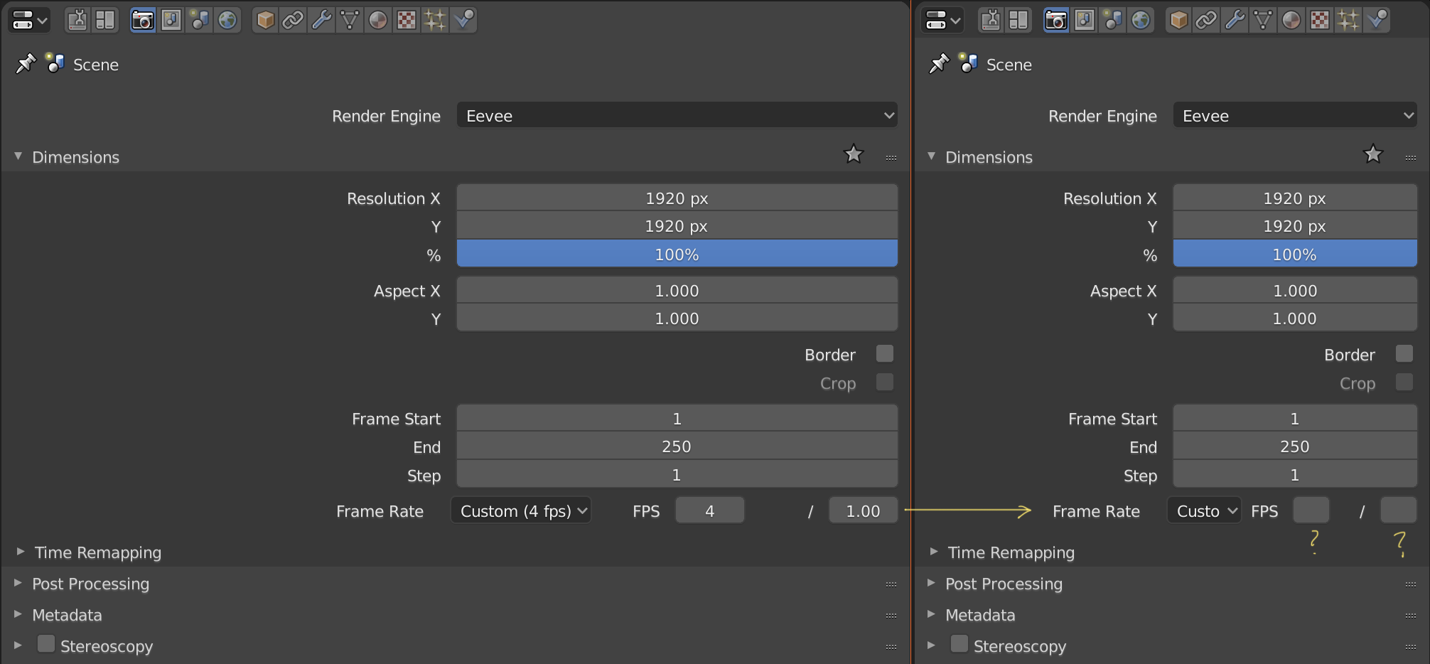
I think that the customizable frame rate is not displayed correctly if the attribute editor is not enlarged
I don’t understand your message perfectly, but yes, it’s the same that I’m telling in the video.
1 Like
Something related to this that I could never understand is why those editors ships by default with an insane narrow width, and hiding important stuff.
I even made a topic about this before.
Enlarging that area is literally what everyone is forced to do everytime they launch blender.
Why this is like that is beyond me…
Hit the b key. You will instantly start beveling selected edges. When you’re done with the bevel operation on those edges, the bevel tool goes away. Click the bevel button on the tool bar (or press space+B) you will have the bevel active tool on your left mouse button. You won’t instantly go into bevel mode on the currently selected edges, but anytime you left click+drag, you will bevel the edge you have selected. If you then select another edge and drag, you will be beveling it. The left button will forever have to bevel tool “attached to it” until you pick another active tool.
1 Like
Ah, I see. That makes sense now. Thanks! That being said, as a new user I found that differentiation completely incomprehensible - I wish the old tools were still on the tool shelf and there was simply a toggle to ‘make selected tool the Active Tool’ for when you want that behaviour over the previous tool system.
Double click to send 3d cursor to the origin of the grid
I noticed that you can not send the 3d cursor to the origin of the grid with just two clicks to its icon and I think that this is something very useful and necessary that should be implemented. Another alternative could be that this icon deployment a menu like the selection and scaling buttons below.
3 Likes
What will happen with the “wizard” that ton mention to select your belnder configuration??
Needs a design and implementation. You’re welcome to contribute designs, ideas, and even implementation!
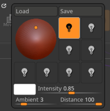
Same for Shadow and Cavity, why not add the color of the theme and workd directly in the popover?
Still nothing to change the values of the specular?
All of this is nice, and we need to be abble to make something like a shader with those presets.
That’s why having the possibility to change the specular without the need to make a shader is important.
Same for the lighting, matcaps are nice but I miss the opengl lighting from 2.79.
Or something like zbrush.
1 Like
Andrea is right, you are going in confusion with the top bar, it must fit in the window space. blender is not photoshop
besides that small window almost at the center of the mesh parameters is annoying and not very functional …
it is true that in the old tool shelf there were some utility problems … but I would say that in the momentary state, the blender 2.8 has serious regressions at the power using level … a feature that has always been a strong point of blender. and distorting it from this point of view, I believe it is not wise. I understand that you want to make the interface a little more user friendly for people who have little to do with 3D … hence the similarity with photoshop in the structure that took the top bar and the shelf tool … but you are forcing it and you are going to a breaking point with the power user logic.
go back to the original philosophy: blender is powerful in the workflow, this first of all …
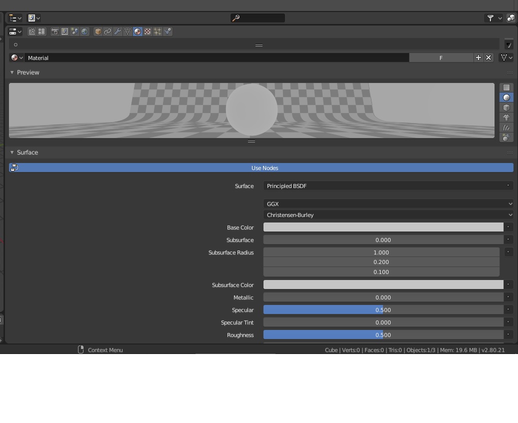
moreover there is to be adjusted in my opinion all the aesthetics of the property panels … too much space wasted … and too long the bar that goes from tool setting to physics
a better taxonomy with sub-categories is to be created … a beginner user who comes to blender for the first time goes insane in finding the shader panel as it is hidden behind the window size of the properties … he will only find out if he expands the window space or if you rotate the mouse wheel on the property bar … this is very little user friendly and is also annoying for the power users … to finish what sense does it have buttons and sliders so long ??? put limits of size —> take inspiration from the android material design for a better dynamic interface with the dimensions
Yes to this. Perhaps more squircle than circle though. Meshmixer takes care of allowing the user to click on obscured faces of the view cube by including arrows that point inwards. So there’s a distinction between “these sides you are presently looking at” and “these sides you are not”
Im not sure if it was by accident or if it was the reference, but many of the main concepts of the new blender 2.8 interface are basically used in 3DCoat, not photoshop nor other standards.
Dedicated spaces, top bar, tool shelf and space bar tool shelf, etc
For reference, 3DCoat its a better example of prof of concept about how would it work rather than other softwares, at least at the moment.
I don’t care about looks of UI. Just want it as fast as possible. 
2 Likes
new text hinting make text in blender hard to read. my eyes drain.
i wish its not default.
top with text hinting, bottom without text hinting
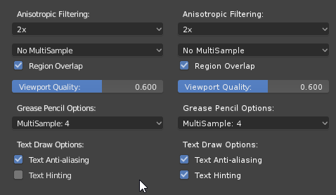
left side without text hinting, right side with text hinting
2 Likes
maybe text need more space ‘kerning’ to make more readable and without text hinting. text hinting make text not smooth. or it’s need antialiasing.
The idea behind hinting is made more narrow and clear the text solving the bad rendering effects